# Jason Sonderman — Full Site Content
This document is generated at build time from the same content sources that build the HTML site. It contains the complete text of every published case study, the about page, and professional experience — everything needed to answer questions about Jason's background, roles, and project work in a single request.
Canonical site: https://jason.sonderman.info
Short index: https://jason.sonderman.info/llms.txt
# Status and Contact
Open to new roles as of August 2026. Most recent role: Head of UX at Arcos, Inc (Oct 2024 – Jul 2026).
- Email: jasonsondermanux@gmail.com
- LinkedIn: https://www.linkedin.com/in/jasonsonderman
- Contact form: https://jason.sonderman.info/#contact
# About
Canonical URL: https://jason.sonderman.info/about/
Markdown: https://jason.sonderman.info/about.md
## Why This Work
I'm in UX because I want to make people's lives better. That sounds simple. It gets complicated quickly.
The complication is that "better" isn't obvious, and the people who would benefit most often can't tell you directly what they need. They describe symptoms, workarounds, the frustration with the thing that exists. Listening past that — to what's actually underneath — requires slowing down when speed is the pressure, staying curious when you're supposed to have answers, and giving the work enough room to miss.
Missing the mark is part of it. Not as failure to be avoided — as instruction. Each iteration gets you closer to something genuinely useful, often in ways the people benefiting will never consciously notice. That's not a failure of visibility. That's the whole point.
I've spent a lot of time thinking about how we actually come to know things — and how looking at the same problem through different lenses changes what you see. My faith, rooted in Jesus Christ and read through both Eastern Orthodox and Western theological traditions, shaped that instinct early. Not because I'm undecided between them, but because holding those perspectives in tension showed me that truth doesn't flatten when you examine it closely. It opens up. That's the same thing that happens when you bring research, systems thinking, and direct observation to a problem at the same time. The answer almost never lives inside a single frame.
## The Work
I've spent 20+ years doing this across healthcare, SaaS, higher education, and critical infrastructure — leading teams across India, Poland, Belgium, and the US, in organizations where UX had to earn its place by demonstrating actual value, not by claiming it. I've built teams, designed systems, run research programs, and influenced product direction. The common thread in all of it is the same question: what does this person actually need, and are we building toward that?
At Arcos, I built a UX practice from the ground up — growing from one designer and two consultants to a senior team with its own ways of working, its own design system, and a delivery model that takes work from discovery through to draft front-end code without leaving the design function. I built that not because it was technically clever, but because the people we were designing for couldn't wait two weeks for a decision. Speed in service of people is worth finding. Speed as a substitute for understanding isn't.
The same conviction shapes how I think about AI in design. It should extend thinking, not replace judgment. It should free up the time and attention that belongs on the actual question.
## Beyond the Work
Outside the office, I'm usually doing something that requires patience, systems thinking, or a willingness to be wrong.
I design and play board games — and game design has taught me more about user experience than most UX books I've read. Mechanics have to be learnable, fair, and satisfying. Feedback loops have to be calibrated. Players have to feel agency even when they're constrained. Sound familiar?
I cook my way through cuisines I don't know yet. It's the same practice as research: approach something unfamiliar with genuine curiosity, learn its logic from the inside, and then make something with it.
I take coffee and bourbon seriously — not as lifestyle accessories, but as exercises in sensory discernment. Training your palate to identify what's actually there, rather than what you expect to be there, is a discipline. One that transfers.
## Credentials
- Nielsen Norman Group UX Master Certification (UXMC)
- IAAP Certified Professional in Accessibility Core Competencies (CPACC)
- BFA, Visual Communications — Kansas City Art Institute
# Professional Experience
Canonical URL: https://jason.sonderman.info/experience/
Markdown: https://jason.sonderman.info/experience.md
Two decades of UX leadership have taught me that the gap between great design and shipped product usually lives in the system… or the absence of one. I build AI-native design infrastructure: token, component, and MCP-enabled documentation layers that treat AI coding agents as first-class consumers alongside human designers and engineers. Deep practice in DTCG token architecture, Figma Variables, Code Connect, Dev Mode, and design-to-code pipelines, grounded in WCAG accessibility throughout.
I design systems where the best choice is the obvious one — whether the hand reaching for it is human or artificial.
## Head of UX
### Arcos, Inc
#### Oct 2024 – July 2026
Arcos builds SaaS and mobile workforce management platforms for utilities and critical infrastructure.
- **Built and scaled an international design team across Poland and Mexico** — grew from one designer and two consultants to three Senior Designers and a consultant, establishing UX values, research methodology, and cross-functional working agreements from the ground up.
- **Pioneered an AI-accelerated delivery model** — moved from discovery through UX design to draft front-end code entirely within the design function, cutting kickoff and handoff from a two-week investigation sprint to three days, reducing time to market by ~30%, and compressing a testable coded concept from 40 hours to 12.
- **Led 2.5 months of embedded field research** across 14 customer sites with 120+ emergency workers — reframing product direction for the Control Tower platform and delivering UX strategy up to 9 weeks ahead of planning sessions through close collaboration with Product Leadership.
- **Shipped the Control Tower MVP on schedule (August 2025)** despite two scope reductions, carving out 2–4 weeks of structured UX discovery within each Milestone definition and Shaping phase to validate feature value with utility users before development began.
- **Strengthened partnerships with legacy Arcos products** — infused modern UX methodology and interaction principles into established product offerings, extending design system consistency across the full platform portfolio.
- **Implemented an AI-enabled design system npm package and Figma MCP integration** — enabling designers to build Higher Order Components directly against the production front-end codebase, near-eliminating revision cycles.
**Skills:** Team Building & Org Design, AI-Accelerated Design Operations, Figma MCP Integration, Research-Backed Product Vision, Cross-functional Strategy, Design Systems, Accessibility Strategy & Compliance
## Director of UX (Global UX Lead)
### TVH Parts, Co
#### Apr 2023 – Oct 2024
- **Led strategic redesign** of the global e-commerce platform using UCD, Double-Diamond, and Design Sprint methodologies — increasing user engagement by 20% through a research-grounded, iterative process.
- **Built and scaled a team of 8 UX Designers** across Belgium, the US, and India — establishing UX values, working principles, and a design culture that operated cohesively across time zones.
- **Implemented enterprise-level discovery infrastructure**: live customer sessions for pre-release validation, session recordings, and behavior metrics to drive evidence-based design decisions.
- **Architected design system strategy** — refined the Figma component library and developed a CSS token system, reducing development time by 35% across two major platforms.
**Skills:** UX Strategy & Vision, Global Team Leadership, Design System Architecture, Discovery & Research Operations, Cross-functional Stakeholder Management, Budget Management
## Lead Product Designer
### BetterCloud
#### Mar 2022 – Mar 2023
- **Designed complex enterprise features** through low and high-fidelity prototypes, increasing feature adoption by 32%
- **Led platform experience strategy** and **mentored a team of three product designers**, establishing career development frameworks and design excellence standards
- **Implemented enterprise-grade design system**, streamlining UI consistency across multiple product tools
- **Reduced time to market by 20%** through cross-functional collaboration with product, engineering, and marketing teams
**Skills:** Enterprise Product Strategy, Team Leadership & Mentoring, Design System Implementation, Cross-functional Collaboration, Discovery Workshop Facilitation, Accessibility Strategy, Data-Driven Design Decisions
## Lead UX Designer
### Archer Education
#### Jul 2018 – Mar 2022
- Improved online higher education engagement by 35% through user-centered design strategies
- Enhanced information architecture and experience design through high-fidelity prototypes for partner microsites, leading to a 23% increase in lead conversion
- Established and documented WCAG AA compliance across online properties
**Skills:** Wireframing, Information Architecture, User Research, Accessibility & Usability Testing, Multivariate & A/B Testing, HTML/CSS, React.js
## Lead Product Design Strategist
### Cerner Corporation
#### Dec 2015 – Jul 2018
- **Managed a team of 4 product designers** — mentoring on craft and career, establishing goal-setting frameworks, and growing the team's leadership capabilities
- Implemented design strategy for healthcare technology products, focusing on in-app coaching and compliance learning systems
- Led the design and implementation of learning management systems for hospital administration
**Skills:** Wireframing, Information Architecture, User Research, Accessibility & Usability Testing, Internationalization, Team Leadership, Business Management
## Principal UX Designer & Web Developer
### blue148, inc
#### Jan 2003 – Dec 2015
- Led the design and development of web and UI projects, consistently exceeding client expectations.
- Developed a customizable CMS, streamlining workflow and enhancing efficiency for client website management.
- Managed a diverse client portfolio, including international manufacturers and start-ups, delivering B2B e-commerce sites, email campaigns, and digital content transformation.
- Adapted UX strategies across various industries, demonstrating versatility and strong problem-solving skills.
**Skills:** Wireframing, Information Architecture, User Research, Accessibility & Usability Testing, Internationalization, Team Leadership, Business Management, Front-end Coding (Javascript), Back-end Coding (PHP, MySQL)
# Case Studies
## Harmony: A Design System Built for Machines
- Subject: Harmony Design System — Arcos, Inc
- Role: Head of UX, Arcos, Inc
- Timeline: Q3 2025 – Jul 2026
- Canonical URL: https://jason.sonderman.info/case-studies/arcos-harmony-design-system/
- Markdown: https://jason.sonderman.info/case-studies/arcos-harmony-design-system.md
What design systems become when AI is a first-class consumer — and what three companies of building them taught me about the architecture that closes the gap between human-readable and machine-executable.
**Key outcomes:**
- Figma Code Connect: 100% (Every Figma library component mapped to its TypeScript implementation)
- HOCs in production codebase: First cohort shipped (Reviewable, trustable, and mergeable by engineers who hadn't built them)
- Team enablement: 3 designers, 2 wks training (Into VS Code with Claude Code CLI; one co-established the token architecture)
- Pilot footprint: 2 pods, 3 senior designers
Jason built Harmony, a design system at Arcos architected to treat AI coding agents as first-class consumers alongside human designers and developers — the third design system he’s built, following BetterCloud Fulcrum and TVH Uplift, which taught him what infrastructure a design system needs to actually hold.
**Facts:**
- Figma Code Connect: 100% of Figma library components mapped to their TypeScript implementation
- Engineering credibility: First HOCs shipped into the Control Tower codebase — reviewable, trustable, and mergeable by engineers who hadn’t built them
- Team enablement: 3 senior designers completed 2 weeks of training into VS Code with Claude Code CLI; 1 went deeper, co-establishing the token architecture
- Architecture: DTCG-format tokens, Figma Code Connect, Zeplin MCP and Figma MCP, an AI agent suite enforcing design-system use in code review
- Status: Harmony npm package published to AWS CodeArtifact March 2026, in production as a versioned dependency; Storybook on Chromatic launched April 2026; Zeplin MCP and JIRA kickoff skill in production; Storybook MCP and enforcement agents in pilot across 2 Control Tower web pods
**Scope:** Pair with BetterCloud Fulcrum and TVH Uplift for the org-adoption lessons that directly shaped Harmony’s architecture. For the delivery-speed metrics this pilot produced — kickoff time, time to market, and the 12-hour coded concept — see The Handoff Is the Bug, which credits the same Zeplin/Figma/Code Connect/Storybook tooling chain documented here as the infrastructure behind those numbers.
**Team:** 3 Senior Designers, 2 Pilot Development Pods, 1 Engineering Advocate
**Tags:** Design Systems, AI-Accelerated Delivery, Token Architecture, Agentic Prototyping, Design Infrastructure, Enterprise SaaS, Cross-functional Leadership
The moment it clicked
The thing about BetterCloud Fulcrum is that it was good. The component library was well-structured, the Figma file was clean, the design intent was documented. What it became, in practice, was the best prototyping library we’d ever had. Design sprints moved faster. High-fidelity concepts that used to take days took hours. For design, it was genuinely transformative.
For engineering, it never existed. Not because they rejected it — there was no rejection, no debate, no principled objection. There was just no capacity to investigate it, plan a pilot, build an implementation strategy. Every team was already mid-sprint, already negotiating what was getting cut this cycle. BetterCloud Fulcrum never crossed the boundary into engineering not because it wasn’t ready but because the organization never had a quiet moment to receive it. What I learned: a design system that lives entirely on the design side of the boundary is a very powerful prototyping tool. It is not, yet, infrastructure.
TVH Uplift had made it across the design-to-engineering boundary, which is what made its situation more instructive. Engineering teams were using it — inconsistently, without full confidence, in pockets rather than as standard practice. The Figma library and the codebase had drifted enough that developers weren’t sure whether following the system would introduce more problems than it solved. Some teams trusted it. Others built around it. The system existed in a state of partial adoption that was, in its own way, more telling than no adoption at all: it showed exactly where trust breaks down when a design system doesn’t have protected organizational ownership. Moving design system engineers under UX, co-designing governance with an engineering advocate, and giving the system genuine capacity is what stabilized it and earned it broader use. Uplift taught me that a design system needs the right home in the organization before it can fulfill what it was built to do.
Both of those experiences were building something more like calibration than cautionary tales. By the time I got to Arcos, I understood two things clearly: a system that doesn’t cross into engineering isn’t infrastructure yet, and a system without protected ownership can’t hold its own trust. Harmony starts from both of those as solved premises. But there was a third problem neither system had ever had to answer, because it didn’t fully exist yet. The moment AI entered the delivery pipeline, the gap between what humans could read in a design system and what machines could actually execute against it stopped being theoretical. That’s the gap Harmony was built to close.
The diagnosis
AI is very good at moving fast and very bad at knowing what it doesn’t know, which causes a heavy problem in the design-to-dev pipeline that isn’t plumbed for it. Feed a model a Figma spec and it will produce code. Confidently. With the same small judgment calls a developer would make, except a developer can ask a question and a model will just pick. The handoff problem didn’t go away when AI showed up. It accelerated.
At the same time, agentic coding was emerging fast enough that the question stopped being theoretical. Cursor. Copilot. Claude Code. Figma Dev Mode with AI assist. Every one of these tools is only as good as the context it can access, and the context most design systems were built to provide was designed for a human reader who could infer, interpret, and ask for clarification. A token named `color-feedback-warning` tells a developer something. It tells a model a label. A component documented with props and variants tells an engineer how to use it. It tells an agent the syntax. What neither of those provides is the thing that actually determines whether the output is right: the why. Why this token and not the similar one two rows up. Why this component and not the raw library element underneath it. Why this layout serves the user’s actual goal in this specific moment.
{/* IMAGE: Token comparison — side-by-side showing the same token with name-only vs. with DTCG description carrying intent. Have: No — recreatable as SVG */}
Vibe coding accelerated the urgency further. As more teams started reaching for AI-generated UI as a starting point rather than a finishing tool, the design systems field started confronting a problem it had mostly deferred: a system that can’t communicate intent to a machine isn’t infrastructure anymore. It’s a reference document. Useful. Not load-bearing.
What had to be true for Harmony to work was that intent had to be legible at every layer of the chain. Not implied by naming conventions. Not written in a Confluence page somewhere. Encoded, structured, and delivered into the agent’s working context at the moment the agent was making decisions. Token descriptions that carry the why and the when, not just the what. Component documentation grounded in user need and goal, not just interaction states and prop tables. Feature-level user intent flowing in from the design spec, scoped to the specific thing being built right now. And underneath all of it, a set of agents that don’t just assist but enforce: catching a developer reaching for raw MUI when a Harmony component exists, validating built output against the design spec before it ships.
That’s a different kind of design system than the field has mostly been building. It’s also, given where agentic coding is going, the only kind that will still matter in two years.
The vision
The argument I needed to make at Arcos wasn’t that we should build a design system. Most organizations agree to that in principle and then never give it the protected capacity it needs. The argument was something more specific and harder to land: we needed to build a design system that treated AI agents as a primary consumer alongside humans. Not a downstream beneficiary. A first-class reader.
_Figure: Solar system diagram with Harmony Design System at the center. Three orbiting bodies represent the three audiences: UX connected to Figma and design principles, Engineering connected to npm and the codebase, and AI Agents connected to context and tokens. Text reads: Three audiences. One vocabulary. The system speaks all three._
That sounds simple stated cleanly. It wasn’t simple to advocate for in 2025. Most of the design systems conversation was still focused on tokens and components: the shapes and values, the Figma file, the component library structure. The deeper bet I was making was that within the next two years, the question every design system would be asked is not “is it well-organized for designers” but “can an AI agent build accurately against it without supervision.” That’s a different brief. It changes what gets documented, where the documentation lives, how it’s structured, and who else has to be in the room while it’s being designed.
The case I built had three parts. The first was cost: every investigation sprint, every correction loop, every revision cycle was a tax on velocity that would only get worse as AI accelerated the noise. The second was quality: a system that lets a model guess produces code that drifts from intent in ways nobody catches until QA, or worse, until production. The third was strategic: companies that built design infrastructure for the agentic era would compound their velocity advantage every quarter; companies that didn’t would discover that “AI is making us faster” wasn’t quite the same thing as “AI is making us better.” Arcos couldn’t afford to be in the second group.
Getting that argument heard required building coalition before building anything. Individual developers came on board first. They were paying the highest cost for the existing handoff and saw the relief most clearly. Product leadership followed, because faster validated direction is something product organizations universally want when they can get it. Tech leadership was the harder room, and the conversation there is still ongoing. Their concerns about codebase ownership, accountability, and what “UX-generated code” actually meant inside an engineering org were legitimate questions that deserved careful answers, not workarounds. What I cared about more than full alignment on day one was shared direction. We agreed on the vision. We agreed on the path. We started moving together. Big ideas like this don’t land in a single meeting and they shouldn’t. What matters is whether the people in the room are negotiating in good faith toward the same outcome and whether the work is visibly making progress against the shared frame. That’s the kind of alignment I optimize for. It’s slower in the first month and dramatically faster everywhere after that.
_Figure: Alignment map showing three stakeholder groups on a spectrum from skeptical to aligned. Individual developers sit at partial buy-in, asking 'Will this displace me, or amplify me?' Tech leaders and managers are in partial buy-in with conversation ongoing. Product leadership is aligned._
The approach
The architecture had to do something unusual: communicate the same design intent at three different levels of abstraction, to three different consumers, in three different formats. Tokens needed to carry their own meaning at the value level. Components needed to carry their own meaning at the system level. Features needed to carry their own meaning at the user-goal level. And all three layers needed to be machine-readable in a way that flowed naturally into the agent’s working context — not requested, not retrieved, just present.
_Figure: Architecture diagram of Harmony showing two lanes. The UX lane connects Figma as the source of truth through Code Connect to the Harmony npm package. The Dev lane connects Zeplin MCP for feature-scoped build context and Storybook MCP for component documentation. The Harmony npm package is published to AWS CodeArtifact at the center. An AI enforcement layer runs underneath both lanes._
The chain we built starts with the tokens. Harmony uses DTCG format because the standard is open, the tooling is mature, and the description field is structured. Every token carries a written description of why the value exists and when to use it versus a similar token. The names are still semantic, which solves the human readability problem, but the descriptions carry the layer of meaning a name can’t, the layer that determines whether a model picks the right token for the right reason instead of the closest syntactic match. From the tokens, the system builds upward: components in the Harmony npm package, published to private AWS CodeArtifact, consumed by engineering as a versioned dependency. Figma library components mapped to their TypeScript implementations through Code Connect, so the source of truth and the implementation can’t drift apart silently. Storybook running against the published npm, documenting component purpose grounded in user need rather than just interaction states.
_Figure: Full system architecture diagram of Harmony. On the left, the Figma library feeds into a DTCG JSON token file and the Harmony npm package, which publishes to AWS CodeArtifact. Two lanes branch from there: a UX lane running Figma MCP for source-fidelity authoring and governance, and a Dev lane running Zeplin MCP for feature-scoped design context, a JIRA AI skill for kickoff automation, Storybook MCP for component documentation, and a Developer Build Environment. Underneath the full chain runs an enforcement layer covering accessibility spec validation, design spec review, component enforcement, and sync spec checking._
The architecture you see now isn’t the one I first drafted. My initial approach was to consume MUI components, override each one with a theme provider, and export the new component — so engineering would import `Button` from Lighthouse-web instead of from MUI, and UX would own the entire visual layer end to end. The argument for it was clean: total UX control over the rendered component. The argument against it became clear as soon as I worked through the implications. Owning components meant owning MUI version updates, owning bug fixes that originated in MUI, owning every regression that surfaced when MUI released a breaking change. UX didn’t have the engineering capacity for that. We don’t have dedicated React developers the way the design system org at TVH did, and committing to it would have created a dependency UX couldn’t honor.
So I pivoted. Instead of consuming and overriding components, Harmony provides themes — detailed token sets and implementations delivered through MUI’s ThemeProvider, layered on top of unmodified MUI components. UX controls the visual layer through tokens and theme configuration. MUI handles the component layer. The architectures stay cleanly separated, and the system has a safety property that the original approach didn’t: if Harmony fails to load for any reason, MUI falls back to its defaults and the software still works. Nothing catastrophic depends on UX-owned infrastructure. That separation of concerns is what made the system safe enough to ship to production in pilot, and it’s what made tech leadership’s concerns about codebase ownership easier to address, because UX wasn’t claiming ownership of anything we couldn’t sustainably own.
The agent layer is where the architecture closes. Two MCP servers, each scoped to a different consumer. Designers work in Figma MCP, with full source fidelity, used for authoring, governance, and system updates. Developers work exclusively in Zeplin MCP, which delivers feature-scoped design context and user intent annotations directly into the build environment. The split is deliberate. Designers need access to the source. Developers need the right information for the build in front of them, scoped to the feature, at the moment of implementation. Storybook is also MCP-enabled in pilot, so component purpose and user-goal documentation flow into the agent’s context alongside the feature spec. The kickoff itself is automated: an AI skill pulls the JIRA ticket that defines the feature, pairs it with the relevant Zeplin design context, and generates a build plan before a human opens VS Code.
Underneath all of that runs a suite of AI agents and skills that don’t just assist but enforce. UX uses agents for design system governance and updates. Two development pods are piloting agents that run accessibility validation, review code against the AI-generated design spec, and catch developers reaching for raw MUI components when a Harmony equivalent exists. The system isn’t asking developers to follow it. It’s making the wrong path visible at the moment they take it. That’s the difference between a design system that works through persuasion and one that works through architecture. Harmony was built to be the second kind.
Building credibility
The pilot couldn’t run on my work alone. Three senior designers had to be genuinely capable inside the delivery model — not watching me demonstrate it, not rubber-stamping artifacts I produced, but authoring inside the same toolchain with the same fluency. Two weeks of training and environment setup got them into VS Code with Claude Code CLI. That’s a real ask for experienced designers who’d never opened a terminal, and they showed up for it. One senior designer went deeper, partnering with me on the token architecture and helping establish the external JSON file as the canonical source of truth for Harmony’s token layer. The model holds because the team can run it without me, not because I’m the only one who can.
Engineering credibility came from the work being legible to engineers on its own terms. When the first higher order components (HOC) shipped from UX into the Control Tower codebase, the question wasn’t whether they looked right. It was whether they’d be reviewable, trustable, and mergeable by engineers who hadn’t built them. They were. The HOCs lived in the same repository as the production code, used the same vocabulary engineering already used, and arrived through the same dependency channels as any other internal package. None of this asked engineering to take anything on faith. The artifacts spoke for themselves.
The sharpest proof of the architecture’s legibility came from somewhere I hadn’t planned. The mobile pod, which was never part of the original delivery model rollout — no training, no onboarding, none of the two weeks the pilot designers went through — connected the Zeplin MCP into their own Claude Code workflow during a planning session, using it to visualize shaping outcomes mid-discussion. They also built a UX Designer agent trained on our team’s documented ways of working, using it as a behavioral frame for a model that now operates inside their own delivery workflow. Nobody onboarded them. They read the same architecture the pilot pods were using and extended it on their own. That’s a different kind of evidence than a pilot metric: it’s proof the system is legible enough to hold up without me — or anyone from the original rollout — in the room.
What shipped
The honest inventory matters here, because the case isn’t “we built a complete system in nine months.” The case is that we built it in the right order, and each piece unlocked the next. Some of the chain is in production. Some is launched and instrumenting. Some is architecture-enabled and being evaluated. All of it was sequenced deliberately.
**In production.** The Zeplin MCP is active across planning and initial build, delivering feature-scoped design context and user intent annotations into the agent’s working environment at the moment developers need them. The AI skill that orchestrates Zeplin and JIRA at kickoff is generating build plans against tickets before a human opens VS Code. What used to be a two-week investigation sprint is now an artifact produced in minutes. Storybook has been live on Chromatic since April 2026 with tokens and core components, importing the actual Harmony npm including the MUI dependency and the Harmony theme. UX is running AI agents and skills for design system governance and updates as part of normal operating practice.
**Launched and instrumenting.** The Harmony npm package was published to AWS CodeArtifact in March 2026 and installed as a dependency in the Control Tower web pilot, where existing production code is being refactored against the new token and theme layer. Figma Code Connect just shipped, built using Figma MCP and Claude Code CLI, connecting every Figma library component to its TypeScript implementation in the npm. The pilot is the validation mechanism, not a delay. We’re learning how the model performs against real delivery cycles before scaling it.
**Architecture-enabled, evaluating.** The Storybook MCP is in pilot with two Control Tower web pods, who are assessing accuracy and trustability against their actual feature work. A subset of the agent suite has been deployed in those same two pods for accessibility testing, code review against the AI-generated design spec, and component enforcement: catching developers reaching for raw MUI when a Harmony component exists. Chromatic visual regression is under evaluation by QA now that Storybook is live with the npm and the regression target is real.
The pattern is intentional: foundation first, then chain, then enforcement. Storybook MCP couldn’t pilot until Storybook was live with the npm. Code Connect couldn’t ship until the npm existed. Chromatic only becomes meaningful once Storybook imports the actual Harmony dependency. Every layer needed the layer underneath it to be solid before the next one could be tested honestly. What’s in pilot is in pilot because that’s where the work is right now, not because it stalled.
The larger argument
The thing I most want you to take from this case is that design systems are no longer documentation projects. They’re infrastructure for a build environment in which AI agents are first-class participants. The systems that treat agents as primary consumers will compound velocity and quality every quarter. The systems that don’t will discover that AI’s speed advantage was never the same thing as a quality advantage. Harmony is the design systems equivalent of a compiler. Tokens and components define a constrained execution environment. Intent descriptions, MCP-enabled documentation, and enforcement agents make accurate output the path of least resistance. The system doesn’t ask developers to follow it. It makes the wrong path visible at the moment they take it.
Where this architecture goes next is in three directions, each one building on what’s already in place. The intent layer wants to go deeper. Code Connect just shipped, and the richer version of this architecture has every component carrying an explicit machine-readable contract that an agent can reason about, not just match against. The enforcement layer wants to scale beyond the two pilot pods, with the right tuning for different team contexts, and to evolve from validation toward something closer to active collaboration with the developer during the build itself. And the pattern itself wants to become portable. What we built at Arcos for one product is the same architecture that scales to multi-brand and multi-platform systems, and the next maturity step is making it transferable rather than bespoke. The companies that get this layer right in the next two years are going to compound advantages that everyone else spends a decade trying to catch.
## The Handoff Is the Bug
- Subject: Arcos, Inc
- Role: Head of UX, Arcos, Inc
- Timeline: Aug 2025 – Jul 2026
- Canonical URL: https://jason.sonderman.info/case-studies/arcos-handoff-is-the-bug/
- Markdown: https://jason.sonderman.info/case-studies/arcos-handoff-is-the-bug.md
At Arcos, design specs were thorough but not executable — developers made hundreds of small judgment calls per feature, and AI entering the pipeline automated the ambiguity instead of solving it. I built Harmony as a context-rich npm package paired with Storybook and Zeplin MCPs, giving UX, engineering, and AI a shared design language. Kickoff compressed from two weeks to three days; a testable coded concept now takes 12 hours instead of ~40.
**Key outcomes:**
- Kickoff & handoff: 3 days (Down from 2-week investigation sprint)
- Time to market: ~30% faster (Across piloted delivery cycles)
- Revision cycles: Nearly eliminated (See-build-review-change loops)
- Testable coded concept: 12 hours (Down from ~40 hours for a wired Figma prototype)
Jason restructured the design-to-dev handoff at Arcos by building Harmony as a shared design language for UX, engineering, and AI agents, then moving the UX team into VS Code to author production-adjacent front-end code against it — compressing kickoff from a two-week investigation sprint to three days.
**Facts:**
- Kickoff and handoff: 3 days, down from a 2-week investigation sprint
- Time to market: ~30% faster across piloted delivery cycles
- Testable coded concept: 12 hours over 3 days, versus roughly 40 hours for a wired Figma prototype covering the same scope
- Front-end story completion time (self-reported): 5–6 days down to 2–3 days, driven by earlier high-fidelity design work, detailed Zeplin annotations on user type and behavior, and tight Zeplin/Figma/Code Connect/Storybook linkage letting engineers pull design intent directly via the Zeplin and Storybook MCPs. Sample/period not confirmed to match the three Control Tower pilot cycles behind the other delivery metrics above — a related but separately-scoped signal, not a fifth data point on the same sample
- Artifacts shipped: Harmony npm package (March 2026), Zeplin MCP in development use (March 2026), Storybook on Chromatic (April 2026), simultaneous Zeplin and Storybook MCPs in VS Code, and an agentically generated Design Implementation Spec the designer reviews rather than authors
- Team enablement: Two weeks of training moved all three senior designers into VS Code with Claude Code CLI; one Senior Designer co-refined the token sets and established the external JSON file as Harmony’s canonical token source
- Stakeholder alignment: Individual developers and Product leadership bought in; Tech leaders and managers are partial, with a pilot running — their stated concern is code quality and codebase ownership
**Scope:** The metrics come from three delivery cycles on Control Tower — early signal from one platform, not a company-wide result. The formal code review and merge process for UX-authored Higher Order Components is not codified yet; what changed is that Tech leadership moved from asking whether UX should produce code at all to asking what the review process looks like. Pair with the Harmony case study for the token architecture underneath this pipeline, and with TVH Uplift and BetterCloud Fulcrum for the two earlier design systems whose adoption lessons shaped it.
**Team:** 3 Senior Designers, 1 UX consultant
A thorough spec isn’t an executable one
The deskcheck at Arcos wasn’t a meeting. It was a Slack channel — and sometimes a long, unwieldy thread trying to get a single component right. A developer would post a Loom video of the work. UX would watch it, trying to investigate what was actually in the code. Was the correct token used, or just a value that looked right on screen? Was that spacing coming from the design system or hardcoded? You couldn’t inspect it through a video. You could only see the surface.
That’s what stuck with me. Not that the developer had done something wrong — they hadn’t. Not that the spec was incomplete — it was thorough. But a comprehensive spec is still interpreted differently by each person who reads it. And when the review mechanism is a Loom video in a Slack thread, UX has no way to verify intent against implementation.
As AI started entering the delivery pipeline — developers feeding specs into models to accelerate their builds — the translation problem didn’t go away. It just moved. Now an AI was misreading the spec instead of a human. We’d automated the ambiguity.
That realization reframed the question. Instead of “how do we write better specs,” I started asking: what if we gave AI better source material to begin with?
_Figure: A Slack post in the lh-desk-check channel showing a developer's deskcheck submission: two UI screenshots attached and a 2-minute Loom video recording, with 25 replies and multiple participants. The review mechanism is a video link in a thread — not inspectable code._
The diagnosis
The traditional design-to-dev handoff has always had a lossy translation layer. Designers produce Figma files, annotations, and Zeplin specs. Developers interpret them — making judgment calls about tokens, spacing, component variants, interaction states. Every judgment call is a potential drift from intent.
At Arcos, that translation tax was being paid in two ways: in time, through investigation sprints and spikes at the start of every delivery cycle, and in quality, through the see-build-review-change loops that consumed the back half. A two-week sprint just to ingest design intent. Then cycles of correction after that. The spec was comprehensive. It just wasn’t executable.
_Figure: Two horizontal timelines comparing before and after. Before: a 2-week investigation sprint followed by build, review, correct, and repeat cycles. After: a 3-day Shape Up kickoff leading directly to build, then done — with approximately 30 percent faster time to market and near-elimination of revision cycles._
What shipped
The artifacts that make this model real, in the order they shipped:
Harmony Design System — npm package published to production, March 2026.
Zeplin MCP — in active use by development as of March 2026.
Storybook on Chromatic — launched April 2026.
Dual MCP agentic workflow — Zeplin and Storybook MCPs active simultaneously in VS Code.
Design Implementation Spec — agentically generated, reviewed and validated by the designer.
Shape Up scope alignment — a cross-functional effort with Product to sharpen Milestone definitions upstream.
The proof that the model works isn’t theoretical. Using Storybook and Harmony, I personally built a functioning testable web concept in 12 hours over 3 days — grounded in UX discovery and requirements, with Pendo tags embedded to track user task completion and flows. A wired Figma prototype covering the same scope would have taken roughly 40 hours. The concept went directly to user testing, and because it was coded rather than simulated, it surfaced interaction behaviors that a Figma prototype would have hidden entirely. No handoff required.
The model is active and expanding. The Control Tower web theme is in test and integration with the production development flow. What started as a workflow experiment is becoming infrastructure.
These metrics come from three delivery cycles on Control Tower — early signal from one platform, not a company-wide result.
The vision — and why it required cross-functional buy-in from the start
I started working toward a different model — one where the UX team transmits design intention in a form that’s closer to code than documentation. Not as a replacement for engineering, but as a cleaner separation of concerns.
The idea was to move the bar left. If front-end visual builds could originate within the UX team — component-correct, pattern-consistent, already informed by the design system — then development could focus on what it does best: backend architecture, data modeling, API integration. Not burning cycles interpreting whether a button should have 8px or 12px of padding.
At the same time, this opened a different opportunity for Product. Simple experiences — low-complexity UI updates that currently require full production cycles — could be built with UX oversight rather than waiting in a delivery queue. Three roles, each elevated to their highest use. That was the vision.
Designers use this model during the Shaping phase of a milestone — building coded concepts to test with users before a feature enters the delivery queue. Developers use it to extend design code that’s already been handed off in the team’s own vocabulary. That dual-user pattern is what makes the handoff genuinely shorter: both roles working from the same artifacts, in the same codebase vocabulary, without a translation step between them.
But I recognized early that this wasn’t a UX decision to make alone. Changing where front-end code originates touches codebase ownership and delivery accountability. I needed product and engineering leadership in the room before anything was built. And I needed my own team to be genuinely capable inside the model — not watching me demonstrate it.
As Arcos’s AI Champion, I led two weeks of training and environment setup to move all three senior designers into VS Code with Claude Code CLI. That’s a real ask for experienced designers who’ve never worked in a terminal. One Senior Designer went deeper — collaborating with me to refine the token sets in both Figma and JSON, and establishing the external JSON file as the canonical source of truth for Harmony’s token layer. The model only holds if the team can run it without me. After those two weeks, they could.
_Figure: Three-column diagram titled 'An org design argument, not a tooling story.' Each column shows what UX, Product, and Engineering gains and hands off under the new model. UX gains time on judgment and authorship of the view layer. Product gains faster validated direction and fewer revision cycles. Engineering gains cleaner inputs tested in code and focus on model and controller._
Building the coalition — where alignment held and where it didn’t
I brought the model to three audiences before building anything:
Individual developers — Buy-in secured. Aligned on reducing investigation overhead.
Tech leaders & managers — Partial; pilot running. Core concern: code quality and codebase ownership.
The Tech leader objection had a specific shape that took time to surface. When they pushed back on “UX-generated code entering the codebase,” the artifact in their heads wasn’t a HOC — it was the AI-assisted prototyping work from early in the exploration. Separating those two things was the work the next phase required.
_Figure: Alignment map showing three stakeholder groups positioned on a skeptical-to-aligned spectrum. Individual Developers: skeptical, engaged through demonstrated output. Tech Leaders and Managers: partial buy-in, conversation ongoing — concerned with codebase ownership and accountability. Product Leadership: aligned, watching the metrics — concerned with roadmap velocity and quality. A note reads: partial buy-in is the honest state. Manufactured consensus would be the wrong metric._
How the model matured — from prototype stigma to production-adjacent components
Responding to that feedback meant making a meaningful technical distinction the early exploration had blurred.
AI-assisted prototyping tools (Lovable, Bolt.new, Figma Make): Fast, generative, great for moving abstract thinking onto a screen. AI-chosen dependencies, no relationship to the production codebase. Correctly perceived by engineering as throwaway.
VS Code + AI agents + Harmony: UX working in VS Code against the actual front-end codebase. Same tokens, same components, same patterns engineering already owns. Higher Order Components that are reviewable, trustable, and mergeable.
A HOC built against the actual front-end stack isn’t foreign. It’s design intent expressed in the team’s own vocabulary.
{/* IMAGE:
What: Side-by-side comparison — left: Lovable/Bolt output (random component library, no token structure); right: HOC output (real tokens, real components, same codebase patterns)
Why: The prototype vs. production distinction is the hinge of the whole Tech leader trust story — showing it visually closes the argument faster than explaining it
Alt: Two code or UI panels side by side. Left labeled "AI-assisted prototyping tools" showing unfamiliar component library. Right labeled "VS Code + Harmony + AI agents" showing production-matched components and tokens.
Have: Partially available — Lovable output exists; HOC output may need a clean screenshot
*/}
Harmony — a design language for UX, engineering, and AI
The single source of truth that makes this pipeline possible is Harmony, the Arcos design system — built so UX, engineering, and AI agents can all operate from the same tokens, components, and patterns instead of three different interpretations of the same intent. For the full architecture, see the dedicated case study: Harmony: A Design System Built for Machines.
The agentic workflow — two MCPs, one context window
Knowing what a component should look like (Zeplin) and knowing how a component actually behaves in production (Storybook) are two different things. The old workflow asked developers to hold both in their heads and reconcile them manually. The new workflow makes both available to the AI agent simultaneously, without leaving VS Code.
With the Zeplin MCP and Storybook MCP active at the same time, an AI agent working in VS Code can reference the design spec and the live production component in the same context window. It sees what the designer intended and what the codebase already contains. That dual context is what makes the output production-adjacent rather than prototype-shaped — the AI isn’t filling gaps with guesses, it’s filling gaps with the production component library itself.
Storybook on Chromatic serves both audiences. For humans — designers, developers, QA — it’s a living reference for what every component looks like, across states and variants, at a given point in time. For AI agents, the Storybook MCP turns that same reference into structured context that’s queryable from within the coding environment. One artifact, two consumers. Neither maintains a separate source of truth.
Moving discovery earlier changed what engineers had in front of them by the time a story reached build. High-fidelity design work happened up front, Zeplin annotations documented user type and behavior in detail, and Code Connect kept Zeplin components, Figma components, and the Harmony Storybook tightly linked — so an engineer working in VS Code could pull that context directly through the Zeplin and Storybook MCPs instead of waiting on a clarifying Slack thread. The first coded draft landed closer to the design target: colors and spacing tracked the central token source more consistently, and engineers told me they felt more confident making the small calls themselves — copy voice, interaction behavior — because the documentation actually answered those questions now. Net result: front-end user stories that used to take 5–6 days to complete came in at 2–3. That’s my own read of the work, not a pulled report, and I haven’t confirmed it maps to the same three pilot cycles behind this case study’s other delivery numbers — treat it as a related, separately-observed signal, not a fifth data point on the same sample.
{/* IMAGE:
What: Screenshot of the Claude Code CLI showing both MCPs (Zeplin and Storybook) listed as active, paired with a VS Code window open to a HOC being built — showing the coding environment where both MCPs are in use
Why: The dual-MCP workflow is the most technically differentiated part of the model — showing it in context makes it real rather than theoretical
Alt: Claude Code CLI output listing Zeplin MCP and Storybook MCP as active connections, alongside a VS Code editor window showing a Higher Order Component being authored
Note: MCP server list is now only visible in the Claude Code CLI, not in VS Code UI
Have: Screenshottable from working environment — run `claude mcp list` in terminal alongside an open VS Code window
*/}
The Design Implementation Spec — same purpose, different form
Every handoff has always needed a spec. A document that says: here is what should be built, here is how it should behave, here are the edge cases. That need didn’t go away. What changed is who produces it, how it’s produced, and what it contains.
The old spec was authored manually — designers writing annotations, documenting component states, describing interactions in prose. It was thorough, but it was also static, human-interpreted, and structurally disconnected from the tools developers and AI agents were actually using to build.
The Design Implementation Spec is generated agentically. With both MCPs active and Harmony’s structured component context available, an AI agent can produce a spec that already speaks the production codebase’s language — referencing actual component names, real token values, documented behavior variants. The designer’s role shifts from authoring the spec to reviewing and validating it. Judgment stays with the designer. The translation work moves to the AI.
This is an evolution, not a replacement. The purpose of the spec hasn’t changed — transmit design intent clearly enough that something real can be built from it. What’s changed is that “clearly enough” now means something more precise: structured, machine-readable, built from the same vocabulary as the components that will implement it.
{/* IMAGE:
What: Side-by-side of old Zeplin annotation spec (prose notes, color pickers, spacing callouts) versus the new Design Implementation Spec format (component references, token names, structured behavior descriptions)
Why: Shows the evolution concretely — same intent, different form — without requiring the reader to take it on faith
Alt: Two document panels side by side. Left labeled "Manual spec" showing Zeplin-style annotations. Right labeled "Design Implementation Spec" showing structured component references and token values.
Have: Left side available from Zeplin history; right side may need a representative example created
*/}
The architectural argument underneath it all
The principle underneath this model pushes toward an MVC separation — visual layer decoupled from model and content. UX owns the V. Dev owns the M and C. That’s not just a workflow change. It’s a structural argument for how product teams should be organized in an AI-assisted delivery environment.
Harmony makes this structural argument concrete. When the design system is also a production dependency — when it’s the shared vocabulary that UX, engineering, and AI agents all read from — the separation of concerns becomes architectural, not just procedural. UX isn’t translating intent into documentation and hoping it survives the handoff. UX is authoring the layer directly, in the language the codebase already speaks.
What’s still unresolved: the formal code review and merge process for HOCs. We have a path — reviewed like any other PR — but it’s not codified yet. The most meaningful outcome so far is that the question has changed. Tech leadership is no longer asking “should UX produce code at all.” They’re asking “what does the review process look like.” That’s a different, more tractable problem. The work to close it is ongoing.
The teams that will move fastest aren’t the ones with the most developers — they’re the ones where each role is doing the work that requires their specific expertise, and AI is handling the translation between them. Harmony moving to a second platform — React Native — is evidence that the model holds beyond its first context. The goal was never to make UX do development. The goal was to make the handoff disappear. That work is underway.
_Figure: Three horizontal layers titled 'Where the handoff happens now.' The View layer is owned by UX plus Harmony, covering components, composition, interactions, and authored as Higher Order Components. The Controller layer is shared, handling behavior, state, and orchestration. The Model layer is owned by Engineering, covering data, services, and business logic. A callout marks the handoff point: 'handoff happens here — in code.' A caption reads: the handoff moved down the stack. UX now authors the view layer directly._
## From Delivery to Direction
- Subject: Arcos, Inc — UX Leadership & AI Delivery
- Role: Head of UX
- Timeline: Oct 2024 – Jul 2026
- Canonical URL: https://jason.sonderman.info/case-studies/ways-of-working-ai-delivery/
- Markdown: https://jason.sonderman.info/case-studies/ways-of-working-ai-delivery.md
When the delivery pipeline started working, the recovered capacity had to go somewhere. This is the story of what the efficiency revealed: that the upstream problem — purpose, data shape, user intent — is harder and more valuable than the downstream one. And what it means when your team’s documented ways of working become the training set for an AI agent someone else built.
**Key outcomes:**
- Rebrand + light mode: 1 wk (Down from a full 2-week sprint)
- Sprint recovery: ½–1 sprint (Per milestone cycle within a 6-week cadence)
- Story point shift: 5–8 → 1–3 (Fibonacci UI estimates after design system hardening)
Jason built an AI-assisted delivery pipeline at Arcos connecting a custom design-system npm package, Figma MCP, Zeplin, and Claude Code — which recovered team capacity and revealed that the higher-leverage problem was upstream clarity of purpose, not handoff translation.
**Facts:**
- Sprint recovery: Half to a full sprint recovered per six-week milestone cycle
- Story point shift: UI estimates moved from 5–8 to 1–3 on the Fibonacci scale as token maturity increased
- Rebrand + light mode: Completed in 1 week, down from a full 2-week sprint
- Team grown: From 1 designer + 2 consultants to 3 Senior Designers + 1 consultant
**Scope:** This case study covers the delivery-pipeline mechanics and what building it revealed about where design creates value — pair with UX as Organizational Strategy for how that upstream role was earned, and Control Tower for where the 3-day kickoff was exercised on a real product.
**Tags:** UX Leadership, UX Team Scaling, Design Systems, AI-Accelerated Delivery, Token Architecture, Cross-functional Leadership, Enterprise SaaS
The terrain
Control Tower and Arcos Field run on two stacks, serve two kinds of users, and opens every six-week cycle the same way — four days of planning sessions where product, design, and a development pod walk every defined outcome together before a line of code is written. Three senior designers cover that work across three pods. I carry the connective tissue role: coherence between the two surfaces, continuity into the legacy tools underneath, and the thread that keeps what gets built on one side from quietly drifting away from the other. The team is small by design. Constraints tend to produce clarity, and clarity, as it turns out, became the whole story.
For most of the time I’ve been here, those planning sessions were where the friction lived. This is the story of what changed when the friction went away — and what it revealed when it did. For the technical story of how the delivery infrastructure was built, see The Handoff Is the Bug. This study picks up where that one ends.
{/* IMAGE: Hero/thumbnail — a single Control Tower component shown in two states: Figma/Zeplin with token annotations visible on the left, the same component rendered accurately in the dev environment on the right. No arrow between them. Tight crop, consistent color grade across both sources. */}
---
What the efficiency revealed
The pipeline worked. Half a sprint to a full sprint recovered per six-week cycle. UI stories that pointed at 5s and 8s came back as 1s and 2s. A rebrand and light mode implementation that would have taken two weeks took one. The work was understood before it began.
{/* STAT BAR: Four metrics — render using the site's existing StatBar or outcomes component from frontmatter.outcomes */}
{/* IMAGE: A generated before/after timeline — two horizontal rows labeled Before and After, each showing a 6-week milestone cycle divided into sprints. In the Before row, the first two weeks are marked as Scaffolding + investigation. In the After row, that space is open or redirected. Two colors only, no gradients. */}
Working inside it closely enough revealed something the original hypothesis hadn’t accounted for. The ambiguity that remained wasn’t in the handoff. It was earlier — in whether the purpose behind a layout decision had ever been made explicit, in whether the shape of the data matched what a user actually needed to see, in the distance between what the interface asked someone to do and what they were actually trying to accomplish. Those questions don’t come from the design file. They come from being close enough to real users — in research, in testing, in the accumulated evidence of watching people work — that the intent behind a decision is grounded in something observed rather than assumed. The smarter the agent got, the more plainly it showed us how much that grounding mattered. Speed was compressing the cost of skipping it, not eliminating it.
> We came looking for a better bridge. We found that the other side needed work first.
Then the mobile pod showed us what documentation is actually for.
The mobile surface had always been the harder one to plan for — there is no clean way to prototype in React Native, and the pod had never been part of the original delivery model rollout. During a planning session, we learned they had connected the Zeplin MCP to pull design context and user flows directly into a Claude Code workflow, using it to visualize shaping outcomes mid-discussion before the formal handoff. They had also built a UX Designer agent — trained on the ways-of-working documentation our team had published. Not a tool handed to them. Not a process they’d been asked to follow. Our own documented values and process norms, used as a behavioral frame for a model working alongside their developers. They built it themselves because the documentation was precise enough to make it possible.
I hadn’t written that documentation for this. I’d asked for it because unclear process wastes senior people’s judgment on questions that shouldn’t still be open — the same instinct behind Clarity of Purpose, just aimed inward at how the team’s own knowledge gets recorded. It turned out to double as something else entirely: the discipline that makes documentation useful to a new hire and the discipline that makes it useful to a model training on it are the same discipline — say the actual reason a thing is done, not just the rule. If the ways-of-working docs had been checklists instead of reasoning, the mobile pod would have had nothing to build on. Good documentation was never just about onboarding humans. It’s what makes your judgment portable to people, and processes, you never planned for.
---
Clarity of Purpose
Oracle’s Redwood Design System named two things that have stayed with me. Clarity of Purpose — every design decision grounded in a specific outcome before execution begins. And the shape of the data — not what the system holds, but what form a user needs it to take to act with confidence. Both principles are older than any library. Both became more urgent when the time between a decision and its built expression collapsed to days.
AI is a domain I’ve worked in long enough and closely enough that other leaders inside the organization began bringing me into the room when strategic decisions about it were being made — not as a title, but as a point of view that had been tested against real work. Those conversations kept returning to the same reframe: the efficiency story is the smaller story. What AI-assisted delivery actually creates, if the recovered time goes somewhere intentional, is the conditions for design to do the work it was always supposed to be doing. Not generating UI. Holding purpose accountable. Defining the right shape for the right data. Staying close enough to what users actually need that the thing being built is worth building.
> AI doesn’t make UX faster. It makes UX more valuable — if the recovered capacity goes back into the questions that determine whether velocity creates anything worth having.
---
Early, and honest about it
One sprint in. The volume of UX updates to screens has dropped. More tellingly, the nature of the work has shifted — designers are no longer the primary producers of UI in Figma, then advocates for its faithful translation into code. They are reviewers: informed, principled, checking that what has been built holds to the UX decisions that were made upstream, that accessibility hasn’t been traded away in the handoff, that the experience arriving at user acceptance testing is one the design team can stand behind. The production work moved to the agents. The judgment work stayed with the people.
Whether that holds, and what it looks like at scale across all three pods, is still being learned. What is visible so far is a design function that moved upstream without shrinking — AI handling the translation layer, developers owning architecture and integration, UX with its attention on the questions that don’t resolve themselves.
What the user is actually trying to accomplish. Whether the thing being built gets them there. Whether the purpose behind the decision was ever made clear enough to survive the distance between intent and code.
That last question turns out to be the one that matters most. It was there before the AI. It will be there after whatever comes next. The tools changed what it costs to ignore it.
{/* IMAGE: A Control Tower screen in the dev or alpha environment alongside a Zeplin annotation or comment referencing a UX principle or accessibility consideration — showing UX engaging with built work rather than producing Figma files. Anonymize any sensitive data visible in the UI. */}
## UX as Organizational Strategy
- Subject: Arcos, Inc
- Role: Head of UX, Arcos, Inc
- Timeline: Oct 2024 – Jul 2026
- Canonical URL: https://jason.sonderman.info/case-studies/arcos-ux-organizational-strategy/
- Markdown: https://jason.sonderman.info/case-studies/arcos-ux-organizational-strategy.md
Arcos had tried to build a Timesheet capability once before UX existed, and it missed. The second attempt was shaped with aggregated user data and POCs tested against roughly 50 field users before engineering committed — and it shipped. That shift, from receiving specs to shaping scope, is what two years of earning credibility with resistant and receptive engineering pods alike actually bought.
**Key outcomes:**
- From invisible to essential: UX shaped product scope before engineering began, not just how things looked once specs arrived (Previously, UX received specs; pod engagement grew from 1 initiative each across 3 pods to active work in 4 (self-reported, before/after))
- Control Tower platform direction: Draft screens reframed the product vision in January 2025 (EA and PM teams moved from circular scoping to focused triage in weeks)
- Timecards capability: POC-first approach — tested with roughly 50 field users at a convention and Arcos's 20-member Storm Response Action Committee — shipped as Timecards Mobile and Timecards Management in August 2026 (Beta release, not a full commercial launch; Outcomes-phase shaping for this capability compressed from a routine 6-week cycle to initial outcomes ready by week 3 (self-reported, single named example))
- Team built outlasted my tenure: All 3 designers I hired, plus one of the original contractors, are still at Arcos (Self-reported, from my last conversation with the team, August 2026)
Jason built Arcos’s first formal UX function from scratch, repositioning design from a downstream delivery service that received specs into an upstream function that co-authored product scope.
**Facts:**
- Starting point: No formal UX function existed at Arcos before Jason’s hire
- Team built: Grew from Jason plus 2 consultants to 3 Senior Designers plus 1 consultant
- Control Tower platform: UX-authored draft screens redirected product scope conversations in January 2025
- Timecards capability: Shaped with UX-aggregated user data and validated via POCs with ~50 field users at a convention and Arcos’s 20-member Storm Response Action Committee — reversing a prior pre-UX attempt that shipped and missed. Shipped as Timecards Mobile and Timecards Management in August 2026 (beta)
- Pod engagement, before and after (self-reported): Before: 1 initiative each in Control Tower, Clearion, and Mobile Workbench (3/quarter). After: active in 4 pods — 2 Control Tower, 1 Clearion, 1 Mobile Workbench
- Outcomes-phase shaping time (self-reported): Compressed from a full 6-week cycle to initial outcomes ready for validation by week 3, evidenced by the Mobile Timecards coded prototype tested with users at a convention mid-Milestones phase
- Team retention: All 3 designers Jason hired, plus one original contractor, remained at Arcos after Jason’s own tenure there ended in 2026
**Scope:** This is an organizational-credibility and process-design narrative, not a single deliverable — pair with From Delivery to Direction and Harmony for the execution-level detail. Pod-engagement counts, the Outcomes-phase shaping-time figure, Timecards POC participant counts, and the team-retention fact are Jason’s self-reported verbal account (2026-08-04), not cross-checked against Arcos project records.
**Team:** 3 Senior Designers, 1 consultant (built from 1 + 2 consultants)
**Tags:** UX Leadership, Org Design, Cross-functional Leadership, Product Vision, Enterprise SaaS
It was January 2025, and the Enterprise Architects and Product Managers were spinning. Control Tower and Arcos Field — Arcos’s new emergency preparedness suite — were in early shaping, and every conversation about scope and process was circling back to the same unresolved questions. My team had done the foundational work: service blueprints, personas, early research synthesis. But none of it was “on paper” in a way that could anchor a room of people who think in systems and specifications.
I made a call that felt risky at the time. I asked UX to take the thin slice of requirements we had and create draft screens — not polished, not validated, explicitly aspirational — of what this platform might be. The goal wasn’t to propose a solution. The goal was to give every person in that room something specific to push back on.
The hypothesis was that pointing at something wrong is easier than defining something right. And it worked. Within weeks, the conversation shifted from open-ended scoping to focused triage. Engineers could say “that workflow would never work with our current stack.” PMs could say “that’s out of scope for this milestone.” The architects could see the seams in the system before they’d been written into a spec. The draft screens hadn’t answered the question — they’d changed what question we were asking.
{/*IMAGE:
What: Side-by-side comparison of service blueprint section and the draft screen that corresponded to it — showing the translation from abstract to concrete
Why: Communicates visually that UX was doing systems thinking, not just UI work
Alt: Service blueprint diagram on the left showing user journey and system touchpoints, paired with a low-fidelity draft screen on the right illustrating one interaction moment from that journey
Have: Recreatable — a Figma frame excerpt alongside the relevant blueprint section would work
*/}
The diagnosis
When I was hired at Arcos, the company had never had a formal UX function. The CPO’s intent was clear: establish a strong UX strategy and design voice, ask the uncomfortable questions about the experience, and unify the product across a set of genuinely complex variables — emergency versus normal operations, wildly different persona needs, and a product suite that had grown through acquisition as much as through deliberate design.
What I walked into was not hostility to UX — it was ambiguity about what UX was for. Different product and engineering pods had different answers. Some teams saw UX as a visual polish layer, applied after the real decisions had been made. Others were skeptical that a centralized UX function could understand the technical constraints they were living with. A few were curious but waiting to see if this was a real commitment or a title on an org chart. None of them had a shared language for collaboration.
The deeper problem was structural. Arcos had made product decisions — real ones, shipped ones — without grounding them in user reality. The prior attempt at a Timesheet capability was the clearest proof point: a feature the company had tried to build before UX existed, and one that hadn’t landed. That story was known internally. It was the kind of miss that lingers in institutional memory and, if handled carefully, could become an argument for doing things differently.
What had to be true for UX to actually change how Arcos built things: I had to earn credibility with each pod on their own terms, not demand it by title. I had to demonstrate that UX could hold the long-term vision while respecting the near-term constraints. And I had to make our artifacts genuinely useful to the people making decisions — not outputs that sat in Figma, but instruments that changed what happened in a room.
{/*IMAGE:
What: A simplified org diagram or ecosystem map showing the different product pods and how UX sits in relation to them — annotated with "accepting," "skeptical," "resistant" to reflect the actual landscape
Why: Makes the complexity of the org visible and signals that Jason understood the political terrain, not just the design problem
Alt: Organizational map showing Arcos product and engineering pods with UX positioned centrally, with annotations indicating initial engagement posture of each pod
Have: Recreatable — a simple annotated diagram in Figma
*/}
The vision
The frame I was working from wasn’t “UX needs a seat at the table.” That framing is passive — it positions UX as waiting to be invited. My actual argument, which I made explicitly to the CPO and implicitly to every product pod I engaged, was that UX is most valuable as a forcing function: a discipline that makes ambiguity concrete early enough that course corrections are cheap rather than catastrophic.
This reframe had practical implications. It meant UX shouldn’t wait for specs to arrive — it should be generating the artifacts that inform those specs. It meant personas and service blueprints weren’t documentation artifacts produced after discovery; they were navigation tools that made product conversations faster. And it meant that a rough screen shown at the right moment could do more strategic work than a polished one shown too late.
The vision for the product itself — what the CPO called “Harmony” — was to unify the user experience across emergency and normal operations, across the range of personas Arcos served, and across the contexts in which their software lived. That was a systems problem, not a UI problem. Holding both the long-term vision of what the experience could be and the near-term reality of what could actually ship with a given tech stack required a specific kind of discipline: knowing when to push, when to negotiate, and when “good enough” was a genuine win rather than a compromise.
{/*IMAGE:
What: A high-level experience vision diagram — something like an annotated landscape of the Harmony vision showing the personas, scenarios (dark sky / blue sky), and how they connect
Why: Shows that Jason was working from a systems-level mental model, not feature by feature
Alt: Experience landscape diagram showing Arcos user personas across emergency and normal operating scenarios, with callouts indicating cross-cutting UX themes
Have: Recreatable — this could be derived from existing service blueprint or strategic framing artifacts
*/}
The approach
With resistant pods, I didn’t lead with process. I led with listening. Every engineering team had a legitimate set of constraints — tech stack debt, timeline pressure, context that UX didn’t have by default. Before I asked anyone to change how they worked, I needed to understand what they were actually up against. That meant sitting in on engineering conversations I wasn’t required to attend, asking questions about what made certain problems hard, and demonstrating that UX wasn’t coming in to add friction to their pipeline.
The negotiation model that emerged from those early relationships became a pattern I applied across the org. For any given release, I’d define the ideal experience — the thing UX research and our understanding of user goals said was right — and then open the floor to what was actually buildable given the constraints at hand. We’d negotiate toward a release target that was meaningfully better than the current state, even if it wasn’t the full vision. The software is mutable. A strong, honest relationship with a tech team is worth more than a single perfect release, and everyone involved knew the long-term vision wasn’t going away.
Building a team capable of holding that model was inseparable from the approach. When I arrived, UX was one person — me — plus two consultants. Over the following two years, I hired three Senior Designers with the specific combination of skills the work required: researchers who could operate at a systems level, designers who could engage directly with engineering constraints, and practitioners who could hold a long-term experience vision while negotiating toward what could actually ship in a given cycle. The team didn’t grow because the org chart said it should. It grew because the scope of what UX needed to do — across Control Tower, Arcos Field, Timesheet, and the full range of Arcos personas and scenarios — required it.
By August 2025, that credibility was buying real access. When the Timesheet capability — later shipped as Timecards — was being shaped, a feature Arcos had already tried and missed before UX existed, I pressed to be involved at the objective-setting stage, not after it. I used AI to aggregate the user and customer data we had, surface the top-value threads, and quickly built working Proof of Concepts in Lovable around that model. Not to propose a final design, but to put something specific in front of leadership and customers early enough that bad ideas could be eliminated before anyone had spent real engineering time on them. The pattern from January’s Control Tower session — give people something to react against — had become a repeatable method.
That method changed the shape of the delivery cycle itself. A coded Mobile Timecards prototype existed midway through the Milestones phase — early enough that we took it to a convention floor and got live feedback from roughly 50 field users before the Outcomes phase had even started. We also reviewed it with Arcos’s 20-member Storm Response Action Committee. Outcomes-phase shaping, which had routinely run a full six weeks and often past its own deadline, had initial outcomes ready for leadership and user validation by week 3. That’s a pattern I saw clearly once, on Mobile Timecards — not a measured average across every initiative I ran, but it’s the sharpest example I have of what a working prototype earlier in the cycle actually buys you. My looser impression, not a measured result, is that it also meant more outcomes got planned all the way through during planning week itself, with user stories clear enough that they rarely needed rewriting afterward.
{/*IMAGE:
What: A Lovable-generated POC screen from the Timesheet capability work, shown alongside a sticky note cluster or affinity map from the AI-aggregated data synthesis — showing the translation from user data to testable concept
Why: Makes the AI-accelerated POC approach concrete and legible; shows that "rapid" doesn't mean "uninformed"
Alt: Side-by-side showing aggregated user feedback themes on the left and a corresponding low-fidelity proof-of-concept interface screen on the right
Have: Likely available — check if Lovable screens from the Timesheet POC work were exported
*/}
Building credibility
The clearest indicator of earned trust isn’t being invited to a meeting — it’s being sought out before one. That shift happened at different times with different pods, but it happened. The teams that were skeptical early on weren’t won over by process decks or capability presentations. They were won over by UX showing up with something useful, consistently, in the context of problems they were already trying to solve. When a PM realized that the personas and flows we’d developed before shaping began made their kickoff conversations faster, that was more persuasive than anything I could have said in the abstract.
By my own count, that shift shows up in scope, too. Before, UX touched about three initiatives a quarter — one each in Control Tower, Clearion (our Ukraine-based team), and Mobile Workbench, our legacy product. By the time I left, UX was active across four pods: two in Control Tower, one in Clearion, one in Mobile Workbench. I never tracked that against Arcos’s total pod count, so read it as a before-and-after, not a share of the whole — but it’s the plainest evidence I have that engagement grew rather than just deepened with the same few teams.
The Timesheet milestone was the sharpest credibility moment because it had a named failure attached to it. The prior attempt — built before UX existed at Arcos — had shipped and missed. That institutional memory was in the room when I made the case to be involved in objective-setting, not just design execution. Leadership agreed not because UX had earned that access by policy, but because the alternative had a known outcome. Early UX involvement wasn’t a preference anymore — it was the variable that had determined whether the previous attempt hit or missed. That argument landed because it was traceable. The Timesheet miss wasn’t ancient history; it was the reason we were having the conversation.
{/*IMAGE:
What: A workshop or co-design session artifact — annotated wireframe with stakeholder feedback, a prioritization board with engineering and PM input visible, or a photo from a cross-functional working session
Why: Shows UX as a collaborative participant in the room, not a downstream service provider
Alt: Whiteboard or digital workspace showing cross-functional prioritization exercise with sticky notes from multiple contributors organized into themes
Have: Recreatable or archival — check for photos or screenshots from Control Tower shaping or Timesheet milestone sessions
*/}
What shipped
The most important thing that existed by the end of my time there that didn’t before isn’t a screen or a component — it’s a position. UX became a necessary participant in product shaping at Arcos. That’s structural, not relational, and it’s the difference between influence that depends on the right people being in the room and influence that’s baked into how the process works.
More concretely:
Service blueprints and personas developed by UX became active inputs to early-stage product and architecture conversations — not documentation produced after the fact.
The draft-screens-first method, introduced in January 2025, became a repeatable tool for focusing scope conversations before requirements are written.
The Timesheet capability — validated with roughly 50 field users at a convention and Arcos’s 20-member Storm Response Action Committee before a line of production code was written — shipped as Timecards Mobile and Timecards Management in August 2026, in beta. A direct inversion of the process that produced the previous missed attempt.
Outcomes-phase shaping compressed from a routine six-week cycle to initial outcomes ready for validation by week 3, evidenced by the Mobile Timecards prototype tested with field users at a convention before that phase had even started (self-reported; Mobile Timecards is the one named example, not a measured average).
Both accepting and resistant product and engineering pods were engaged in UX process — up from one initiative each across three pods to active work in four (self-reported comparator) — with the negotiation model allowing each team to participate in defining what ships without sacrificing the long-term experience vision.
The UX team grew from one person and two consultants to three Senior Designers and one consultant — a team that could hold the full scope of the Harmony vision across multiple simultaneous product workstreams.
{/*IMAGE:
What: A timeline or before/after artifact showing the evolution of UX's role — from hired as sole practitioner to team of four with seats in shaping, discovery, and delivery
Why: Makes the organizational transformation tangible; shows that this isn't just about process changes but about structural investment
Alt: Timeline diagram showing Arcos UX function growth from 2023 to present, with key milestones including team hires, process inflection points, and notable product decisions influenced by UX
Have: Recreatable — a designed timeline artifact would be compelling here
*/}
The larger argument
What this story proves is that UX influence isn’t granted — it’s built, incrementally, through artifacts that are genuinely useful to the people making decisions. The draft screens in January 2025 worked not because of their visual quality but because they changed what kind of thinking was possible in the room. The Timesheet POCs worked not because of technological novelty but because they gave leadership and customers something concrete to invalidate before the cost of being wrong became engineering time. The persistent engagement with resistant pods worked not because of organizational authority but because UX kept showing up with something worth engaging with.
The model I’ve built at Arcos — design artifacts as strategic instruments, long-term vision held alongside near-term negotiation, UX as an upstream shaping function rather than a downstream delivery service — isn’t specific to Arcos. It’s what UX leadership looks like in an organization where the function is new and the credibility has to be earned.
The three designers I hired are still at Arcos today, along with one of the original contractors — the function I built outlasted my own time there. In our last conversation, all three expressed strong intent to keep growing the practice, naming AI-assisted design delivery, a refined research framework, and design-system expansion beyond Control Tower as next frontiers.
{/*IMAGE:
What: A forward-looking conceptual diagram — the Harmony experience vision across all persona types and scenarios, annotated with what's been addressed and what remains ahead
Why: Signals forward-looking strategic thinking; shows that Jason is managing a long arc, not just a series of projects
Alt: Experience vision diagram showing Arcos product landscape across personas and scenarios, with completed areas marked and future vision areas indicated
Have: Recreatable — this would be a strong artifact to develop specifically for this case study
*/}
## Uplift: Fixing the Org Before Fixing the Design System
- Subject: TVH Parts Co.
- Role: Director of UX (Global UX Lead), TVH Parts Co.
- Timeline: Apr 2023 – Oct 2024 at TVH; ~1 year direct DS leadership, ~6 months governance/strategy reframe
- Canonical URL: https://jason.sonderman.info/case-studies/tvh-uplift-design-system/
- Markdown: https://jason.sonderman.info/case-studies/tvh-uplift-design-system.md
At TVH, a design system existed in name only — engineers had stopped trusting it and were building their own components. Moving DS engineers under UX and co-designing governance with an engineering advocate stabilized the system and expanded it to four brand tech teams and 15 front-end developers, with a token architecture that would underpin the company’s planned international brand consolidation.
**Key metrics:**
- Tech team adoption: 4 brand tech teams (from 1 team using the system unguided)
- Front-end developers reached: 15 developers (across 3 primary brands + 1 secondary brand)
- CSS accuracy: Token-extracted CSS (from eyedropper guesswork to consistent values via Figma Dev Mode)
- Org advocacy: DS engineers under UX (after ~6 months of cross-org advocacy in a peer organization)
Jason diagnosed a struggling design system’s failed adoption at TVH as an organizational capacity problem, not a design one, and fixed it by moving design-system engineers under UX and co-designing governance with an engineering advocate.
**Facts:**
- Adoption: Grew from 1 development team (unguided) to 4 brand tech teams, reaching 15 front-end developers
- Org change: ~6 months of cross-org advocacy to move DS engineers from Development under UX
- Token maturity: Enabled CSS extraction from Figma Dev Mode, eliminating eyedropper color sampling
- Strategic role: Positioned as shared infrastructure for TVH’s planned consolidation of 3 international brands — TVH, TVH America, and Bepco
**Scope:** Jason later hired a dedicated DS Design Lead to own the system’s ongoing maturity and shifted his own focus to leading UX research across a six-person international team.
**Team:** 3 front-end engineers, 1 DS Design Lead (hired to own system at scale), 6 UX designers (international)
**Contributions:** Cross-org structural argument to move DS engineers under UX, Three-layer governance model (contribution, engineering review, documentation), Multi-brand token architecture and Figma Dev Mode integration, Toolchain design: Storybook, Zeroheight, Tokens Studio, Figma Libraries, Hired DS Design Lead to own system at scale, Templatized ecommerce sites across TVH, TVH America, and Bepco
**Tools:** MUI, Figma, Figma Libraries, Figma Dev Mode, Tokens Studio, Storybook, Zeroheight, Design tokens, CSS token systems
**Tags:** Design Systems, Org Design, Multi-brand, Cross-functional Leadership, Design-to-development handoff, Token Architecture
The moment it clicked
There’s a pattern I’ve learned to recognize — and it doesn’t announce itself clearly at first. You ask a developer why they built a custom component instead of using the design system, and the answer is usually something vague: “the system didn’t have what we needed,” or “it was faster to just build it.” What they almost never say directly is: *I stopped trusting it.*
That’s what was happening at TVH when I arrived. Uplift existed — a real, thoughtfully constructed system built on MUI with a Figma component library designed to give designers and developers a common visual language. But when I started looking at what was actually being used in production, I kept finding components that didn’t exist in the library. Custom builds. Parallel solutions. The quiet evidence of a system people had quietly walked away from. Only one development team was using the coded system at all — and even they were doing it largely unguided by UX, without the design intent behind the components fully communicating across the handoff.
What made this more than a tooling problem was the strategic context I was stepping into. TVH is a multi-brand, international operation: the main TVH brand serving western Europe, TVH America covering North America, and Bepco — primarily agricultural, based in France. Each brand had its own experience, its own technology, its own product offerings. The company’s direction was to bring them together — a cautious but deliberate consolidation toward a single platform for buying industrial parts internationally. That meant the design system wasn’t just infrastructure for today’s products. It was the foundation that would make a major corporate strategic move possible. And right now, it was a tool one team used, inconsistently, without guidance.
{/* IMAGE:
What: Map or brand overview showing TVH, TVH America, and Bepco — their regions, distinctions, and the consolidation direction
Why: Immediately communicates the international scale and complexity that makes Uplift's maturity strategically important
Alt: Brand map showing TVH (western Europe), TVH America (North America), and Bepco (France, agricultural) with arrows indicating planned platform consolidation
Have: Recreatable as a simple diagram
*/}
The diagnosis
The answer, once I found it, was structural — not a design quality problem, not a documentation problem, not a communication problem. It was a capacity problem.
Design system engineers were embedded within the Development organization. In theory, this made sense: they were writing code, they belonged with the engineers. In practice, it meant their time was perpetually at risk. When a product sprint got tight — and product sprints always get tight — the design system work got deprioritized. The engineers who were supposed to maintain Uplift’s repository, address bugs, and keep the Figma library synchronized with production code were reassigned. Not once. Consistently. This was the default behavior of a system where design system work had no protected capacity.
The compounding effect was predictable. When a developer found a bug in an Uplift component and submitted it, nothing happened — or nothing happened fast enough. When a designer updated a component in Figma, there was no guarantee the code version would follow. The Figma library and the codebase drifted. Teams discovered the drift when it caused problems in delivery. They learned, correctly, that using Uplift introduced risk. So they stopped using it.
There were real handoff friction points layered on top of this. Developers needed Figma access to understand design intent — but that meant designers had to be more rigorous about finalizing and handing off documented designs before developers opened the file. Any ambiguity in the Figma file became a translation risk: without reliable design tokens in the system, developers were using eyedroppers to sample colors and estimating spacing values. The result was subtle inconsistency — not catastrophically wrong, but wrong enough to accumulate into a product that didn’t look quite like what design had specified.
The multi-brand complexity amplified everything. TVH, TVH America, and Bepco each had distinct experiences, technology stacks, and product offerings. A design system capable of serving that complexity — let alone the planned consolidation toward a single international platform — required real architectural thought and sustained engineering attention. Without protected capacity, the scope became a liability.
What had to be true for the system to work: the engineers maintaining Uplift needed to be insulated from the competing demands of product delivery. That protection couldn’t be informal. It needed to be organizational.
{/* IMAGE:
What: Diagram showing the before-state: DS engineers in Development org, capacity being pulled to product sprints, Figma/code drift accumulating
Why: Makes the structural failure mode visible — shows this wasn't anyone's fault, it was the system working as designed
Alt: Flow diagram showing design system engineer capacity being diverted to product delivery, causing Figma library and code repository to drift out of sync
Have: Recreatable in Figma or diagramming tool
*/}
The vision
My argument to engineering leadership was straightforward, even if the conversation wasn’t easy: the design system isn’t a development project that occasionally needs UX input. It *is* a UX project that happens to produce code. Its primary purpose is to maintain the shared visual language between design and engineering — which means its health is fundamentally a design concern, not a delivery concern.
I framed it in the language that mattered to tech leadership at TVH: quality and performance. Those were the benchmarks they cared about, the metrics by which engineering success was measured. A design system that teams had opted out of was producing quality problems — subtle inconsistency, translation drift, components built in isolation rather than against shared standards. It was also creating velocity drag: every custom component built outside the system was engineering time that didn’t have to be spent. Uplift, if it worked, was a performance accelerant. If it didn’t work, it was overhead without benefit.
The deeper argument, though, was strategic. TVH was moving — carefully, deliberately — toward consolidating three distinct brand experiences into a single international platform. TVH, TVH America, and Bepco were each different in experience, technology, and market. Merging them wasn’t just a design challenge; it required shared infrastructure at the component level. We had already started templatizing the ecommerce sites across brands — making the experience and tech consistent while maintaining distinct brand identities through token-driven theming. That templatization only worked if the design system was mature enough to carry the weight. I pushed to mature Uplift quickly because I could see what it needed to become, and the window for doing so was not unlimited.
{/* IMAGE:
What: Slide or diagram showing the brand consolidation strategy — three brands moving toward a shared platform, underpinned by the Uplift design system
Why: Makes the strategic ambition visible — positions Uplift as corporate infrastructure, not just a UX tool
Alt: Diagram showing TVH, TVH America, and Bepco converging toward a unified platform, with Uplift design system shown as the shared foundation
Have: Recreatable — may also exist in internal strategy materials
*/}
The approach
Once the engineers were under UX, the repository stabilized almost immediately. That part was the straightforward result of having protected capacity — work could be planned, bugs could be addressed, the Figma library and the codebase could be kept synchronized. The structural change was the unlock.
The harder and more interesting work was governance. Stability wasn’t enough to rebuild trust — we needed a model that gave teams a path to participate in the system rather than just consume it. The governance process combined three elements: a contribution model that let product teams propose new components, a review and approval process before anything shipped to the shared library, and documentation standards that made the system navigable for both designers and engineers.
The toolchain we built around Uplift reflected the different audiences who needed to use it. Storybook served as the developer reference — living documentation of components in their actual coded state. Zeroheight handled non-developer documentation, giving product, marketing, and other teams a readable reference that didn’t require opening a code repository. Marketing leveraged the system for non-ecommerce site design from Zeroheight directly, which extended Uplift’s reach beyond the product teams without creating a parallel system. Tokens Studio managed design token JSON as the source of truth, keeping the token definitions stable and portable across contexts. Figma Libraries served UX design, with the component library as the design-side expression of the same system engineers were building against.
The multi-brand challenge was handled through scoping — primary brand governed and stable first, secondary brands documented with a clear path into the system incrementally. It was an honest acknowledgment of capacity and leverage. Trying to solve for all three brands simultaneously would have diluted the effort enough to stall the trust recovery on the primary product.
At a certain point I recognized a tension building: the design system work was mature enough to need dedicated ownership, and the UX research and team leadership work was scaling in ways that made splitting my attention between them untenable. I hired a dedicated DS Design Lead to own and grow the system — someone who could carry Uplift’s ongoing maturity while I moved focus to the larger UX research effort and leading a team of six designers internationally. That transition was the proof that the system had genuinely stabilized: it could be handed off, and it would hold.
{/* IMAGE:
What: Diagram showing the Uplift toolchain — Tokens Studio → Figma Libraries → Storybook (dev) / Zeroheight (non-dev) — showing how one source of truth served multiple audiences
Why: Makes the system architecture visible; shows sophistication beyond "we made a component library"
Alt: Flow diagram showing Tokens Studio as source of truth feeding Figma Libraries for UX, Storybook for developers, and Zeroheight for non-technical stakeholders and marketing
Have: Recreatable in Figma or diagramming tool
*/}
Building credibility
Getting the DS engineers to report through me took about six months — and most of that time wasn’t spent arguing. It was spent finding the right person to argue with.
TVH has a large, mature tech organization, and I was leading a peer org. UX didn’t traditionally have front-end engineers on its teams. That made the headcount ask genuinely unusual — not hostile territory, but unfamiliar territory. The risk wasn’t that engineering leadership would say no outright. It was that the idea would sit politely in a queue of things that might happen someday.
What broke it open was finding an engineering leader who understood what I was trying to do and was willing to champion it internally. That took persistent conversation and patience. But once I had that person, something more valuable happened: they didn’t just advocate for the move, they pushed back on how I was planning to run it. Their feedback — on the governance structure, on how contribution workflows would interact with engineering review processes, on what “stable” actually meant from an engineering point of view — made the model significantly stronger. It wasn’t a design system governance process designed by UX and handed to engineers. It was a process that had been stress-tested by someone who understood both sides.
That engineering credibility mattered enormously for adoption. When other development teams saw that the governance model had engineering fingerprints on it — that it wasn’t just a fancy design tool with a new reporting line — the conversation changed. The system had standing in tech because tech had helped shape it.
{/* IMAGE:
What: Governance documentation or contribution workflow diagram — showing the three-layer process in a format engineers would recognize
Why: Makes the cross-functional nature of the governance model visible
Alt: Design system contribution workflow showing proposal, engineering review, approval gate, and documentation requirements
Have: TODO confirm availability — recreatable
*/}
What shipped
By the time I left TVH, Uplift had gone from one development team using the coded system — mostly without UX guidance — to four brand tech teams actively using it: all three of our main brand tech teams plus our secondary brand team. That’s 15 front-end developers building against the same system, with design intent communicating reliably across the handoff.
The token architecture was probably the most concrete day-to-day improvement for developers. Before stable tokens, developers were using eyedroppers to sample colors from design files and estimating spacing values. That sounds minor until you see it compound across hundreds of components and dozens of pages — subtle inconsistency that no single person caused and no single person could fix. With mature design tokens and Figma Dev Mode, developers could extract consistent CSS directly from the design file. The guesswork left the process.
DS engineers with protected capacity under UX, insulated from product delivery reprioritization
Stable Uplift repository with active maintenance: bugs addressed, Figma library kept synchronized with production code
Mature design token architecture enabling CSS extraction from Figma Dev Mode — eliminating eyedropper sampling and spacing estimation
Three-layer governance model: contribution process, engineering review/approval gate, documentation standards — co-designed with an engineering advocate
Templatized ecommerce sites across brands: consistent experience and tech with token-driven brand theming
Developers contributing to the system rather than working around it
The multi-brand work was scoped honestly. TVH’s direction was consolidation, but the process was cautious — we weren’t merging three distinct brand experiences overnight. What we could do was build the shared architecture that made future consolidation viable: templatizing the sites, stabilizing the token system, and establishing the governance model that would scale as more brands came in.
_Figure: Figma Dev Mode panel alongside a TVH product page. A button component labeled Button/_Primitive is selected, with the Dev Mode panel showing CSS layout properties and design token names — bg/surfacePrimary/default, icon/onSurfaceInverted/default, text/onSurfaceInverted/default — in place of raw hex values. Demonstrates token-extracted CSS replacing manual eyedropper color sampling._
The larger argument
The lesson I’d take from Uplift to any organization with a struggling design system: before you invest in better documentation, better tooling, or better design quality, ask where the engineers are. Not which engineers — *where they sit*. Who sets their priorities. What happens to their backlog when a product sprint gets tight.
A design system is infrastructure. Infrastructure requires protected maintenance capacity. When that capacity is embedded in a delivery organization, it will always lose to delivery pressure — not because anyone made a bad decision, but because delivery pressure is immediate and visible in ways that infrastructure debt isn’t. Teams will consistently make the locally rational choice until the accumulated cost becomes impossible to ignore. By then, the trust is already gone.
What the Uplift work taught me is that a design system’s value is inseparable from its governance structure — and its governance structure is inseparable from its place in the org chart. The system I inherited wasn’t bad work. It was good work that had been structurally set up to fail. Fixing it meant fixing the structure first.
The strategic dimension is what I find most interesting in retrospect. At the time, the day-to-day work was maintenance, adoption, and governance. But the reason it mattered — the reason I pushed to mature the system as quickly as we did — was the corporate direction TVH was moving. Consolidating three international brands into a single platform isn’t primarily a technology challenge. It’s a design language challenge. A component system that works for one brand in one market can’t carry that weight. A design system with mature token architecture, proven multi-brand theming, and engineering credibility across the organization can. We were building the foundation for a move the company hadn’t fully committed to making yet.
That’s the kind of infrastructure investment that requires someone in UX to see forward — to understand that the design system isn’t just about today’s product, but about what the organization is trying to become.
## Control Tower and Arcos Field: Embedded Field Research That Reframed a Platform
- Subject: Arcos, Inc
- Role: Head of UX, Lead Researcher
- Timeline: ~18 months to MVP
- Canonical URL: https://jason.sonderman.info/case-studies/control-tower-field-research/
- Markdown: https://jason.sonderman.info/case-studies/control-tower-field-research.md
As Head of UX and Lead Researcher, I conducted field research across 14 AEP operating companies — observing and interviewing 120+ emergency managers and field workers — to reframe Arcos’s emergency preparedness platform — what shipped as Control Tower for the back office and Arcos Field for mobile — from UI modernization to a workflow-native system. I developed the “user lenses” product vision using AI-assisted prototyping in Lovable, then held that vision through two descoping rounds to ship the convoy tracking MVP in August 2025.
**Key outcomes:**
- Sites researched: 14 (AEP operating companies visited across 2.5 months of embedded fieldwork)
- Participants: 120+ (Emergency managers and field workers observed and interviewed)
- MVP shipped: August 2025 (Convoy tracking launched after two rounds of scope cuts, vision intact)
- AI prototyping: Team-wide practice (PMs and designers adopted independently by MVP launch)
Jason led UX and field research for Control Tower and Arcos Field, Arcos’s greenfield emergency-preparedness platform, reframing the product from a planned UI-modernization effort to a workflow-native system based on 2.5 months of embedded field research.
**Facts:**
- Sites researched: 14 American Electric Power (AEP) operating companies
- Participants: 120+ emergency managers and field workers observed and interviewed
- Research duration: 2.5 months of embedded field research
- MVP shipped: August 2025, as convoy tracking, after two rounds of scope cuts
- Vision concept: “User lenses” — an experience framework adapting the platform to a person’s role during storm response
**Scope:** Convoy tracking, not the full crew check-in redesign, is what shipped in the MVP — the highest-priority problem found in the field remains unsolved as of launch.
**Team:** Strategist + Designer (consultant), Design Ops + Designer (consultant)
**Tags:** UX Leadership, Field Research, Product Vision, Agentic Prototyping, Enterprise SaaS
I joined Arcos with a plan already in motion: modernize the UI of our legacy emergency preparedness tools and make the experience more consistent. The assumption was that the work was a UI refresh. The harder question — what do these users actually need to do their jobs during a major power outage — hadn’t been asked yet.
I wasn’t brought in to validate that assumption. I was brought in to lead UX. So we started by going out to the field.
---
### What we found in the field
14customer sites visited across AEP operating companies
120+emergency managers and field workers observed and interviewed
2.5months of embedded field research
We spent two and a half months on-site with American Electric Power, visiting 14 of their operating company locations and spending time with both command center staff and field workers. We weren’t doing interviews from a conference room — we were watching storm mode happen. We saw what the actual workflow looks like under pressure.
What we found was that users weren’t struggling because the UI was outdated. They were struggling because software — ours and everyone else’s — had been built as a collection of individual tools, not as a system that matched how storm restoration actually works. Command center operators were running 4 monitors with 8 different applications open simultaneously. Field workers kept a paper notebook — their “bible” — because it was more reliable than any digital tool when pressure was high and connectivity was spotty.
> The insight that reframed everything: users didn’t need a better bag of tools. They needed a system that understood the storm restoration process and gave them what they needed next — instead of making them hunt for the wrench in a bag of screwdrivers.
That reframe changed what Control Tower and Arcos Field needed to be. Not a modernized UI. A workflow-native platform — one that follows the actual sequence of a storm response and surfaces the right information and actions at the right moment in that process.
---
### Shaping the vision
With that research foundation in place, my job became translating what we’d learned into a product direction that the broader team — product managers, engineering leads, company leadership — could see and believe in. Evidence alone doesn’t create alignment. You have to make the future tangible.
I developed the concept of **user lenses** — a framework for how the platform should adapt its experience based on a person’s role in the storm process. A field crew supervisor in Arcos Field needs fundamentally different information surfaces than a command center coordinator in Control Tower, even when they’re working the same event. Lenses became the conceptual spine of the vision for both products.
To make that vision concrete, I built a working prototype in Lovable. This was an intentional choice to use AI-assisted prototyping as a leadership tool: get to something tangible fast, and use that tangibility to drive real conversation instead of abstract deck review. I worked in constant dialogue with the product managers and design team throughout, so the prototype reflected shared understanding, not just my interpretation of the research.
> AI-assisted prototyping wasn’t about speed for its own sake. It was about compressing the distance between research insight and stakeholder alignment — making the vision real enough to pressure-test.
---
### Navigating the constraints
The most important problem we’d identified in the field was crew check-in. Before a storm restoration can begin, external crews have to be checked in at a staging site — and that process was slow, error-prone, and still largely paper-based. We designed a full workflow to fix it, grounded directly in what we’d learned from the users who live that process.
Then scope got cut. Twice. The reality of delivery capacity and organizational agility meant the August 2025 MVP shipped as convoy tracking — knowing where inbound external resources are and helping command center teams prepare for their arrival — rather than the full check-in overhaul we’d designed.
The check-in process is still manual and off-system. We didn’t ship the thing users needed most. That’s a real limitation, and I own it as part of the story.
But convoy tracking isn’t nothing. It starts migrating customers from an older legacy solution onto the new platform — a deliberate, low-disruption first step that builds familiarity without overwhelming users with a full feature suite on day one. It’s the right phase one. And crucially, the vision hasn’t changed. The research is still true. The user lenses concept is still the north star. What shipped in August is the beginning of that journey, not a detour from it.
---
### What this taught me
The most important thing I did on Control Tower and Arcos Field wasn’t the research, the prototype, or the design work — though all of those mattered. It was maintaining a clear and credible vision of where this platform needs to go, even when organizational constraints meant we couldn’t get there all at once.
The AI-assisted prototyping work we piloted during this project has since become part of how the team operates — product managers and designers are now using that approach to translate product needs into tangible examples for leadership review faster than before. That capability didn’t exist at Arcos when I arrived. Building it was part of the job.
## Building Fulcrum: BetterCloud’s Internal Design System
- Subject: BetterCloud
- Role: Lead Product Designer, BetterCloud
- Canonical URL: https://jason.sonderman.info/case-studies/bettercloud-fulcrum-design-system/
- Markdown: https://jason.sonderman.info/case-studies/bettercloud-fulcrum-design-system.md
How I led the design of Fulcrum, BetterCloud’s internal design system — unifying a fragmented SaaSOps product suite and learning firsthand what it takes to carry a design system across the boundary from design into engineering.
**Key metrics:**
- Prototype velocity: ~40% faster (Across 3 Design Sprints, Q3 2022 (2 Secure feature sprints, 1 Workflow Management feature sprint))
- Component library: Unified Figma system (Shared atoms and patterns across the full Elevate product suite)
- Documentation site: Fulcrum Guide (Designed and built in Gatsby.js — the team’s single source of truth)
Jason led the design of Fulcrum, BetterCloud’s internal design system, unifying a fragmented multi-squad product suite in Figma — though the design-to-engineering adoption gap it exposed was never resolved.
**Facts:**
- Prototype velocity: ~40% faster in Design Sprint workshops, across 3 Design Sprints in Q3 2022 (2 Secure feature sprints, 1 Workflow Management feature sprint)
- Deliverables: Unified Figma component library (core MUI free-tier components; heaviest use in buttons, checkboxes, radios, and tabs), the Fulcrum Guide documentation site (designed and built by Jason in Gatsby.js), an interface element audit and taxonomy
- Design adoption: Fully adopted by the design team — 3 of 3 squads working on Elevate-enhanced products, each squad composed of 1 PM, 2 frontend developers, 3 backend developers, and 1 embedded designer
- Engineering adoption: Organized adoption never happened — no team built a matching React library, no design-to-code bridge formed. Separately, on an individual basis, 3 of 6 frontend developers across the three squads began informally reusing Fulcrum-aligned components and color tokens, without engaging the documentation or any dedicated build effort.
**Scope:** Fulcrum succeeded as a design-team tool but didn’t cross into engineering — stated plainly in the case study, not an inferred limitation. Contrast with TVH Uplift and Arcos Harmony, later systems Jason built specifically to solve that crossing.
**Team:** Product Design, Product Management, Engineering Leadership
**Contributions:** Design system architecture and Figma component library, Fulcrum Guide documentation site (Gatsby.js), Interface element audit and taxonomy, Research proposal design, Cross-squad consistency review, Designer and developer training
**Tools:** Figma, Gatsby.js, MaterialUI, Design Sprints, Stakeholder interviews
**Tags:** Design Systems, Design Infrastructure, Cross-functional Leadership
The moment it clicked
Two Figma files, opened side by side. Same platform. Designed around the same time. And they didn’t match.
Not in a subtle way. The button hierarchy was different. The spacing system was different. The typefaces, used on screens that would appear in the same navigation session, were different enough that a user switching between tools would feel a shift — not quite “wrong,” but slightly off, the way a borrowed sweater fits almost right. Our products were built by smart, careful designers. And they looked like they came from different companies.
The problem wasn’t negligence. It was infrastructure. Each squad had its own Figma setup, its own component conventions, its own interpretation of what the brand meant in practice. There was no shared source of truth. Each designer was doing the right thing with the information they had. There just wasn’t a place where “the right thing” was defined.
That audit changed the brief for me. Elevate was supposed to be about enhancing functionality. Underneath it was a more fundamental problem: we couldn’t evolve the user experience coherently without something to evolve from.
{/* IMAGE TODO:
What: Side-by-side Figma frames from two squads showing the same UI element with inconsistent styling
Why: Visually demonstrates the fragmentation problem without requiring reading
Alt: Two Figma artboards side by side showing button styles with different corner radii, type weights, and spacing conventions
Have: recreatable — can export audit comparison frames from existing Figma files
*/}
The diagnosis
BetterCloud’s product suite was organized by squads — each one owning a specific tool like Secure, Manage, or Automate. The model made sense for delivery: dedicated teams, focused roadmaps, accountable ownership. But it created a structural problem for design consistency. Every squad was shipping their own interpretation of the same interface.
The consequences showed up in predictable places. Late in the design phase, a designer would realize their components didn’t match what another squad had shipped. They’d try to align, but now both versions were in live products. Changing one meant a coordinated cross-squad effort. Most of the time it didn’t happen — the inconsistency stayed, layered on top of previous inconsistencies, accumulating like technical debt but for visual language.
On the development side, the same pattern played out in code. Developers were creating and recreating components with each new feature because the Figma designs rarely matched what was already in the codebase. A component that was “reusable” in design might exist in three slightly different implementations in code. The rift between design and engineering grew with each product cycle.
The result was a compounding problem: increased design time, increased development time, inconsistent user experience, and a widening gap between what design produced and what engineering could implement. And because each squad was independently functional — shipping, iterating, delivering — there was no obvious breaking point. The pain was real but diffuse.
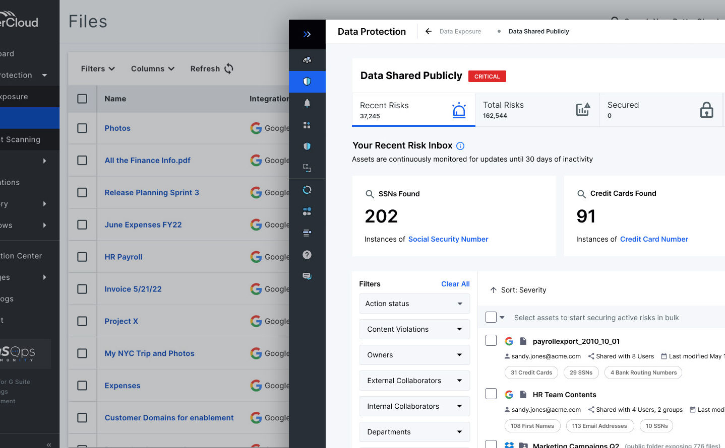
The vision
The problem wasn’t that we lacked good designers — we had a strong team. The problem was that good designers without shared infrastructure produce divergent output. What we needed was a shared foundation: agreed-upon atoms, patterns, and decisions that every squad could reach for, so their energy went into solving product problems, not relitigating button radius.
I named the system Fulcrum deliberately. A fulcrum doesn’t do the work — it makes the work more effective. The goal wasn’t to centralize every design decision or constrain creativity. It was to define the decisions that didn’t need to be made individually, so designers could spend their attention on the ones that did.
This required framing the design system not as a designer’s toolkit but as a shared organizational resource. That distinction mattered for buy-in. A “designer’s toolkit” is something designers own. A “shared design language” is something the whole product organization benefits from — and therefore has a stake in maintaining. I made that argument explicitly to product and engineering leadership before a single component existed, because what teams are asked to adopt after the fact is always harder to carry than what they helped shape. Getting engineering stakeholders into that conversation early — before they were recipients of something design had already decided — changed how the project was resourced and what kinds of concerns could surface in time to matter.
The approach
Before defining what the system should contain, we needed to understand what already existed. I led a systematic audit of live interfaces and in-progress Figma files — cataloging every button, input field, spacing value, and icon set in active use across the product suite. The audit was unglamorous and essential. It turned “we have inconsistency” from a feeling into a map.
From the audit, patterns emerged. Most of our components were variations of a smaller set of core elements. We didn’t need to invent a new visual language — we needed to distill and codify the one we already had, and make deliberate choices where the existing system was ambiguous or contradictory. That produced the atomic foundation of Fulcrum: a type scale, a spacing system, a color palette, and a base component set with documented usage guidelines.
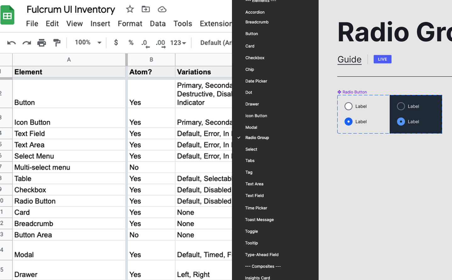
The Figma library had to be opinionated about usage, not just a component dump — a button in Fulcrum wasn’t just a shape, it had states, hierarchy guidance, and documented anti-patterns. I built the Fulcrum Guide documentation site myself in Gatsby.js rather than using a template, and studied IBM’s Carbon, Salesforce’s Lightning, and Apple’s Human Interface Guidelines — not to copy their structure, but to understand what each had decided required written rationale versus what the component could communicate on its own. That distinction shaped how Fulcrum Guide was organized: component taxonomy for navigation, usage guidance and anti-patterns in the body, the design principles that governed edge cases at the top level where they couldn’t be skipped.
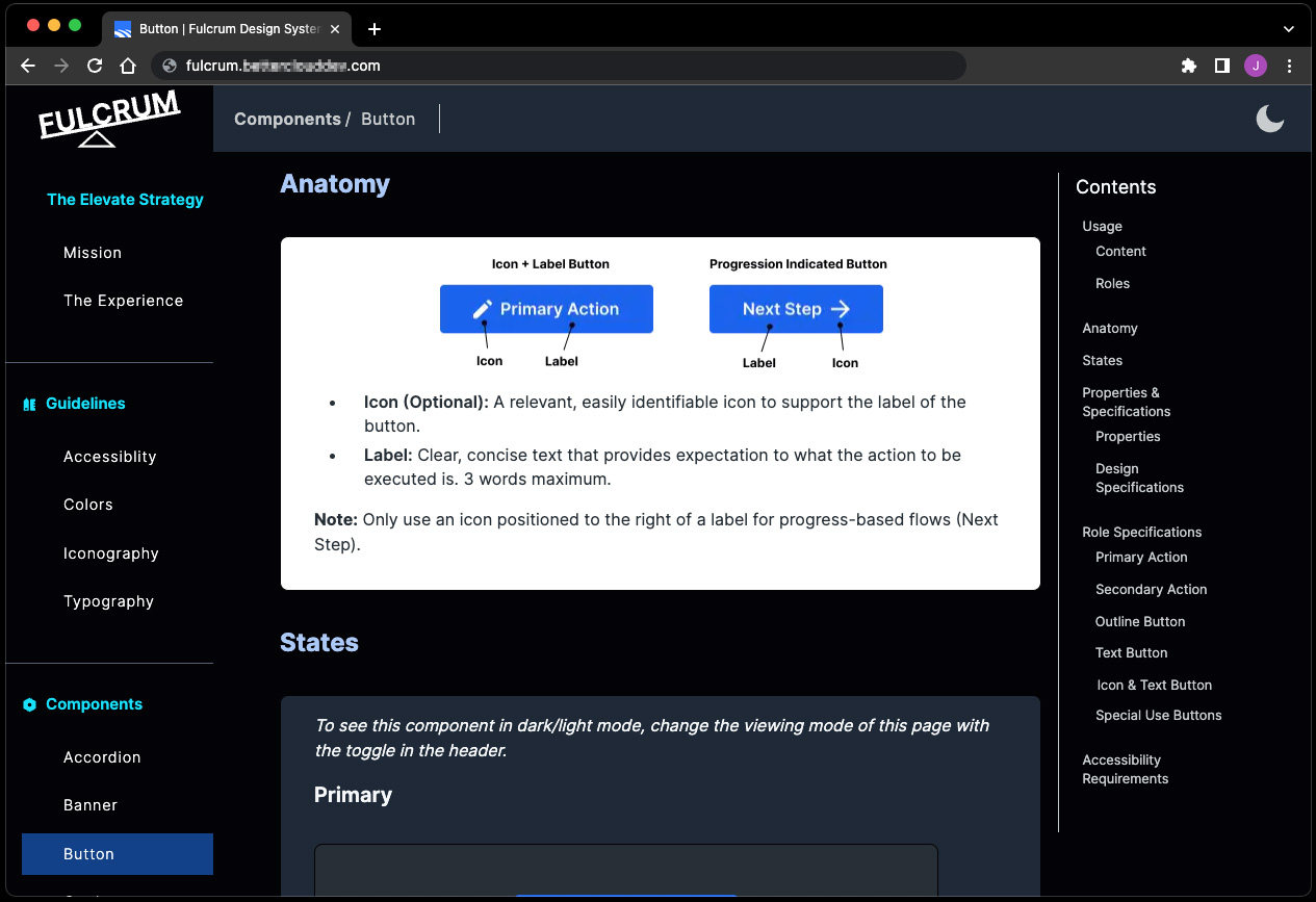
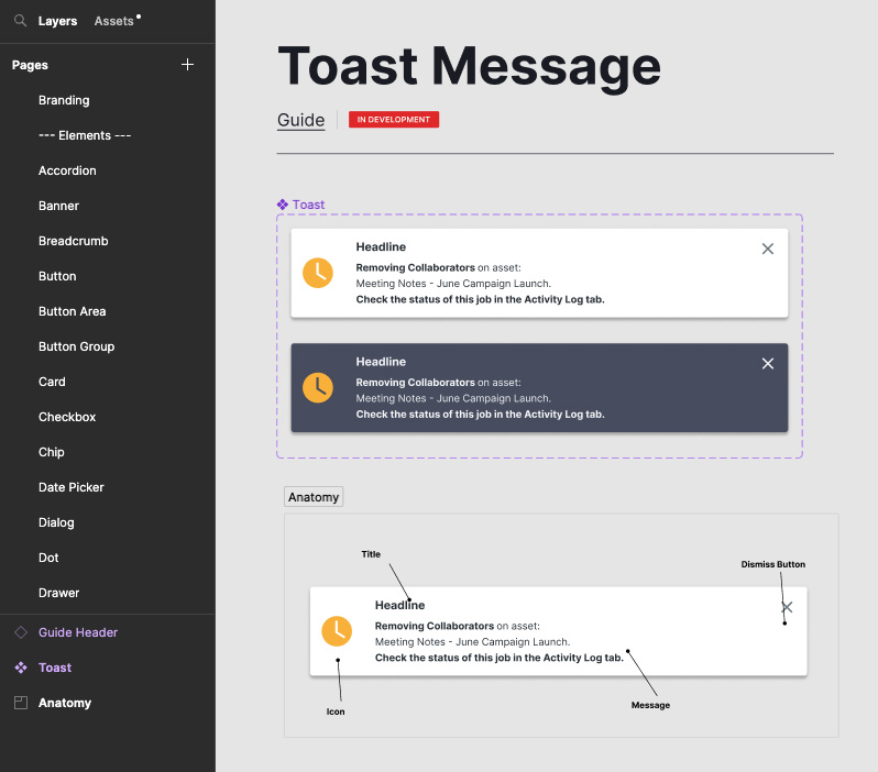
In late 2022, I ran separate training sessions for designers and developers — intentionally not the same session for both. What designers needed was how to use the system for exploration: the Figma library as a starting point, not a ceiling. What developers needed was more structural: how the token system was organized, and what the intended relationship between Figma components and their coded counterparts was supposed to be. Those developer sessions were where the gap began to show itself. Not in the questions — which were reasonable — but in what the questions assumed. The token system I was describing lived in Figma. The component implementations developers were maintaining lived in MaterialUI. The bridge between them was an organizational agreement that hadn’t been made.
Building credibility — and what stayed out of reach
The design team adopted Fulcrum quickly. The clearest evidence wasn’t a survey — it was observable in Design Sprint workshops: across three Design Sprints in Q3 2022 (two Secure feature sprints, one Workflow Management feature sprint), teams using Fulcrum components got from sketch to testable clickable prototype roughly 40% faster. Components snapped into place. Designers weren’t making style decisions mid-sprint; they were making product decisions. That’s the work that was supposed to happen.
The ~40% faster figure comes from that small set of sprint sessions, not a rigorous controlled study. I want it taken seriously, not over-read. But the directional result was consistent across multiple sprints — consistently enough to be real.
Engineering adoption was a different story. The gap between Figma components and coded components didn’t close. Our development teams were working in MaterialUI, and bridging design tokens in Figma to a coded component library requires organizational agreement: who maintains the bridge, who owns it when it drifts, how discrepancies get resolved. That agreement didn’t form. What existed in Figma stayed in Figma.
That organized gap didn’t mean zero contact with the system on the engineering side. On an individual, informal basis — without engaging the documentation or any dedicated build effort — 3 of the 6 frontend developers across the three squads began reusing Fulcrum-aligned components and color tokens in their own work, across both the Secure and Workflow Management projects. In the two dev-facing sprints where that informal reuse was present, late Q3 2022 and early Q4 2022, code-review and rework cycles dropped from 5–6 rounds to 2. That’s a small, individual signal, not evidence that engineering adoption partially succeeded — the organized bridge described above never formed.
This wasn’t a failure of will. It was a governance gap — the kind that’s hard to see until you’ve tried to cross it. The design system worked as a design team tool. It didn’t achieve what I’d hoped: a shared language that design and engineering could both reach for.
What shipped
**Fulcrum Figma component library** — Shared system covering atoms (type, color, spacing, icons) and patterns (forms, navigation, data display), with documented states, variants, and usage guidance. Built on the core MUI library (free tier), with heaviest use in buttons (text+icon and icon-only variants), checkboxes, radios, and tabs. Adopted by all squads working on Elevate-enhanced products — 3 of 3, each composed of 1 project manager, 2 frontend developers, 3 backend developers, and 1 embedded designer.
**Fulcrum Guide documentation site** — Built in Gatsby.js, modeled on IBM Carbon and Salesforce Lightning. The design team’s single source of truth for component usage, philosophy, and design decisions. I designed and built the site.
**Interface element audit and taxonomy** — A systematic catalog of all existing UI elements across live and in-progress products, which produced the structural foundation for the Figma library and surfaced the full scope of the fragmentation problem.
**Training program** — Designer sessions on the Figma library and developer sessions on the intended implementation model, conducted as part of the late 2022 rollout. Attended by 3 designers (2 senior, 1 associate) and 4 senior frontend developers.
What Fulcrum made possible for designers: a consistent starting point for every project, faster exploration in Design Sprints, and a shared vocabulary for design reviews. Feedback that once took the form of “that doesn’t look right” could now reference a specific component state or usage guideline instead.
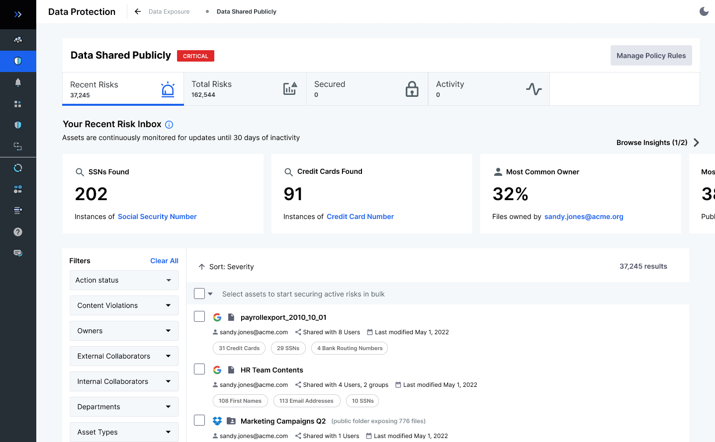
The larger argument
What Fulcrum proved: a design system is infrastructure, not a project. It required sustained attention, governance decisions, and organizational agreements that went beyond what a design team can impose on itself. Getting the design team aligned was necessary but not sufficient. The system reached its ceiling when it hit the boundary between design and engineering — not because the system was wrong, but because we hadn’t built the cross-functional scaffolding to carry it across that boundary.
This is the lesson I’d carry into every subsequent design systems conversation: the component library is the easy part. The hard part is getting agreement on what happens when a token changes, who reviews the design-to-code bridge, and how inconsistencies between Figma and code get surfaced and resolved. These are organizational questions, not design questions. Without answers to them, a design system is a design team tool — valuable, but bounded.
If I were building Fulcrum again, I’d spend the first month getting engineering leadership and dev managers to co-author the token schema with me, rather than presenting it to them after it existed. The adoption ceiling would have been higher if engineering had been architects of the foundation, not recipients of it — because what teams help build, they defend. That’s not a design insight. It’s an organizational one, and it’s more durable than any component library.
## Cerner Learning Journey Portal: Designing for EMR Adoption at Scale
- Subject: The Cerner Learning Journey Portal
- Role: Lead Product Design Strategist, Cerner Corporation
- Timeline: Concept through launch, during Cerner tenure (Dec 2015 – Jul 2018)
- Canonical URL: https://jason.sonderman.info/case-studies/healthcare-learning-management-system/
- Markdown: https://jason.sonderman.info/case-studies/healthcare-learning-management-system.md
Clinicians forced into EMR adoption by the ACA’s ‘meaningful use’ mandate weren’t resisting because they lacked information — they were defending professional identity under compulsion. I helped Cerner redesign their Learning Journey Portal around that insight: replacing full-path transparency with strategic opacity, and shipping a platform that reached 253 client implementations with a 48% improvement in measured software competency.
**Key metrics:**
- Client implementations: 253 (Platform rolled out across Cerner’s client base)
- Competency improvement: +48% (vs. prior in-person training — per Cerner internal client reporting)
- Training time recovered: ~26% (time previously consumed by onsite training — per Cerner internal client reporting)
**Key outcomes:**
- Client implementations: 253
- Competency improvement: +48%
- Training time recovered: ~26%
Jason redesigned Cerner’s Learning Journey Portal for clinicians compelled to adopt EMR systems under the ACA’s ‘meaningful use’ mandate, replacing full-journey transparency with strategic opacity after user testing showed the former caused disengagement.
**Facts:**
- Client implementations: 253
- Competency improvement: +48% versus prior in-person training (per Cerner internal client reporting)
- Training time recovered: ~26% of time previously consumed by onsite training
- Design approach: Adapted the ADKAR change-management framework; learner interface exposed only the current step (locked/current/complete), with no time estimates or full-path visibility
**Scope:** Outcome figures are per Cerner’s internal client reporting, not independently audited — stated as such in the case study.
**Team:** User Experience, Business Strategy, Learning Design, Partnership Management, Clinical Leadership, Engineering, Data Architecture
**Tags:** Enterprise SaaS, User Research, Change Management
The Moment It Clicked
Early in the project, we made an assumption that felt almost too obvious to question: clinicians resisting EMR adoption were resistant because they didn’t understand the system. The answer, then, was clarity. Give them a full picture of the learning path — how many modules, how much time, how it all fits together. Show them the journey. Reduce the unknown.
We built a prototype around that idea. It mapped the complete learning arc: a visual timeline, estimated hours per section, a progress meter that showed how far they had to go. We thought seeing the whole thing would reduce anxiety. We thought transparency would build confidence.
The testing told us we had it exactly backward.
Learners looked at the complete journey view and froze. Not metaphorically — they stopped clicking. They stopped talking. A few said versions of the same thing: *I don’t have time for this.* One nurse said she’d rather just figure it out on the floor. The visualization we’d built to reassure people was, instead, turning a manageable task into an impossible one before they’d done anything at all.
That was the moment the real design problem came into focus. This wasn’t a training problem. It was a change management problem — and the tools we’d been drawing from weren’t built for this population.
{/* IMAGE:
What: Side-by-side comparison of the full-journey visualization prototype vs. the enumerated-step model tested in the same session
Why: Shows the specific design decision concretely — the "before" that failed and the direction that worked — without requiring reading
Alt: Two learning journey UI prototypes side by side: on the left, a timeline visualization showing all steps and hour estimates; on the right, a simple enumerated step list showing only current and completed states
Have: yes — /case-study-images/ProgressionTests-80-1.jpg
*/}
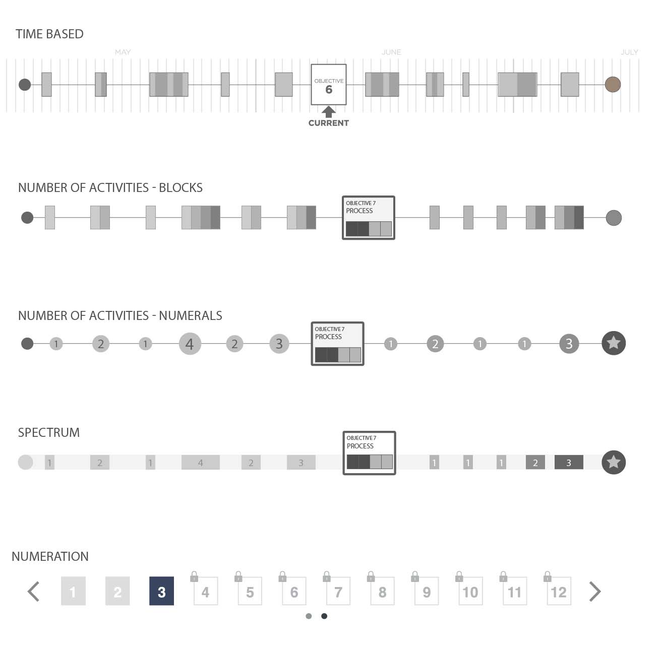
The Diagnosis
To understand why that matters, you have to understand what was actually happening in hospitals in 2014. The ACA’s “meaningful use” mandate had set a hard deadline: healthcare providers had to demonstrate meaningful use of certified EMR systems or face financial penalties. This wasn’t a product rollout where users could opt in gradually. Adoption was compulsory, the timeline was externally imposed, and the workforce being asked to adopt had neither requested the change nor designed the workflows that resulted from it.
Organizational change management frameworks — ADKAR, Kotter’s 8-step, Prosci’s methodology — were well-established by then. But they’d been developed and refined primarily for enterprise software rollouts: voluntary or at least internally-mandated migrations, with reasonably flexible timelines, in workforces where directed learning was a normal part of professional life.
Clinicians are different. Their professional identity is bound up in demonstrated competence, not certified completion. A physician doesn’t think of herself as someone who completes training modules — she thinks of herself as someone who already knows how to do her job. An LMS built on corporate learning patterns asks that person to temporarily occupy the position of student, and the resistance that produces isn’t irrational. It’s a defense of professional identity.
Add to that the structural reality: hospital workflows have almost no slack. There’s no “training time” carved out of a shift. Learning has to happen in the margins — between patients, before rounds, during whatever quiet moments exist. The existing playbook assumed learners had time and motivation. These learners had neither.
What had to be true for a solution to work: the system couldn’t feel like a learning management platform. It had to feel like a tool for getting competent quickly. Those are different experiences with different designs.
{/* IMAGE:
What: Annotated diagram showing the gap between enterprise OCM model assumptions (voluntary, time-flexible, motivated learners) vs. clinical reality (compelled, time-scarce, identity-defensive)
Why: Makes the diagnostic argument visual — shows why the standard playbook failed before the alternative is introduced
Alt: Two-column diagram comparing enterprise OCM assumptions with clinical workflow realities, highlighting gaps in assumed learner time, motivation, and choice
Have: no — recreatable as a simple two-column comparison diagram
*/}
The Vision
Cerner’s learning team had already arrived at a useful concept before I joined: *journeys*. Targeted, sequenced learning experiences designed to build competency incrementally on a specific topic. Not a course catalog. Not a curriculum. A path with a clear beginning and end, scoped to what someone in a specific role actually needed to know.
The journey concept was right. What it needed was a design philosophy that matched the population.
My read, after the user testing: the existing OCM frameworks needed to be adapted, not abandoned. ADKAR’s awareness-desire-knowledge-ability-reinforcement model still applied — but the sequencing had to be compressed, and the design had to work against the learner’s instinct to assess the total ask before committing to any of it. The journey view had to withhold scale deliberately. Show the next step. Make it completable. Let the learner discover the journey is manageable by doing it, not by being told.
The enumerated-step model that emerged from testing was counterintuitive enough that it needed defending. Stakeholders and learning designers had built the original vision around visibility and transparency — *learners should understand what they’re getting into.* I had to make the case that what learners needed to feel capable wasn’t a complete picture of the path, but evidence that the first step was achievable. That’s a different argument than “simpler is better.” It’s a claim about how professional identity and motivation interact when learning is compelled rather than chosen.
That argument held, and it shaped every subsequent design decision about information architecture, progress indicators, and how we structured the content management tools that administrators used to build journeys.
{/* IMAGE:
What: Early concept sketch or whiteboard diagram showing the journey architecture — role-scoped, sequenced steps with gated progression
Why: Shows the strategic vision concretely — journey as a scoped competency path rather than a course catalog
Alt: Whiteboard or concept sketch showing a learning journey as a linear sequence of role-specific steps with gated progression between stages
Have: no — recreatable from lo-fi artifacts
*/}
The Approach
The testing finding shaped two parallel design tracks: the learner-facing journey experience and the administrator content management system.
For learners: enumerated steps with three states — locked, current, complete. No time estimates. No completion percentage relative to the full journey. Progress feedback was local: *you finished this step.* The system validated momentum rather than measuring distance to a destination. Each step built on the previous one by design — we worked with the learning design team to structure content atomically, smallest conceptual units first, so that competence accumulated in a way that felt earned rather than assigned.
For administrators: building a journey required assembling discrete content objects in sequence, which meant the content management tool had to support a fundamentally different workflow than a standard LMS course builder. I produced low-fidelity flows for the manager interface first, before any learner-facing screens — partly because the admin tool had to ship before the user-facing app could be populated, but mostly because the integrity of the learner experience depended on journey architects understanding what they were constructing. If the admin tool made it easy to dump content in without considering sequence and dependency, learners would end up with broken journeys regardless of how well the front end was designed.
The transition from lo-fi to medium fidelity happened faster than I would have liked — engineering timelines compressed the iteration window — but we’d done enough testing on the core navigation model that the wireframe phase was mostly about refinement, not discovery. The decision to leverage existing design system elements aggressively, rather than introducing new components, was deliberate: it kept the learner experience visually familiar within Cerner’s ecosystem and reduced engineering risk at a point where we had little schedule margin left.
{/* IMAGE:
What: Low-fidelity admin journey builder wireframes showing the atomic content sequencing workflow
Why: Shows the parallel-track strategy and the reasoning behind building admin-first — the admin tool's structure determined the learner experience's integrity
Alt: Low-fidelity wireframe flows for the journey builder admin interface showing how content objects are sequenced into a learning journey with dependency relationships
Have: yes — /case-study-images/Journey-Builder-Wires-80.jpg
*/}
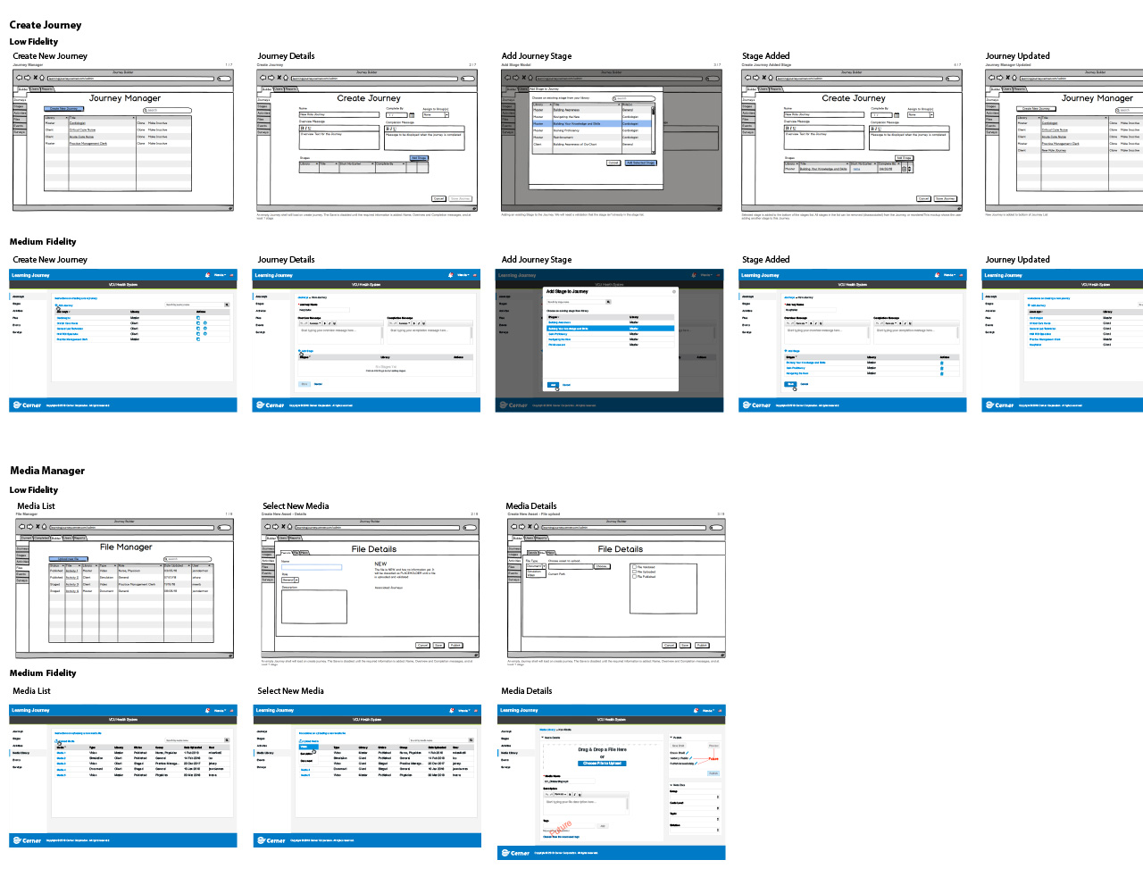
{/* IMAGE:
What: Medium-fidelity learner-facing wireframes showing enumerated steps with locked, current, and complete states — no global progress or time indicators visible
Why: Shows the specific three-state navigation model that emerged from testing — the design decision made concrete
Alt: Medium-fidelity wireframes for the learner-facing journey interface showing numbered steps with three visual states: locked steps grayed out, current step highlighted, completed steps marked as done
Have: yes — /case-study-images/JournyUserWires.jpg
*/}
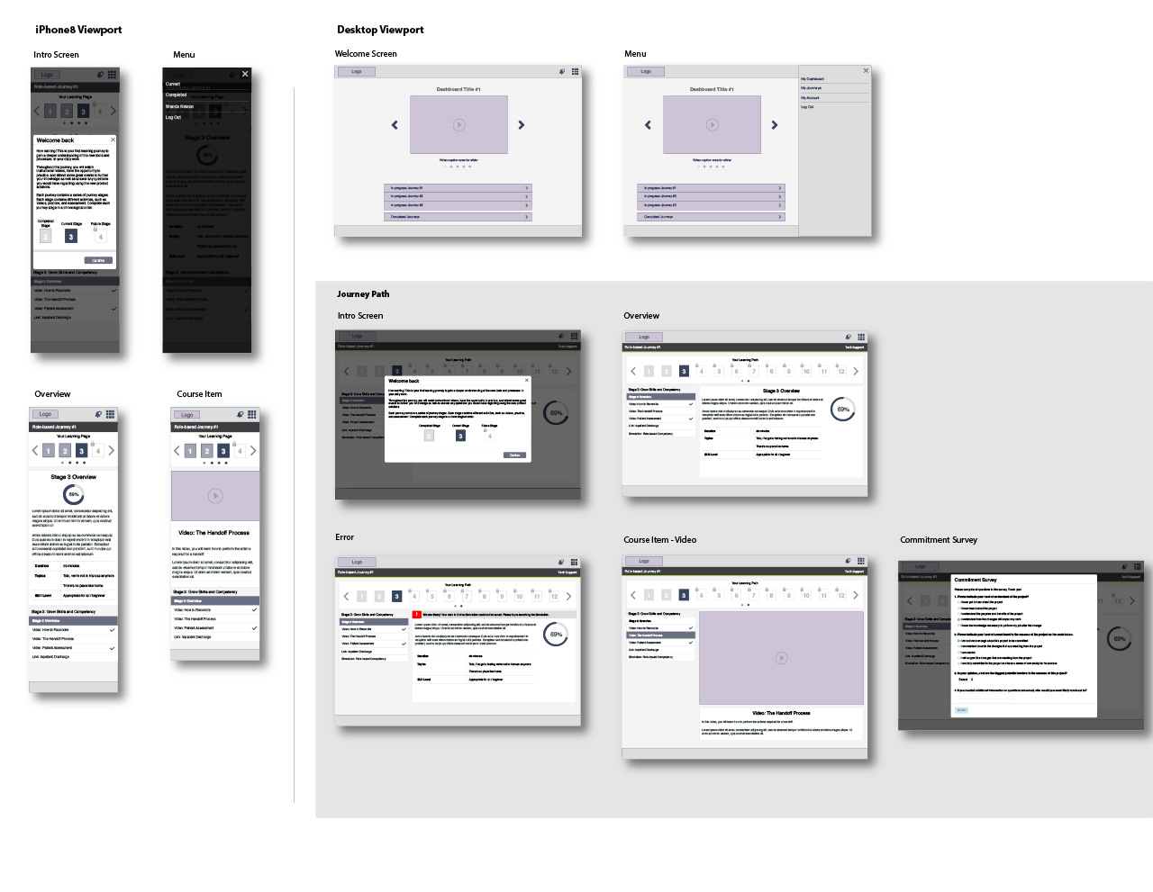
Building Credibility
The hardest stakeholder conversation wasn’t about the design. It was about the philosophy behind it.
Cerner’s learning team had spent considerable time and energy on the journey concept. They believed in transparency — in giving learners a complete view of what they were taking on. The user testing that contradicted that belief was well-run and unambiguous, but it challenged an assumption that had been organizational consensus. I wasn’t presenting findings to a neutral audience; I was presenting findings that required people to let go of something they’d built.
What made that conversation work was the specificity of the finding. This wasn’t “users prefer simpler interfaces” — that’s easy to dismiss as a preference. This was *learners looked at complete journey visualizations and stopped engaging entirely.* The behavioral data was concrete enough that it was harder to rationalize away. And because we’d tested multiple visualization approaches — not just the full-journey view versus the step view, but several variations of each — the recommendation came with evidence that the direction mattered more than any specific implementation.
The clinical leadership on the team was actually the most receptive audience. They understood immediately why a nurse seeing 14 hours of required training before a shift would close the browser. That credibility made the design argument easier to prosecute with the learning design and engineering stakeholders who had more invested in the original concept.
{/* IMAGE:
What: Research summary or presentation artifact showing the behavioral testing findings — specifically the contrast between engagement in full-journey vs. step view sessions
Why: Shows the rigor behind the counterintuitive recommendation — evidence concrete enough to shift organizational consensus
Alt: Research findings summary showing user testing behavioral observations comparing engagement levels across full-journey visualization and enumerated-step design variants
Have: no — consider creating a sanitized version of the testing findings summary document
*/}
What Shipped
The Cerner Learning Journey Portal launched as a modified LMS combining targeted courses into discrete, sequenced experiences. The learner-facing interface delivered journeys as enumerated steps with completion indicators — no timeline view, no total-duration estimate. Administrators built journeys through a content management platform designed around atomic content sequencing, with the manager tool preceding the learner-facing app in the release order.
The platform rolled out across 253 client implementations. Per Cerner’s internal client reporting, measured software competency through training improved 48% compared to prior training approaches. Users reported recovering roughly 26% of the time that had previously been consumed by onsite training and bulky learning programs — which, given that “no time for training” was the foundational constraint the entire design was built around, felt like the most honest validation we could have received.
That time recovery number is the one I’d point to first with a skeptical stakeholder. It’s not a satisfaction score. It’s evidence that the design premise held: if you build learning to fit the margins of a clinical workflow rather than asking clinicians to create margins that don’t exist, the math changes. The mandate that had seemed to doom adoption instead became a catalyst — learners who completed journeys reported feeling more capable rather than simply more compliant. Some progressed beyond basic competency and became learning leaders within their facilities, supporting colleagues navigating the same transition.
That last outcome — clinicians who started as reluctant mandatory participants and ended as voluntary advocates — was the signal that the design had achieved something beyond compliance. It had shifted how those people related to their own competence. That’s a different result than adoption metrics. It’s what happens when the design is built around professional identity rather than course completion.
{/* IMAGE:
What: Final production screens of the learner-facing portal showing the enumerated step navigation model in a real journey
Why: Connects all the design decisions to a concrete shipped deliverable — lets skimmers see what strategic opacity looks like in practice
Alt: Production screenshots of the Cerner Learning Journey Portal showing a learner's active journey with numbered steps, step completion status indicators, and a current step in progress — no total journey timeline or duration estimate visible
Have: yes — /case-study-images/lj-final-screens.jpg
*/}
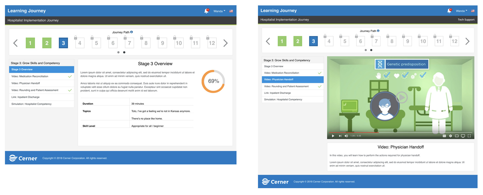
The Larger Argument
When adoption is mandated rather than chosen, the designer’s job isn’t to make learning easier. It’s to make the learner feel capable. Those are different problems with different solutions.
Making learning easier is an information design problem: reduce cognitive load, improve navigation, clarify instructions. Making someone feel capable is a psychological problem: sequence experiences so that evidence of competence accumulates before the scale of the task becomes visible. The first problem is solved by clarity. The second is sometimes solved by strategic opacity.
The existing OCM playbooks didn’t make that distinction because they were built for contexts where learners had a choice — where motivation could be developed, where adoption could be gradual. Healthcare EMR adoption in 2014 had none of those affordances. It required a different theory of change, and getting to that theory required testing assumptions that the client’s internal team had treated as foundational.
That’s a pattern I’ve returned to across different domains: the most important design work is often the work of identifying which assumptions are load-bearing and which aren’t. The journey concept was load-bearing. The transparency assumption wasn’t. Knowing the difference is what made the project work.
{/* IMAGE:
What: Conceptual two-column diagram — "Making learning easier" (information design tactics) vs. "Making the learner feel capable" (psychological sequencing tactics)
Why: Externalizes the meta-level insight in scannable form — makes the larger argument accessible to a reader who skips the prose
Alt: Two-column diagram comparing information design tactics for making learning easier on the left with psychological sequencing approaches for building learner capability on the right
Have: no — simple diagram, recreatable
*/}
## BetterCloud Secure: Redesigning Risk Remediation for IT Teams
- Subject: BetterCloud Secure Platform
- Role: Lead Product Designer, BetterCloud
- Canonical URL: https://jason.sonderman.info/case-studies/bettercloud-secure-elevate/
- Markdown: https://jason.sonderman.info/case-studies/bettercloud-secure-elevate.md
As Lead Product Designer, I led persona research, workshop facilitation, and prototyping to transform BetterCloud’s Secure platform from passive monitoring to active risk remediation. Three core capabilities — Quick Actions, Risk Lifecycle Tabs, and Universal Action Properties — tested well before a strategic shift shelved the product. The Figma design system built to support the work outlasted it, becoming platform infrastructure that cut prototype time across the team.
**Key metrics:**
- Task accuracy: 68% → 82% (Correct bulk-remediation action selection across 13 users, alpha builds 1–7 (Apr–Oct 2022))
- Capabilities designed: 3 (Quick Actions, Risk Lifecycle Tabs, Universal Action Properties — validated in design-sprint and alpha-build testing, never shipped to production)
- Design system: Outlasted the product (Became platform infrastructure, cut prototype time across the team after strategic pivot)
As Lead Product Designer, Jason led persona research, workshop facilitation, and prototyping to redesign BetterCloud’s Secure platform from passive risk monitoring into active remediation — three tested capabilities were shelved before full implementation following a company strategic shift.
**Facts:**
- Audit: 86 potential remediation actions identified across 5 applications
- Capabilities designed: Quick Actions, Risk Lifecycle Tabs, Universal Action Properties — all tested well with users
- Testing program: 4 design sprints and 7 alpha builds, April–October 2022, tested with 5 external customer-partner companies, internal professional services staff, and IT admin users
- Task accuracy: 68% → 82% correct bulk-remediation selection across 13 users, alpha builds 1–7
- Time to perception: New users averaged 3.8s (target: 3s); returning users found key actions in under 1s. Blended across 7 design-sprint users and 10 alpha-build users, April–October 2022 — two testing methodologies, not one controlled sample.
- Outcome: Full implementation was shelved at the alpha stage due to budget constraints and a strategic shift in company market focus — the product never reached beta or production
- Lasting artifact: The Figma design system built to support the work outlasted the shelved product and became platform infrastructure
**Scope:** The redesign tested well but never shipped to production — stated plainly in the case study; don’t imply it launched. The Universal Actions ~70% action-reduction figure is a projection from user interviews, never measured in production; don’t cite it as a measured result.
**Team:** Product Design, Product Management, Product Operations, Front-end Engineering, Full-stack Engineering
**Contributions:** Persona Creation, Workshop Facilitation, User Research, Sketches, Task Flows, Figma Prototyping, User Testing, Planning, Stakeholder Alignment, User Advocate
**Tools:** Miro, AHA!, Figma, UserTesting.com, JIRA
**Tags:** Design Systems, Enterprise SaaS, User Research, Cross-functional Leadership
BetterCloud is a SaaS management product that enables IT teams to maximize efficiency through automating manual tasks and enforcing company security policies.
BetterCloud was undergoing a strategic effort to redesign the existing experience for the Secure platform. I worked as the Lead Product Designer on the team, leading the design process and defining the experience’s ‘remediation’ journey.
### Setting the Stage: The Challenge Before Us
In the fast-paced world of SaaS management, BetterCloud had already made a name for itself. Our platform was the go-to solution for IT teams looking to automate manual tasks and enforce company security policies. But in the realm of cybersecurity, standing still means falling behind.
We faced a critical challenge: our customers needed the power to mitigate security risks in real-time, preventing data breaches before they could occur. Our existing Secure platform allowed users to discover and monitor exposed data, but it lacked a crucial capability – the ability to resolve these risks swiftly and effectively.
As the Lead Product Designer, I found myself at the helm of an ambitious project. Our mission? To redesign the Secure platform, transforming it from a passive monitoring tool into an active guardian of sensitive data.
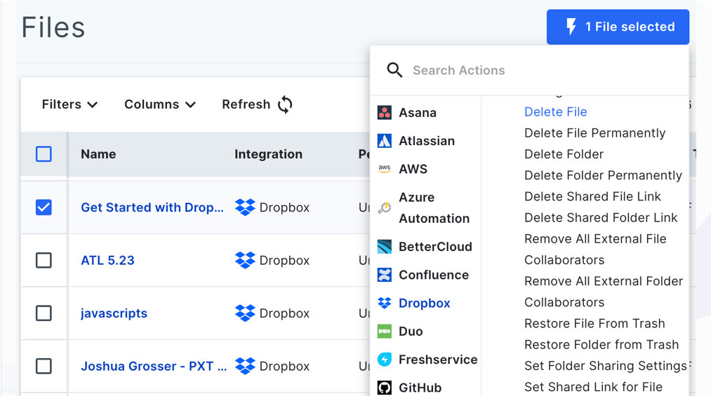
### Discovery: Bringing Our Users to Life
Our journey began not with wireframes or prototypes, but with people. Real people, with real challenges and aspirations. We had a wealth of data at our fingertips – hundreds of user interviews and support calls. But data alone doesn’t tell a story.
Working hand-in-hand with our Business Intelligence team, we sifted through this treasure trove of insights. Slowly but surely, patterns emerged. We weren’t just looking at numbers; we were uncovering the hopes, frustrations, and needs of our users.
That’s when the magic happened. We transformed these insights into living, breathing personas. We crafted detailed actor sheets, complete with goals, quotes, and even imagined workspaces. These weren’t just profiles on a page – they were the characters in our product’s story.
These personas became our guiding stars, ensuring every decision we made was grounded in real user needs.
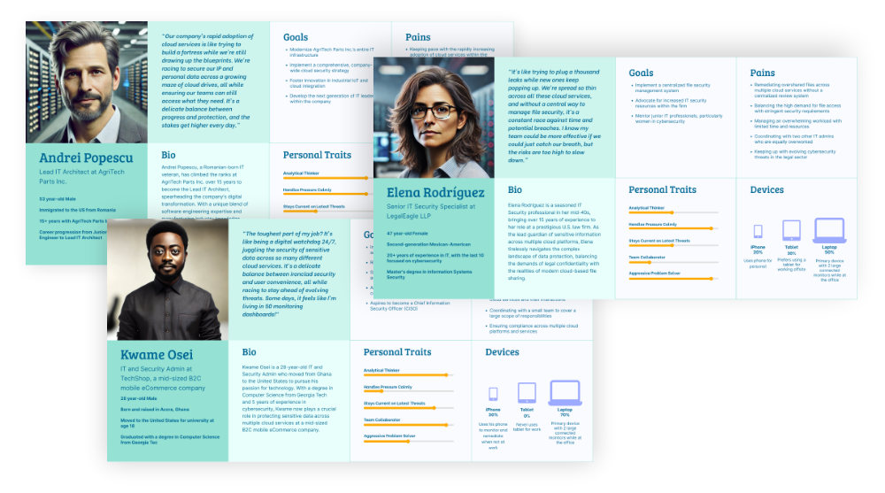
### Mapping the Current State: Understanding the Journey
With our personas by our side, we dove into the existing Secure platform. We put ourselves in our users’ shoes, navigating through the process of identifying and addressing security risks.
The journey was eye-opening. Users could view their assets – files and folders shared across their organization – and identify potential risks. But when it came to taking action, they hit a wall. The platform presented a dizzying array of remediation steps, often leaving users unsure of the best course of action.
Through a painstaking manual audit, we uncovered a staggering 86 potential actions across just 5 applications. It was clear: we needed to simplify without sacrificing functionality.
### The Design Sprint: Where Ideas Take Flight
Armed with our insights, we launched into a design sprint. Picture a room buzzing with energy – designers, product managers, and customer-facing roles all coming together to tackle our challenge head-on.
We set an ambitious goal: Guide users to quickly remove 100% of risks. But we also acknowledged the hurdles. How could we ensure the right action for all users? How could we balance bulk actions with digestible steps?
Through story mapping and rapid sketching, ideas began to take shape. Each team member brought their unique perspective, resulting in a rich tapestry of potential solutions.
### From Sketch to Screen: The Prototype Emerges
As the Lead Product Designer, my role shifted into high gear. I led the charge in transforming our storyboards into a clickable prototype. We divided and conquered, with each designer taking ownership of a section while I ensured consistency across the entire journey.
The clock was ticking – we had users scheduled to review our work. But as the prototype came together, excitement built. We were creating something that could truly transform how our users approached security risks.
### Key Features: The Heart of Our Solution
Our design sprint yielded three core features that would redefine the Secure platform experience:
**Quick Actions:** A streamlined interface allowing users to take the correct action to secure their risk with minimal clicks.
**Risk Lifecycle Tabs:** A visual representation of the user’s security landscape, showing current risks and successfully remediated issues at a glance.
**Universal Action Properties:** A consistent interface for configuring action properties across different asset types and applications, reducing cognitive load on our users.
### Refining Our Vision: From Idealism to Reality
The design sprint had given us a bold vision, but now came the crucial task of grounding it in reality. I worked closely with our Product Manager and architects, mapping out the technical feasibility of our ideas.
We identified ‘chunks’ – what would later become our development epics – that would allow us to build iteratively towards our end goal. It was a delicate balance, preserving the high-value capabilities while ensuring we didn’t overextend our technical resources.
### Putting the Prototype in Front of Users
From April to October 2022, we ran four design sprints and built seven alpha versions of the interface, testing each one before moving to the next. Five external customer-partner companies took part — two to three system admins per company — working through specific tasks with us: finding files, bulk-securing files, setting notifications, and walking through their existing remediation process outside our tool. Internal professional services staff, who support customer setup, tested alongside them. Between sprints, two to three IT admin users sat with us each week to react directly to the Figma prototype.
The three capabilities held up under that testing. The redesigned flow gave users:
#### A comprehensive view of all current risks, allowing users to prioritize their actions effectively.
#### Streamlined, universal action properties that worked consistently across applications, reducing confusion and errors.
#### A clear Risk Lifecycle view, enabling users to track their progress and audit their security actions over time.
Two numbers came out of that testing, tracked in aggregate by our product manager. Against a 3-second target for how quickly users could perceive and act on a key task, new users averaged 3.8 seconds; returning users found the same actions in under a second, often clicking before we’d finished explaining the task. That figure blends two different testing methods — seven design-sprint users on the Figma prototype and ten alpha-build users on the built feature, with some overlap where sprint testers came back for alpha retesting — so treat it as two data sources merged into one directional read, not a single controlled sample.
Task accuracy showed a clearer trend. Early testing on tasks like selecting 50+ files and choosing the correct bulk remediation action found a 68% success rate, with most failures coming from misclicks. That climbed to 82% by alpha build 7, across 13 users total tested between April and October 2022.
### Learnings: Unexpected Turns and Silver Linings
While our redesigned Secure platform tested extremely well with users and generated real excitement among the partner companies who tried it, the project ultimately took an unexpected turn. Due to budget constraints and a strategic shift in the company’s market focus, the project was shelved in October 2022 after seven alpha builds — before it reached beta or production.
Not everything held up under testing. Data-refresh performance never met the mark: our target was under 50 seconds for infinite-scroll file loading — the same number users independently named as their own expectation — but the best we achieved was on-request-only refreshes averaging two to four minutes to download, cache, and rehydrate. We never solved it before the project was shelved.
Universal Action Properties was designed to collapse the 86 actions we’d audited into a much smaller, reusable set of interaction patterns. User interviews suggested roughly a 70% reduction in the number of distinct actions someone would need to learn — but that number is a projection from interviews, not a measured result. The feature never shipped, so it was never tested in production.
However, in the world of UX, no effort is ever truly wasted. The insights we gained and the problem-solving processes we developed during this project proved invaluable as the company pivoted to its new focus. Our team’s ability to rapidly ideate, prototype, and test solutions became a model for future projects across the organization.
Perhaps the most tangible legacy of our work was the creation of a highly effective Figma Design System library. This comprehensive resource allowed our UX designers to create extremely high-fidelity prototypes for most tools in our platform. What once took weeks now could be accomplished in days, dramatically accelerating our ability to move from initial idea to user testing.
In the end, while the Secure platform redesign didn’t reach full implementation, it left an indelible mark on our design processes and capabilities. It served as a powerful reminder that in the fast-paced world of technology, adaptability and learning are just as crucial as the end product itself. The skills we honed and the systems we built continue to drive innovation and efficiency across our design teams, ensuring that BetterCloud remains at the forefront of user-centered design in the SaaS management space.
## Athens State Online: A Microsite Built for Graduate Enrollment
- Subject: Athens State Online Degree Microsite
- Role: Lead UX Designer, Archer Education
- Canonical URL: https://jason.sonderman.info/case-studies/archer-higher-education-website/
- Markdown: https://jason.sonderman.info/case-studies/archer-higher-education-website.md
Athens State needed more than a website update — it needed a full-funnel marketing microsite that ranked independently on program keywords while looking like the parent institution. I led UX across journey mapping, information architecture, wireframes, and usability testing to build a site that entered prospective students into the admissions nurture pipeline. The launch drove a 20% enrollment increase in struggling graduate programs.
**Key metrics:**
- Graduate enrollments: 20% increase (In struggling programs following microsite launch)
- Site structure: SEO-first IA (Ranked independently on program keywords while matching parent institution brand)
As Lead UX Designer at Archer Education, Jason built an SEO-first microsite for Athens State’s online degree programs, journey-mapped and structured to rank independently on program keywords while matching the parent institution’s brand — driving a 20% increase in graduate enrollments.
**Facts:**
- Enrollment increase: 20% in previously struggling graduate management degree programs
- Launch: Summer 2021
- Method: Persona-based user interviews, journey mapping, SEO-first information architecture, low-fidelity usability testing
**Scope:** The 20% figure applies to a subset of struggling graduate programs, not enrollment site-wide.
**Team:** User Experience, Creative, SEO, Paid Search Marketing, Admission Advisors, Audience Intelligence, Web Development, Web Analytics
**Tags:** Information Architecture, User Research
### The Challenge
Athens State had expanded its online program offerings, but getting viable prospects for enrollment was lagging behind capacity. Due to limited institutional resources, this university hired our team to audit its marketing-to-application process and implement strategies to increase applications for the five enrollment segments.
### Project Overview
Our team was engaged to create an optimized microsite and a suite of landing pages utilizing the existing university brand to motivate online degree seekers to submit a request for more information on a subset of program offerings. This submission would begin a journey for the seeker through our nurturing, enrollment, and retention programs, which assist degree-seeking users through their discovery and enrollment stages.
Key to the success of this project would be a content-rich website for the user to engage with to gather information on the program of interest. Crafting the site in a way that would rank high on organic searches based on program keywords would also be key. The new site had to look as close to the parent site as possible to avoid too much dissonance and erosion of confidence if the two sites looked to be from different sources.
### Journey Map
To better understand the challenges the client faced with enrolling in their online degree programs, we utilized the personas developed by the audience intelligence team to recruit and interview possible users who aligned with these personas. The interview asked a variety of questions based on the type of activities they would do if they were seeking online degree programs.
From these findings, I developed user journey maps to identify areas of negative response, areas we could focus our efforts on with our new web properties to mitigate the seeker’s barriers to submitting an application.
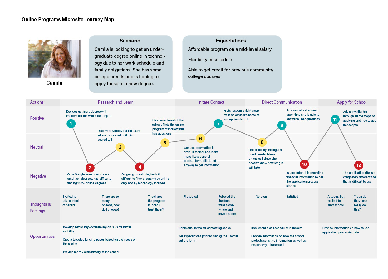
### Information Architecture
The microsite’s structure is unbalanced. The div for the programs has a deeply nested information architecture, while the supporting top-level divs are flat in structure. We had to collaborate closely with the SEO team to align an architecture that would provide saliency and discoverability for the user and present structured data in a manner that would gain positive search engine ranking value.
A secondary challenge was that the university was to manage a number of the online programs. This meant we had to link back to the parent site on some of the programs and link to our site on others. To the user, there needed to be as little visual difference between the two types of programs as possible.
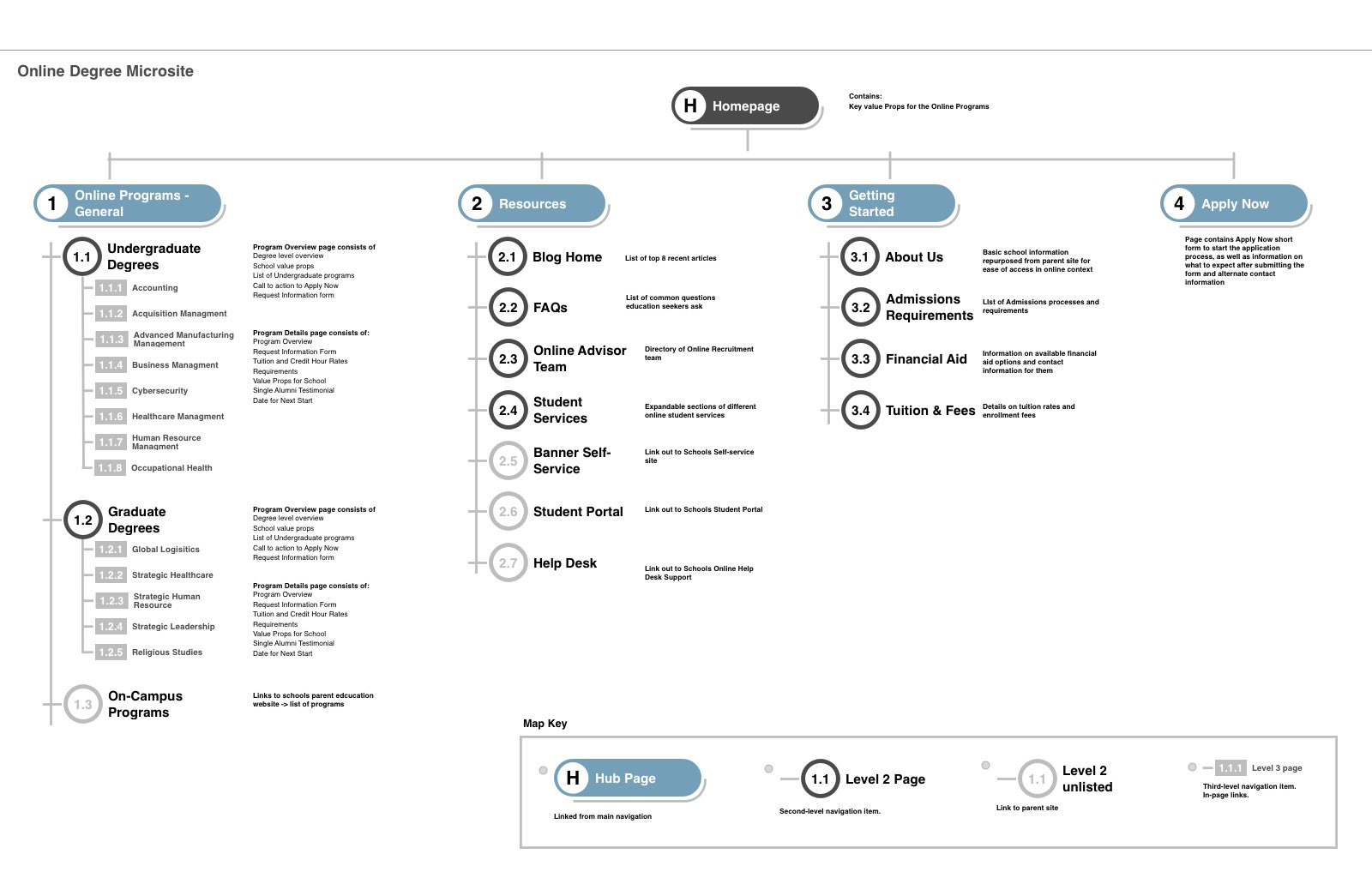
### Wireframes
Focusing on the areas of opportunity identified in the journey maps, aligning with the business requirements, and using the content strategy outlines for each page, I utilized user experience patterns and principles to build a flow highlighting the key actions the user would take on a given page. The wireframes would be used in low-fidelity usability testing to ensure we were getting the expected behaviors and discover any new barriers to the user completing the task.

### Conclusion
Our final deliverable was a microsite that existed outside the main brand site but kept much of the functionality and design to make any transition between the two as seamless as possible. This would also include a blog focused on online degree content to help the site gain SEO value beyond the brand value it was already benefitting from.
With the launch of the microsite in the summer of 2021 and the coordinated online marketing efforts to drive new organic and paid search traffic to the site, the client saw a 20% increase in enrollments into a few of the programs that were struggling to attract attention, primarily in their graduate management degree programs.
Currently, the website is undergoing a phase 2 refresh, which utilizes the findings from the initial six months to evolve and improve content and site structure.
## Peru State: A Tiered Landing Page System That Beat Conversion Goals
- Subject: Peru State Online Degree Program Marketing Pages
- Role: Lead UX Designer, Archer Education
- Canonical URL: https://jason.sonderman.info/case-studies/archer-higher-education-landing-pages/
- Markdown: https://jason.sonderman.info/case-studies/archer-higher-education-landing-pages.md
Peru State’s online programs had ad traffic but no landing pages built for conversion. I led UX across journey mapping, IA design, wireframing, and usability testing to create a tiered system — from program-overview pages down to individual degree pages — with a multivariate testing rhythm built in from the start. The 15-page launch exceeded both visitor-to-lead and lead-to-applicant conversion targets.
**Key metrics:**
- Pages launched: 15 (Tiered from brand overview to individual degree program pages)
- Conversion targets: Exceeded (Both visitor-to-lead and lead-to-applicant goals surpassed at launch)
As Lead UX Designer at Archer Education, Jason designed a tiered landing-page system for Peru State’s online degree programs, built around the student decision journey, which exceeded both visitor-to-lead and lead-to-applicant conversion targets at launch.
**Facts:**
- Pages launched: 15, tiered from a branded program overview down to individual degree pages
- Conversion: Both visitor-to-lead and lead-to-applicant targets exceeded at launch
- Method: Journey mapping, direct user interviews, low-fidelity usability testing, and a built-in multivariate testing rhythm
**Scope:** The case study states conversion targets were exceeded but doesn’t disclose a specific percentage — don’t invent one.
**Team:** User Experience, Creative, Paid Search Marketing, Admission Advisors, Audience Intelligence, Web Development, Web Analytics
**Tags:** Information Architecture, User Research
### The Challenge
Our partnership with Peru State was to raise brand awareness of their online degree programs, with the outcome of growing enrollments into the online programs. The school had very general information pages to which ad traffic was directed, and they were experiencing a high bounce rate for visitors to the page.
### Project Overview
Our team partnered with the client to create a suite of landing pages utilizing the existing university brand to motivate online degree seekers to submit a request for more information on the program offerings. This was a tiered approach, with a general branded landing page that would display information on all the available online programs, a set of pages that would focus on the programs for the two levels of degrees (Undergraduate and Graduate), and then focused pages for each program.
Since the university’s brand was not widely recognized, our challenge was to instill trust in the quality of education offered, the affordability and flexibility of the education, and the social proof that a degree from the institution would be recognized in the industry. Prior to the discovery, part of our strategy was to plan out multivariate tests at regular intervals to evolve the content and visuals, as users’ expectations tend to change in a 5-8 month cycle.
### Journey Map
The university had the challenge of attracting degree-seeking students to their online programs due to a lack of brand awareness and a thin online marketing strategy. We worked with the school to understand more deeply the types of learners that typically attend their on-campus programs, as well as researching the current trends in psychographic and demographic audiences who enroll in online higher education programs.
Direct user interviews were set up based on the personas derived from the data to understand what a typical process of searching for an online degree for a Bachelors in Accounting, a Masters in Education, and a Masters in Organizational Management. These steps and user feedback were captured and visualized in a journey map to discover the areas we would need to focus on to remove friction for the prospective student.
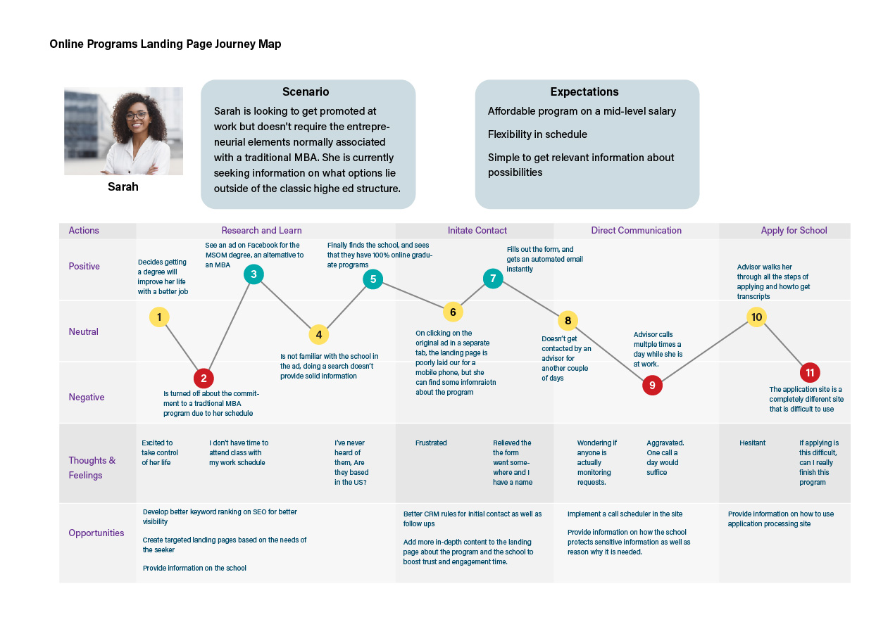
### Information Architecture
The nature of the landing page system was the initial gateway a user would only see a targeted page through an ad campaign, and the requirement was that there would not be any cross or interlinking between pages, nor any linking to a parent site. This was established to focus the user on the primary task: Fill out and submit the request for more information.
This action would enter the user into the admissions nurturing program where consistent and regular contact would be made with the interested user through personalized digital experiences to further inform and engage the prospective student, email drip campaigns to keep the prospect engaged with key admission and enrollment dates, and direct phone calls from assigned admission and enrollment advisor.
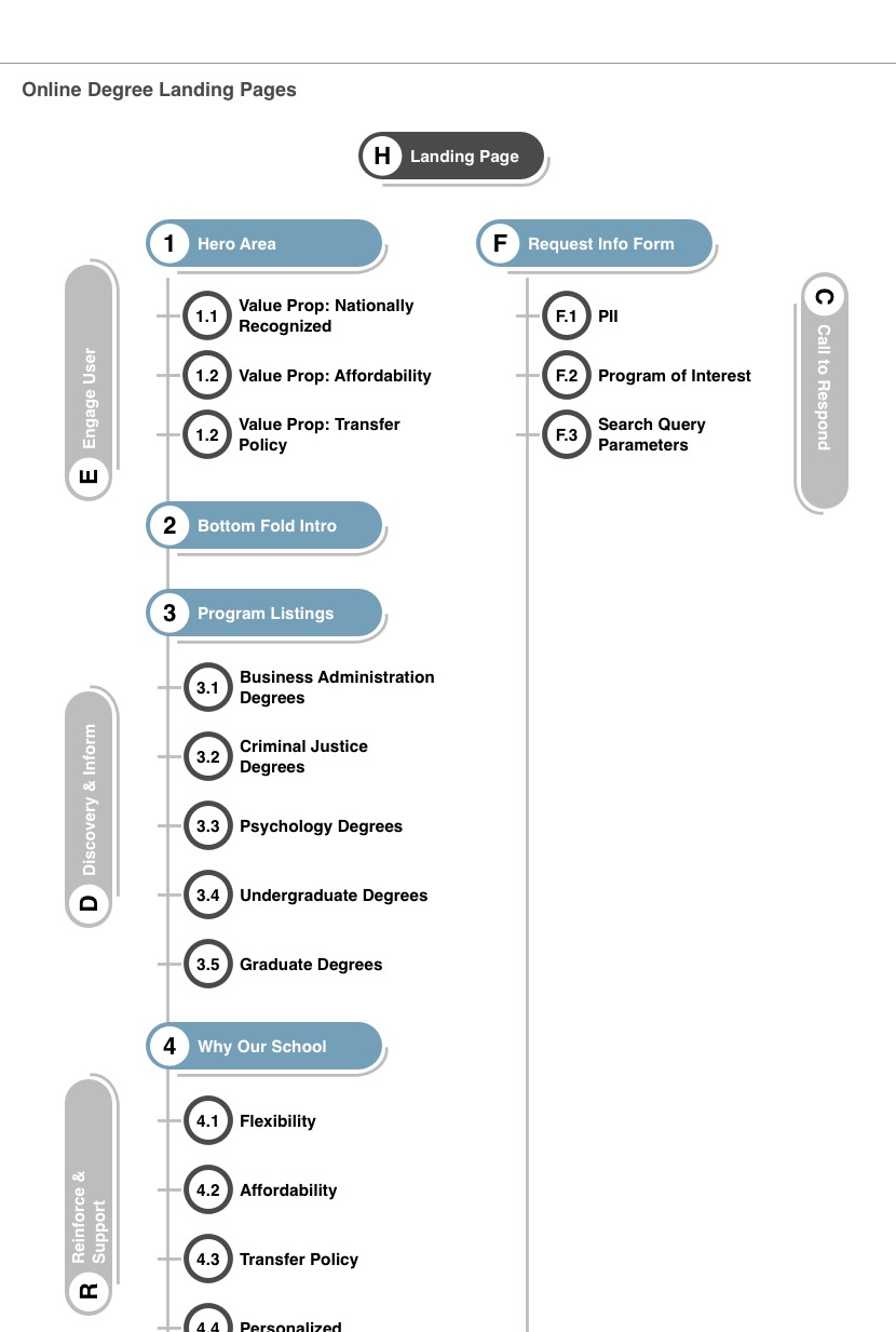
### Wireframes
Focusing on the areas of opportunity identified in the journey maps, aligning with the business requirements, and using the content strategy outlines for each page, I utilized user experience patterns and principles to build a flow that would highlight the key actions the user would take on a given page. The wireframes would be used in lo-fi usability testing to ensure we were getting expected behaviors, as well as discover any new barriers to the user completing the task.
### Conclusion
Our teams produced 15 unique landing pages to suit the needs of paid search marketing as well as persona-driven social media campaigns. These pages delivered a range of content from full overviews of all programs, targeted programs, as well as contexts such as community college transfers and non-traditional degree seekers.
The launch of the landing pages has exceeded the proposed conversion of visitor-to-lead and of lead-to-applicant. The traffic to these pages is solely dependent on paid search ads on social media outlets, which are optimized to reduce ad spend per lead and target education seekers. With the worldwide pandemic moving many traditional students into less traditional online learning, we saw an initial spike in enrollments into this school’s online programs. Adjusting for the post-2020 spike, these landing pages continue to generate a moderate number of qualified leads for the managed online programs of this school.
Our teams regularly test new content and layouts based on findings from the analytics and qualitative data channels to keep engaged with our prospective students and walk with them as they look to improve their lives through higher education.
## The Content Is the API
- Subject: jason.sonderman.info
- Role: Site owner / builder
- Timeline: Jul 2026
- Canonical URL: https://jason.sonderman.info/case-studies/agent-layer-extraction/
- Markdown: https://jason.sonderman.info/case-studies/agent-layer-extraction.md
This site’s own redesign produced three candidate patterns worth reusing elsewhere: a static, agent-facing content layer; an intent-based lens entry system; and an offline fit-brief generator. Investigating them side by side showed they were architecturally independent, not one coupled idea. I extracted only the agent layer — the part with the highest reuse value and the clearest thesis — into a standalone template, and left the other two out on purpose.
**Key outcomes:**
- Systems investigated: 3 — agent layer, lens entry system, fit-brief generator (Assessed each against reuse value and coupling, not just whether it shipped)
- Systems extracted: 1 — the agent layer only (The other two were real engineering, just not reusable in the way the redesign’s own plan assumed)
- Packaging: Standalone Astro template, GitHub template repo intended (Rejected an npm package and an Astro integration as the wrong shape for what’s actually being shared)
- Template status: Public on GitHub, marked as a template repo (github.com/blue148/agent-layer-template — CI groundedness eval passes 3/3 against a real Anthropic credential)
This site’s redesign produced three candidate patterns for reuse — a static agent-facing content layer, a lens-based entry system, and an offline fit-brief generator. Investigating them against reuse and coupling criteria showed they were architecturally independent, not one idea; only the agent layer was extracted into a standalone Astro template, with the other two deliberately left out.
**Facts:**
- Systems investigated: 3 (agent layer, lens entry system, fit-brief generator)
- Systems extracted: 1 — the agent layer only (qaContext schema, llms.txt/llms-full.txt generators, per-page markdown mirrors, JSON-LD, CI groundedness eval)
- Packaging decision: GitHub template repo — rejected an npm package (wrong maintenance commitment for a portfolio project) and an Astro integration (wrong API shape for page/schema conventions)
- Template status: Public at github.com/blue148/agent-layer-template, marked as a GitHub template repo
- CI groundedness eval: 3/3 passing against a real Anthropic credential — one ground-truth question had to be fixed first (see ‘What shipped’)
**Scope:** This case study documents the extraction decision and the resulting template’s design. The template itself is a starting point, not a maintained product — it’s public and verified working, not under an ongoing support commitment.
**Tools:** Astro content collections, Zod, Anthropic API (Claude)
**Tags:** Agent Layer, Content Architecture, Astro, AI Discoverability, Structured Content
Three systems, one assumption
This site’s redesign shipped in stages. Cycle 1 built a static, agent-facing content layer — every case study, rendered at build time into a short index (llms.txt), a complete document (llms-full.txt), per-page markdown mirrors, and JSON-LD, all sourced from the same content collections that build the HTML. Cycle 2 built a lens-based entry pattern — a dismissable, persisted prompt that routes a visitor into a curated sequence based on why they’re here, degrading to full static content with JavaScript off. Cycle 3 built an offline fit-brief generator — a two-phase CLI that reads a job description, matches it against case studies using the same agent-facing facts Cycle 1 produced, and writes a static, unlisted page.
The plan’s own scope for this phase was one line: extract the pattern into a reusable, documented codebase. Singular. It read like these three things were one idea that happened to ship across three cycles — which made sense on paper, since all three touch content, and two of them explicitly reuse Cycle 1’s output. The obvious move was to package all three together and call it “the redesign, extracted.”
I didn’t trust that framing enough to start building against it. Before writing any extraction code, I went back through all three systems and asked a narrower question of each one: if I handed just this piece to someone building an unrelated site, how much of it would they actually keep, and how much would they have to tear out?
The diagnosis
The agent layer turned out to be almost entirely mechanism. qaContext — a structured, optional field co-located with the content it describes — has no assumptions about what the content actually is. The generator that projects it into llms.txt/llms-full.txt hardcodes a handful of things specific to this site (a site URL constant, an About/Experience special-case, an exact field list), but the core loop — iterate a collection, render its facts, write a file — doesn’t care whether the collection holds case studies, blog posts, or product docs. The CI groundedness eval that checks the generated document against ground-truth questions is cleaner still: nothing in the harness itself references this site at all, only the ground-truth file does, and replacing that file is the entire point.
The lens system was real engineering — a no-JS-first state machine handling URL params, localStorage persistence, and session-scoped dismissal, plus two genuinely reusable primitives (an escape hatch, a persistence helper). But the part doing the actual routing work is a hardcoded union of four personas and the literal copy for each one, including a line as specific as “I’m evaluating Jason for a role.” Another site adopting this pattern doesn’t want my personas. What’s reusable is a smaller kernel inside a larger, more bespoke surface: a dismissable, persisted, URL-overridable entry choice that degrades to static content. Real, but narrower than it looks from the outside.
The fit-brief generator had a different problem — not coupling, but validation. Its two-phase generate/review/commit flow and its prompt-injection hygiene (a pasted job description is always treated as content to analyze, never as instructions) are ideas worth reusing on their own. But at the point I was investigating this, the script had never actually produced a real fit brief. src/content/fit-briefs/ was empty. Extracting and genericizing a pattern that’s never been exercised against a single real input isn’t extraction — it’s guessing that the current shape is right before anything has tested that assumption.
The decision
Bundling all three into one “extracted pattern” would have manufactured a shared abstraction between things that aren’t actually coupled — they shipped in the same project, not from the same design. The agent layer is a build-time content projection. The lens system is client-side progressive enhancement over static routing. The fit-brief generator is an offline CLI. Nothing in one depends on the other; the PRD driving this redesign says as much explicitly for Cycle 3 and Cycle 2.
I scoped the extraction to the agent layer alone. It has the highest reuse value of the three — portable to any Astro site built on content collections, regardless of what the content actually is — and the lowest genericizing cost: pulling a few hardcoded constants into a config file, not a rearchitecture. It’s also the most differentiated idea on its own. “Treat agents as first-class consumers of your content, the same way a design system treats agents as first-class consumers of design tokens” doesn’t need the lens system or the fit-brief generator to be a complete thesis.
Packaging was its own decision, weighed against three alternatives. An npm package implies a semver and maintenance commitment out of proportion to a portfolio project’s appetite — and half the value here isn’t “install a dependency,” it’s “copy this schema shape into your own content.config.ts and adapt it.” An Astro integration is the wrong API surface entirely; these are page, schema, and script conventions, not renderer-level hooks. A documented reference with no formal packaging was the lowest-effort option, but the weakest forcing function — nothing would actually require the genericizing work to happen; it’s easy for docs to gesture at “swap this for your content” without the swap being clean. A GitHub template repo sits between all three: someone can click “use this template” and get a working site with the agent layer wired up, which forces every site-specific string to actually become a placeholder, without taking on a package’s versioning burden.
What shipped
The template is a standalone Astro project: a generic items content collection standing in for whatever your primary content type is, the qaContext schema copied as-is, a genericized generator reading site name and URL from one config file instead of a hardcoded constant, the same three routes (llms.txt, llms-full.txt, per-item markdown mirrors), parameterized JSON-LD, and the CI eval harness with a small example ground-truth file in place of this site’s actual content.
One piece of the original code got fixed on the way out, not just copied: the generator tracked which published entries were missing qaContext but never surfaced that list anywhere — no build warning, no CI gate, a signal nobody was reading. The template version logs it as a build warning instead. Small, but worth naming, because it’s exactly the kind of dead tracking code a template shouldn’t silently inherit.
I confirmed llms.txt, llms-full.txt, the per-item markdown mirrors, and both levels of JSON-LD all render correctly against two example content entries — that was true before the eval ran once. Running the ported eval harness for real, against a live Anthropic credential, is what actually caught a problem: one ground-truth question required the literal digit ”5”, but the model’s correct answer spelled it out as “Five channels,” so a right answer failed the check. The fix was the same alternate-phrasing pattern this site’s own ground-truth file already used elsewhere for exactly this reason — I just hadn’t applied it to every question. That’s the specific value of actually running an eval instead of trusting that a well-built harness implies a well-built ground-truth file: the harness was fine. The test data wasn’t. With that fixed, the eval passes 3/3, and the template is public at github.com/blue148/agent-layer-template, marked as a GitHub template repo.
Knowing what not to generalize
The lens system and the fit-brief generator aren’t in the template, and that’s stated in its README as plainly as what is included — not as a hedge, but because leaving them out was itself the harder decision to make well. It would have been easy to extract all three and call it thorough. It would have been just as easy to extract nothing and call the whole investigation a wash because it didn’t produce one clean “the pattern.” Neither of those is what the evidence supported. One of the three systems had a real, portable idea at its core; the other two didn’t, for two different reasons — one because its reusable core was smaller than its bespoke surface, the other because it had never been tested against reality yet.
That’s the same instinct this site’s case studies keep returning to elsewhere: a partial result, stated honestly, is more useful than a complete-sounding one that overclaims. This one just happens to be about the site’s own construction instead of a client’s product.