Building Fulcrum: BetterCloud's Elevate Design System
How I led the design of Fulcrum, BetterCloud's internal design system — unifying a fragmented SaaSOps product suite and learning firsthand what it takes to carry a design system across the boundary from design into engineering.
The moment it clicked
I was doing a cross-product consistency review during the early stages of the Elevate initiative — one of those audits where you open two Figma files from two different squads side by side and compare. The files were for the same platform. They’d been designed around the same time. And they didn’t match.
Not in a subtle way. The button hierarchy was different. The spacing system was different. The typefaces, used on screens that would appear in the same navigation session, were different enough that a user switching between tools would feel a shift — not quite “wrong,” but slightly off, the way a borrowed sweater fits almost right. Our products were built by smart, careful designers. And they looked like they came from different companies.
The problem wasn’t negligence. It was infrastructure. Each squad had its own Figma setup, its own component conventions, its own interpretation of what the brand meant in practice. There was no shared source of truth. Each designer was doing the right thing with the information they had. There just wasn’t a place where “the right thing” was defined.
That audit changed the brief for me. Elevate was supposed to be about enhancing functionality. Underneath it was a more fundamental problem: we couldn’t evolve the user experience coherently without something to evolve from.
The diagnosis
BetterCloud’s product suite was organized by squads — each one owning a specific tool like Secure, Manage, or Automate. The model made sense for delivery: dedicated teams, focused roadmaps, accountable ownership. But it created a structural problem for design consistency. Every squad was shipping their own interpretation of the same interface.
The consequences showed up in predictable places. Late in the design phase, a designer would realize their components didn’t match what another squad had shipped. They’d try to align, but now both versions were in live products. Changing one meant a coordinated cross-squad effort. Most of the time it didn’t happen — the inconsistency stayed, layered on top of previous inconsistencies, accumulating like technical debt but for visual language.
On the development side, the same pattern played out in code. Developers were creating and recreating components with each new feature because the Figma designs rarely matched what was already in the codebase. A component that was “reusable” in design might exist in three slightly different implementations in code. The rift between design and engineering grew with each product cycle.
The result was a compounding problem: increased design time, increased development time, inconsistent user experience, and a widening gap between what design produced and what engineering could implement. And because each squad was independently functional — shipping, iterating, delivering — there was no obvious breaking point. The pain was real but diffuse.
The vision
The problem wasn’t that we lacked good designers — we had a strong team. The problem was that good designers without shared infrastructure produce divergent output. What we needed was a shared foundation: agreed-upon atoms, patterns, and decisions that every squad could reach for, so their energy went into solving product problems, not relitigating button radius.
I named the system Fulcrum deliberately. A fulcrum doesn’t do the work — it makes the work more effective. The goal wasn’t to centralize every design decision or constrain creativity. It was to define the decisions that didn’t need to be made individually, so designers could spend their attention on the ones that did.
This required framing the design system not as a designer’s toolkit but as a shared organizational resource. That distinction mattered for buy-in. A “designer’s toolkit” is something designers own. A “shared design language” is something the whole product organization benefits from — and therefore has a stake in maintaining. I made that argument to product and engineering leadership before we’d built anything, which shaped how the project was resourced and reviewed.
The approach
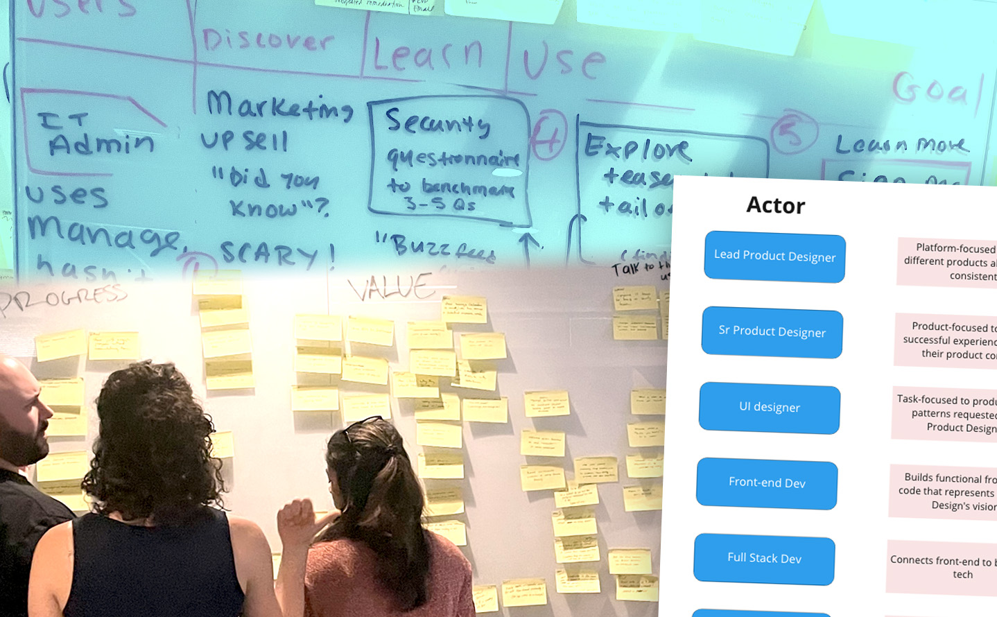
Before defining what the system should contain, we needed to understand what already existed. I led a systematic audit of live interfaces and in-progress Figma files — cataloging every button, input field, spacing value, and icon set in active use across the product suite. The audit was unglamorous and essential. It turned “we have inconsistency” from a feeling into a map.
From the audit, patterns emerged. Most of our components were variations of a smaller set of core elements. We didn’t need to invent a new visual language — we needed to distill and codify the one we already had, and make deliberate choices where the existing system was ambiguous or contradictory. That produced the atomic foundation of Fulcrum: a type scale, a spacing system, a color palette, and a base component set with documented usage guidelines.
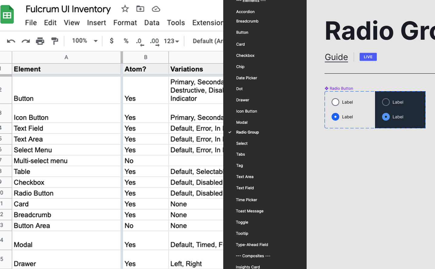
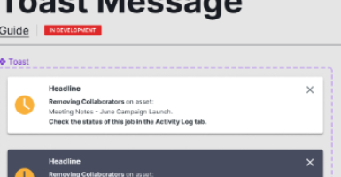
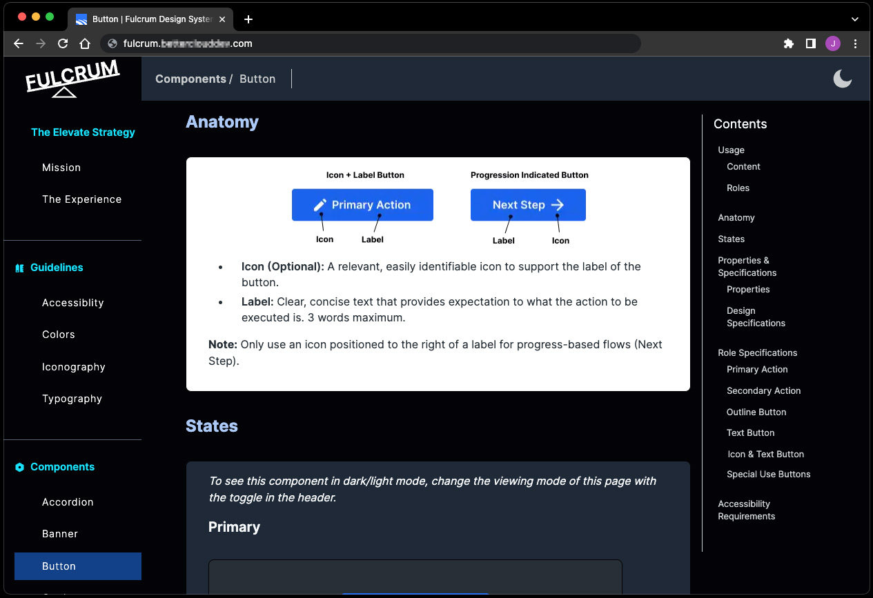
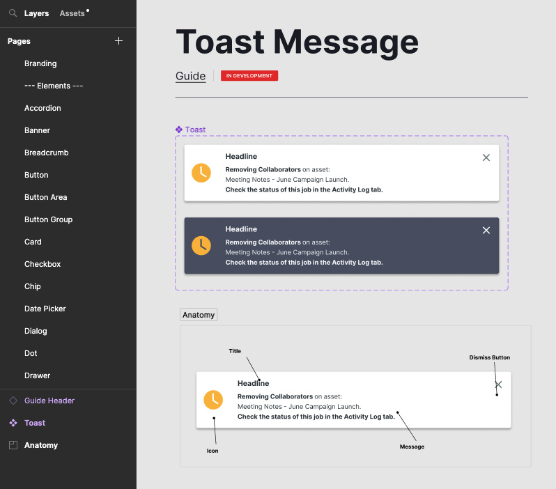
I built the Figma library in parallel with the documentation site. The library needed to be opinionated about usage, not just a component dump — a button in Fulcrum wasn’t just a shape, it had states, hierarchy guidance, and documented anti-patterns. I designed and built the Fulcrum Guide documentation site in Gatsby.js, drawing on IBM’s Carbon, Salesforce’s Lightning, and Apple’s Human Interface Guidelines for structure and philosophy, then tailoring both for BetterCloud’s product context.
The training rollout in late 2022 was deliberate. Designer sessions on the Figma library, and separate sessions with developers on the intended implementation model. The training was where a gap began to surface.
Building credibility — and what stayed out of reach
The design team adopted Fulcrum quickly. The clearest evidence wasn’t a survey — it was observable in Design Sprint workshops. Before Fulcrum, getting from sketch to testable clickable prototype typically took two full days. After, the same team was producing high-fidelity prototypes in one. Components snapped into place. Designers weren’t making style decisions mid-sprint; they were making product decisions. That’s the work that was supposed to happen.
The ~40% faster figure comes from a small dataset of sprint sessions, not a rigorous controlled study. I want it taken seriously, not over-read. But the directional result was consistent across multiple sprints — consistently enough to be real.
Engineering adoption was a different story. The gap between Figma components and coded components didn’t close. Our development teams were working in MaterialUI, and bridging design tokens in Figma to a coded component library requires organizational agreement: who maintains the bridge, who owns it when it drifts, how discrepancies get resolved. That agreement didn’t form. What existed in Figma stayed in Figma.
This wasn’t a failure of will. It was a governance gap — the kind that’s hard to see until you’ve tried to cross it. The design system worked as a design team tool. It didn’t achieve what I’d hoped: a shared language that design and engineering could both reach for.
What shipped
- Fulcrum Figma component library — Shared system covering atoms (type, color, spacing, icons) and patterns (forms, navigation, data display), with documented states, variants, and usage guidance. Adopted by all squads working on Elevate-enhanced products.
- Fulcrum Guide documentation site — Built in Gatsby.js, modeled on IBM Carbon and Salesforce Lightning. The design team’s single source of truth for component usage, philosophy, and design decisions. I designed and built the site.
- Interface element audit and taxonomy — A systematic catalog of all existing UI elements across live and in-progress products, which produced the structural foundation for the Figma library and surfaced the full scope of the fragmentation problem.
- Training program — Designer sessions on the Figma library and developer sessions on the intended implementation model, conducted as part of the late 2022 rollout.
What Fulcrum made possible for designers: a consistent starting point for every project, faster exploration in Design Sprints, and a shared vocabulary for design reviews. Feedback that once took the form of “that doesn’t look right” could now reference a specific component state or usage guideline instead.
The larger argument
What Fulcrum proved: a design system is infrastructure, not a project. It required sustained attention, governance decisions, and organizational agreements that went beyond what a design team can impose on itself. Getting the design team aligned was necessary but not sufficient. The system reached its ceiling when it hit the boundary between design and engineering — not because the system was wrong, but because we hadn’t built the cross-functional scaffolding to carry it across that boundary.
This is the lesson I’d carry into every subsequent design systems conversation: the component library is the easy part. The hard part is getting agreement on what happens when a token changes, who reviews the design-to-code bridge, and how inconsistencies between Figma and code get surfaced and resolved. These are organizational questions, not design questions. Without answers to them, a design system is a design team tool — valuable, but bounded.
If I were building Fulcrum again, I’d spend the first month getting engineering leadership and dev managers to co-author the token schema with me, rather than presenting it to them after it existed. The adoption ceiling would have been higher if engineering had been architects of the foundation, not recipients of it. That instinct — getting the right people into the process before the artifact exists — shaped how I approached the delivery model work I later led at Arcos.
Quick Read
Team
- Product Design
- Product Management
- Engineering Leadership
My Contributions
- Design system architecture and Figma component library
- Fulcrum Guide documentation site (Gatsby.js)
- Interface element audit and taxonomy
- Research proposal design
- Cross-squad consistency review
- Designer and developer training
Tools
- Figma
- Gatsby.js
- MaterialUI
- Design Sprints
- Stakeholder interviews