
BetterCloud Secure: Redesigning Risk Remediation for IT Teams
BetterCloud’s Secure platform was already good at surfacing risk: exposed files, misconfigured apps, policy violations. What it couldn’t do was fix them. Remediation meant leaving the platform, switching tools, and coming back to check whether anything had changed. The redesign was about collapsing that gap.

BetterCloud is a SaaS management product that enables IT teams to maximize efficiency through automating manual tasks and enforcing company security policies.
BetterCloud was undergoing a strategic effort to redesign the existing experience for the Secure platform. I worked as the Lead Product Designer on the team, leading the design process and defining the experience’s ‘remediation’ journey.
Setting the Stage: The Challenge Before Us
In the fast-paced world of SaaS management, BetterCloud had already made a name for itself. Our platform was the go-to solution for IT teams looking to automate manual tasks and enforce company security policies. But in the realm of cybersecurity, standing still means falling behind.
We faced a critical challenge: our customers needed the power to mitigate security risks in real-time, preventing data breaches before they could occur. Our existing Secure platform allowed users to discover and monitor exposed data, but it lacked a crucial capability – the ability to resolve these risks swiftly and effectively.
As the Lead Product Designer, I found myself at the helm of an ambitious project. Our mission? To redesign the Secure platform, transforming it from a passive monitoring tool into an active guardian of sensitive data.
Discovery: Bringing Our Users to Life
Our journey began not with wireframes or prototypes, but with people. Real people, with real challenges and aspirations. We had a wealth of data at our fingertips – hundreds of user interviews and support calls. But data alone doesn’t tell a story.
Working hand-in-hand with our Business Intelligence team, we sifted through this treasure trove of insights. Slowly but surely, patterns emerged. We weren’t just looking at numbers; we were uncovering the hopes, frustrations, and needs of our users.
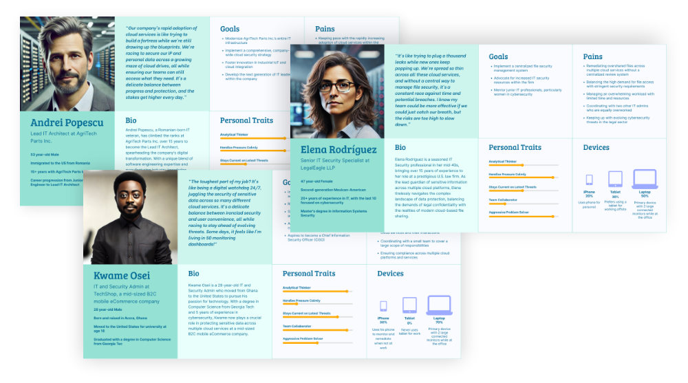
That’s when the magic happened. We transformed these insights into living, breathing personas. We crafted detailed actor sheets, complete with goals, quotes, and even imagined workspaces. These weren’t just profiles on a page – they were the characters in our product’s story.
These personas became our guiding stars, ensuring every decision we made was grounded in real user needs.
Mapping the Current State: Understanding the Journey
With our personas by our side, we dove into the existing Secure platform. We put ourselves in our users’ shoes, navigating through the process of identifying and addressing security risks.
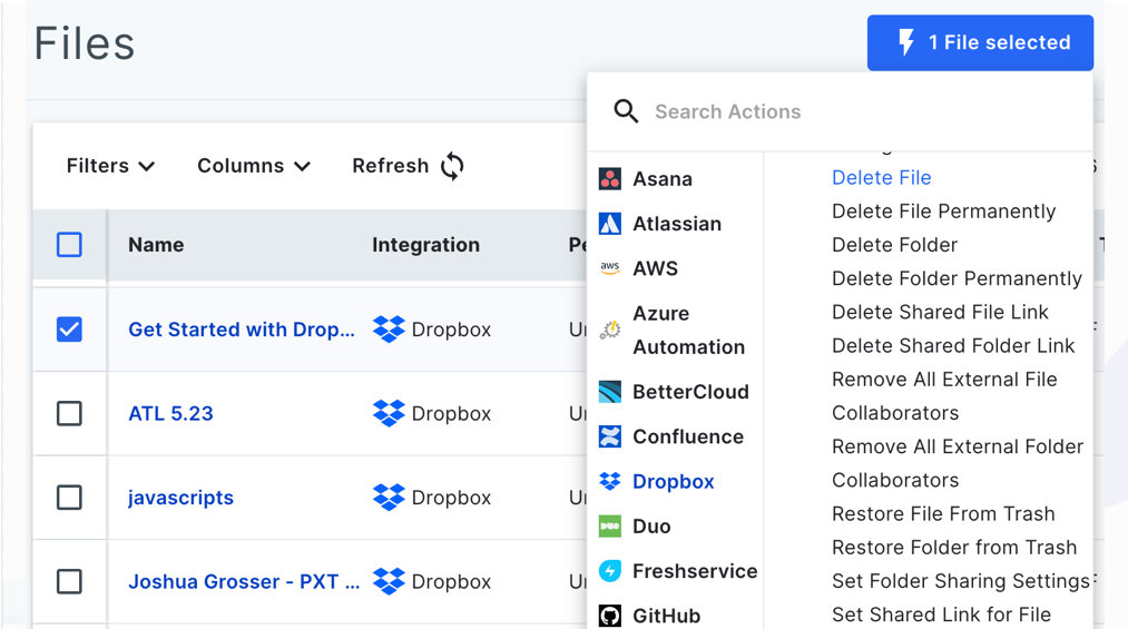
The journey was eye-opening. Users could view their assets – files and folders shared across their organization – and identify potential risks. But when it came to taking action, they hit a wall. The platform presented a dizzying array of remediation steps, often leaving users unsure of the best course of action.
Through a painstaking manual audit, we uncovered a staggering 86 potential actions across just 5 applications. It was clear: we needed to simplify without sacrificing functionality.
The Design Sprint: Where Ideas Take Flight
Armed with our insights, we launched into a design sprint. Picture a room buzzing with energy – designers, product managers, and customer-facing roles all coming together to tackle our challenge head-on.
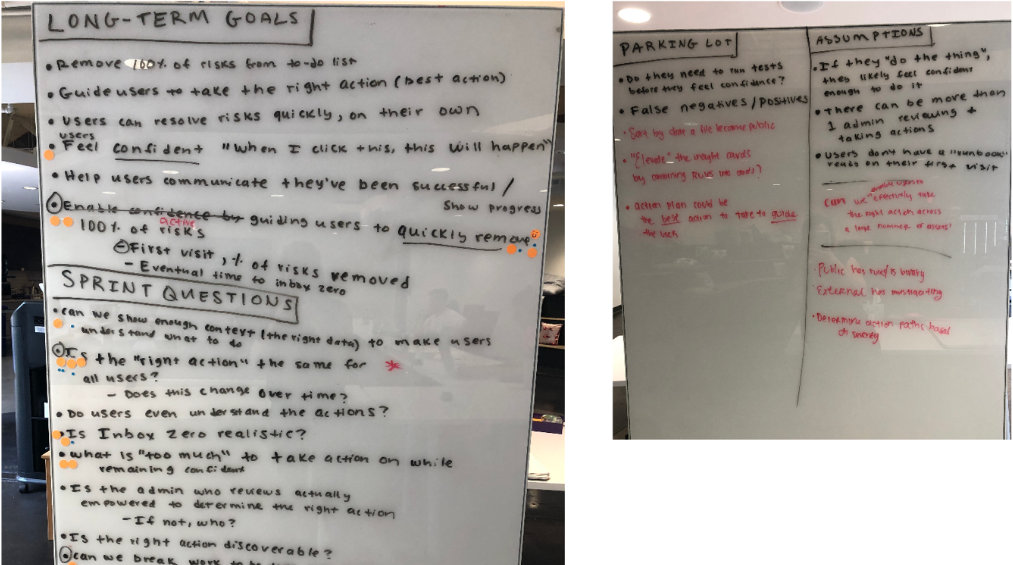
We set an ambitious goal: Guide users to quickly remove 100% of risks. But we also acknowledged the hurdles. How could we ensure the right action for all users? How could we balance bulk actions with digestible steps?
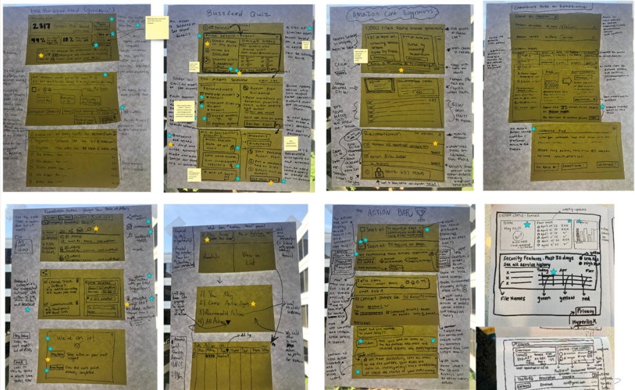
Through story mapping and rapid sketching, ideas began to take shape. Each team member brought their unique perspective, resulting in a rich tapestry of potential solutions.
From Sketch to Screen: The Prototype Emerges
As the Lead Product Designer, my role shifted into high gear. I led the charge in transforming our storyboards into a clickable prototype. We divided and conquered, with each designer taking ownership of a section while I ensured consistency across the entire journey.
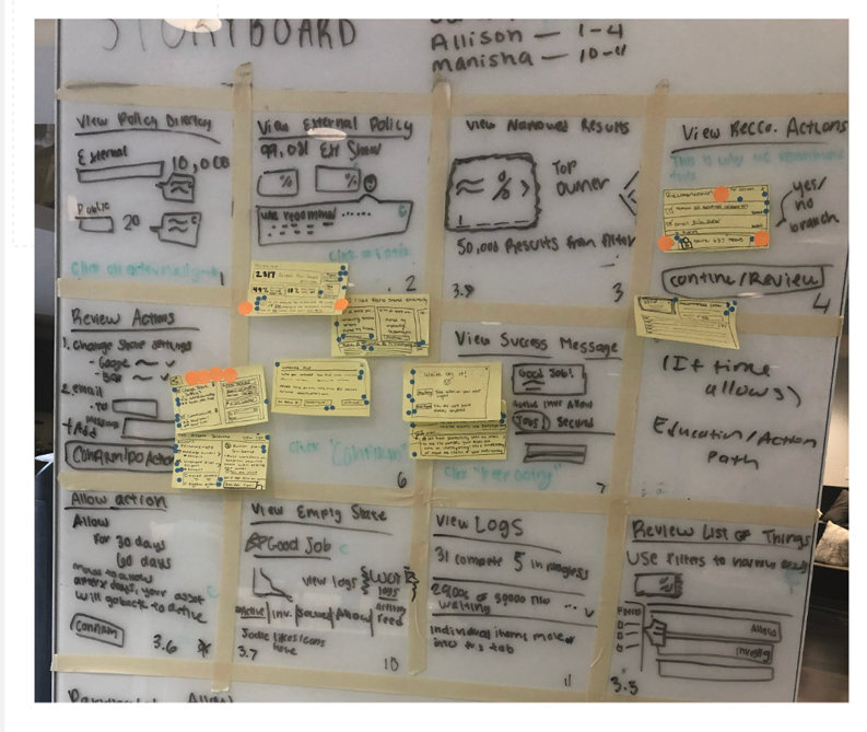
The clock was ticking – we had users scheduled to review our work. But as the prototype came together, excitement built. We were creating something that could truly transform how our users approached security risks.
Key Features: The Heart of Our Solution
Our design sprint yielded three core features that would redefine the Secure platform experience:
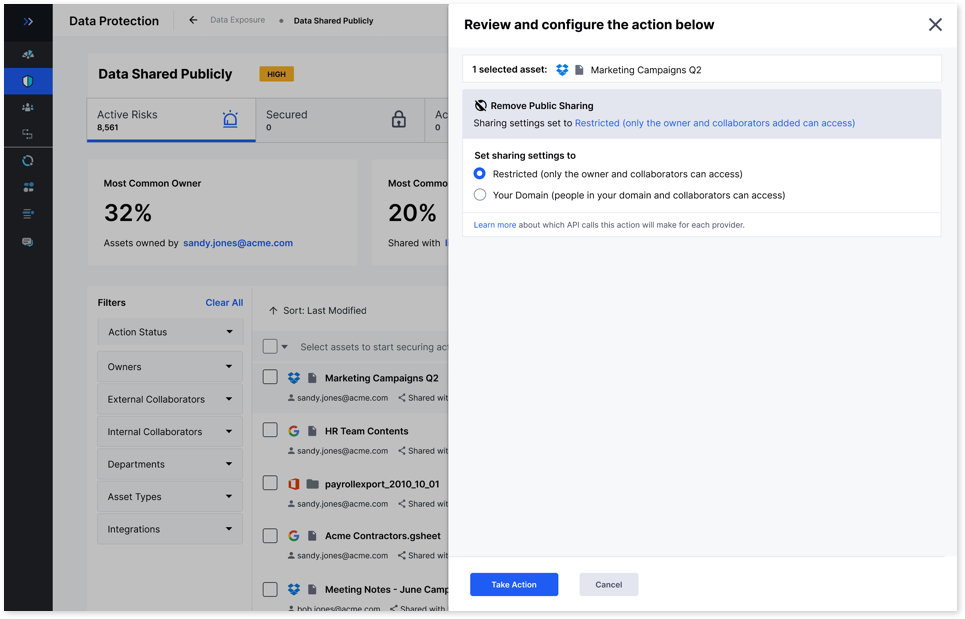
Quick Actions: A streamlined interface allowing users to take the correct action to secure their risk with minimal clicks.
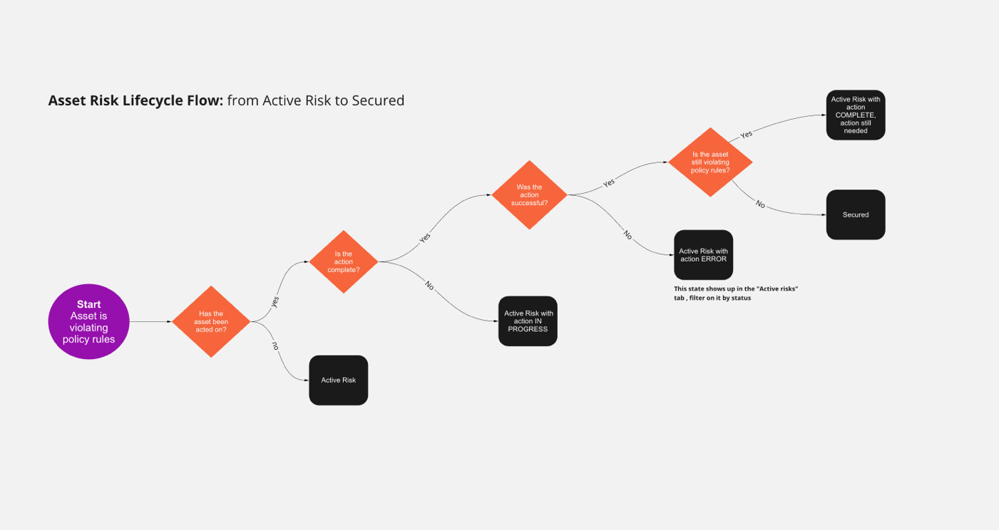
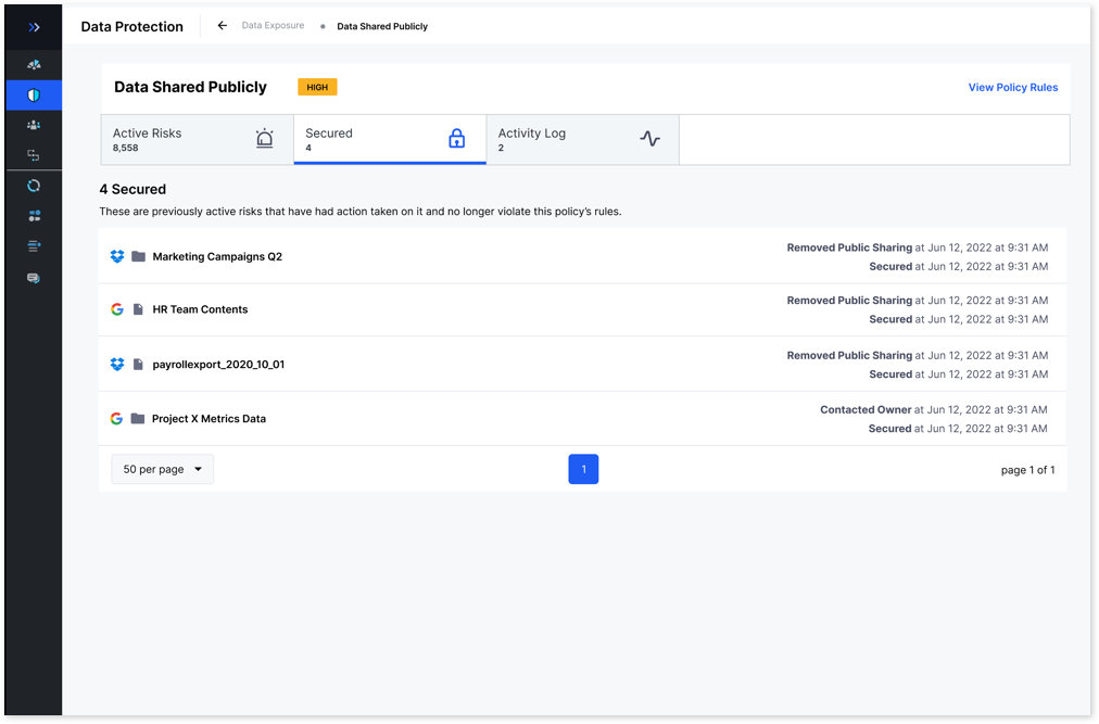
Risk Lifecycle Tabs: A visual representation of the user’s security landscape, showing current risks and successfully remediated issues at a glance.
Universal Action Properties: A consistent interface for configuring action properties across different asset types and applications, reducing cognitive load on our users.
Refining Our Vision: From Idealism to Reality
The design sprint had given us a bold vision, but now came the crucial task of grounding it in reality. I worked closely with our Product Manager and architects, mapping out the technical feasibility of our ideas.
We identified ‘chunks’ – what would later become our development epics – that would allow us to build iteratively towards our end goal. It was a delicate balance, preserving the high-value capabilities while ensuring we didn’t overextend our technical resources.
Putting the Prototype in Front of Users
From April to October 2022, we ran four design sprints and built seven alpha versions of the interface, testing each one before moving to the next. Five external customer-partner companies took part, two to three system admins per company, working through specific tasks with us: finding files, bulk-securing files, setting notifications, and walking through their existing remediation process outside our tool. Internal professional services staff, who support customer setup, tested alongside them. Between sprints, two to three IT admin users sat with us each week to react directly to the Figma prototype.
The three capabilities held up under that testing. The redesigned flow gave users:
A comprehensive view of all current risks, allowing users to prioritize their actions effectively.
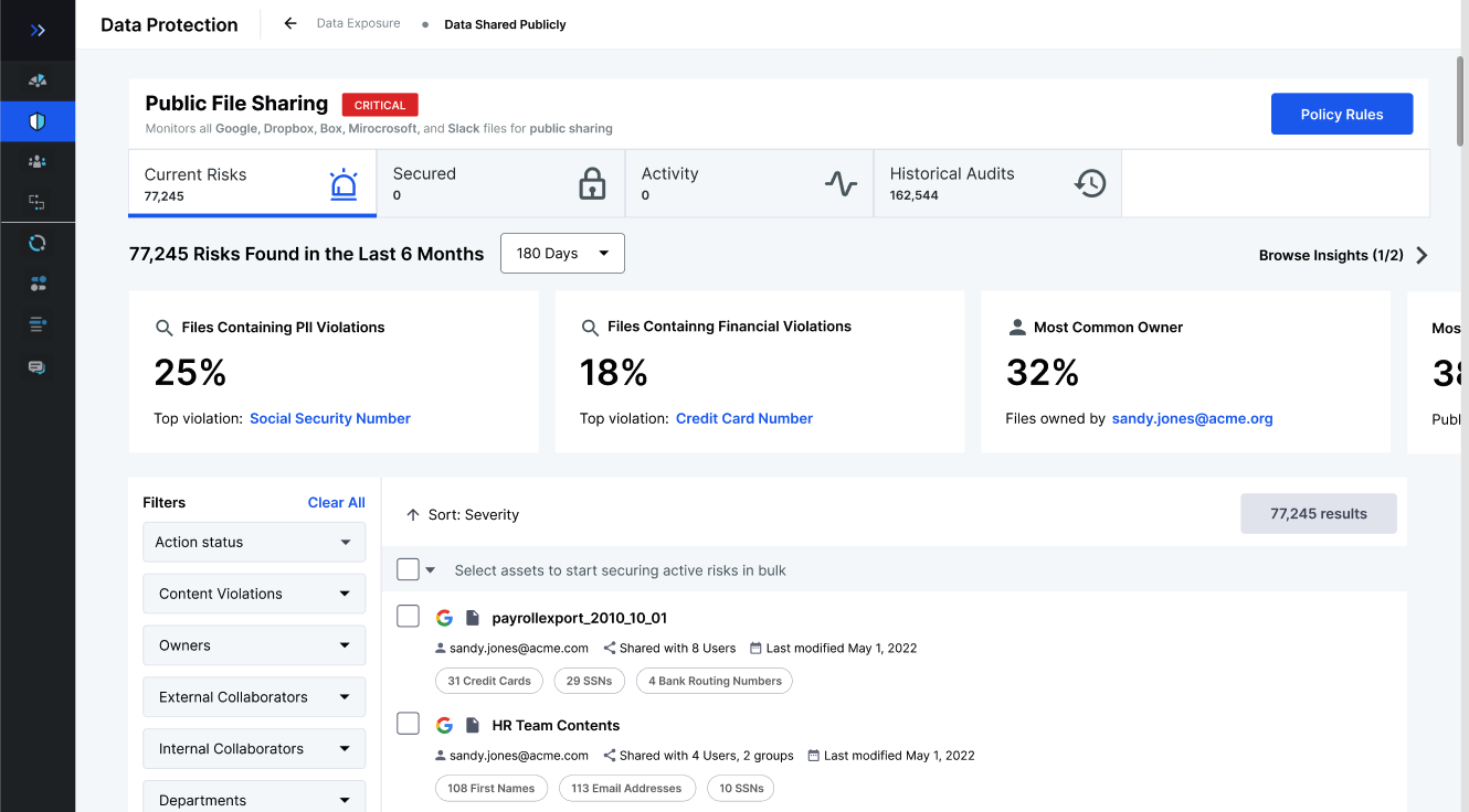
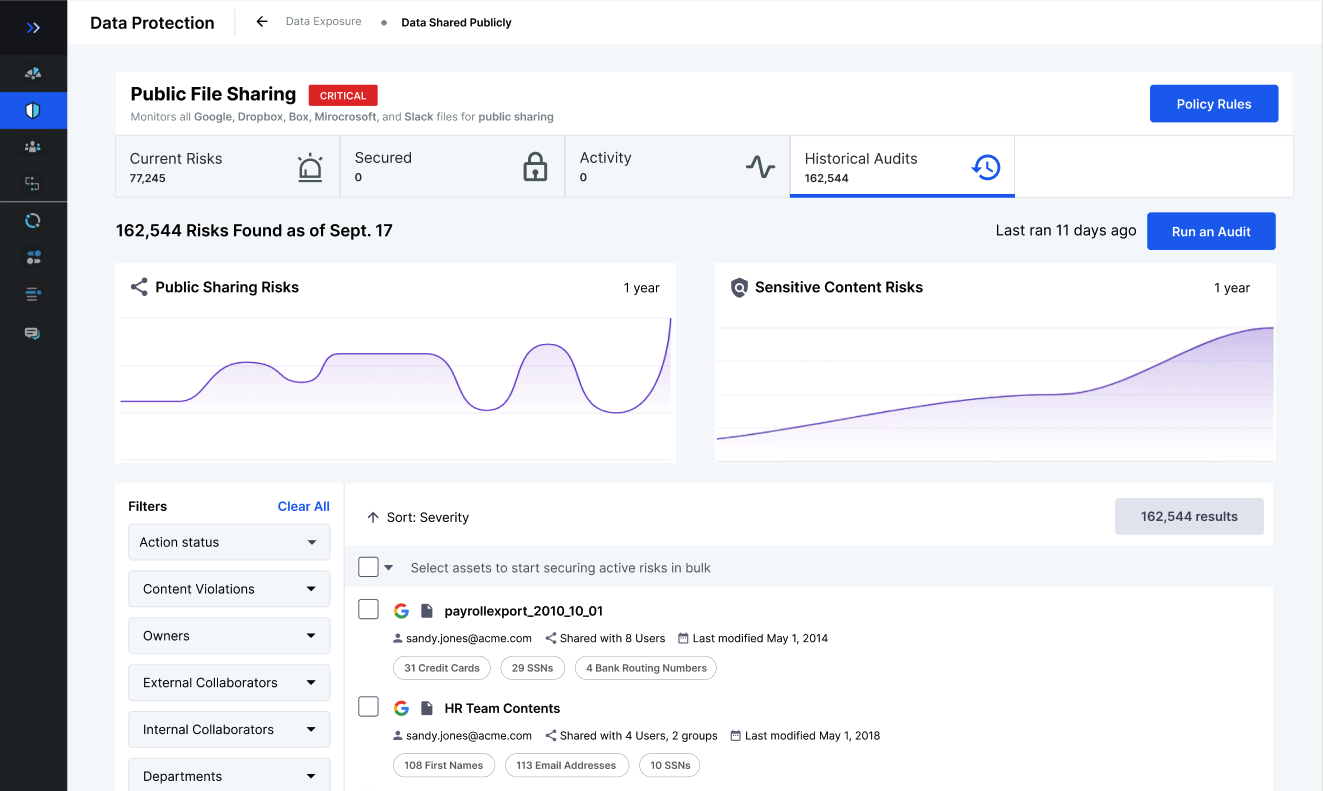
Streamlined, universal action properties that worked consistently across applications, reducing confusion and errors.
A clear Risk Lifecycle view, enabling users to track their progress and audit their security actions over time.
Two numbers came out of that testing, tracked in aggregate by our product manager. Against a 3-second target for how quickly users could perceive and act on a key task, new users averaged 3.8 seconds; returning users found the same actions in under a second, often clicking before we’d finished explaining the task. That figure blends two different testing methods, seven design-sprint users on the Figma prototype and ten alpha-build users on the built feature, with some overlap where sprint testers came back for alpha retesting, so treat it as two data sources merged into one directional read, not a single controlled sample.
Task accuracy showed a clearer trend. Early testing on tasks like selecting 50+ files and choosing the correct bulk remediation action found a 68% success rate, with most failures coming from misclicks. That climbed to 82% by alpha build 7, across 13 users total tested between April and October 2022.
Learnings: Unexpected Turns and Silver Linings
While our redesigned Secure platform tested extremely well with users and generated real excitement among the partner companies who tried it, the project ultimately took an unexpected turn. Due to budget constraints and a strategic shift in the company’s market focus, the project was shelved in October 2022 after seven alpha builds, before it reached beta or production.
Not everything held up under testing. Data-refresh performance never met the mark: our target was under 50 seconds for infinite-scroll file loading, the same number users independently named as their own expectation, but the best we achieved was on-request-only refreshes averaging two to four minutes to download, cache, and rehydrate. We never solved it before the project was shelved.
Universal Action Properties was designed to collapse the 86 actions we’d audited into a much smaller, reusable set of interaction patterns. User interviews suggested roughly a 70% reduction in the number of distinct actions someone would need to learn, but that number is a projection from interviews, not a measured result. The feature never shipped, so it was never tested in production.
However, in the world of UX, no effort is ever truly wasted. The insights we gained and the problem-solving processes we developed during this project proved invaluable as the company pivoted to its new focus. Our team’s ability to rapidly ideate, prototype, and test solutions became a model for future projects across the organization.
Perhaps the most tangible legacy of our work was the creation of a highly effective Figma Design System library. This comprehensive resource allowed our UX designers to create extremely high-fidelity prototypes for most tools in our platform. What once took weeks now could be accomplished in days, dramatically accelerating our ability to move from initial idea to user testing.
In the end, while the Secure platform redesign didn’t reach full implementation, it left an indelible mark on our design processes and capabilities. It served as a powerful reminder that in the fast-paced world of technology, adaptability and learning are just as crucial as the end product itself. The skills we honed and the systems we built continue to drive innovation and efficiency across our design teams, ensuring that BetterCloud remains at the forefront of user-centered design in the SaaS management space.
Team
- Product Design
- Product Management
- Product Operations
- Front-end Engineering
- Full-stack Engineering
My Contributions
- Persona Creation
- Workshop Facilitation
- User Research
- Sketches
- Task Flows
- Figma Prototyping
- User Testing
- Planning
- Stakeholder Alignment
- User Advocate
Tools
- Miro
- AHA!
- Figma
- UserTesting.com
- JIRA
Agent view
This page has a machine-readable twin, generated from the same source rather than written alongside it.
See how an agent reads this page