
Cerner Learning Journey Portal: Designing for EMR Adoption at Scale
When adoption is mandated, the designer’s job isn’t to make learning easier. It’s to make the learner feel capable.
253
+48%
~26%
The Moment It Clicked
Early in the project, we made an assumption that felt almost too obvious to question: clinicians resisting EMR adoption were resistant because they didn’t understand the system. The answer, then, was clarity. Give them a full picture of the learning path: how many modules, how much time, how it all fits together. Show them the journey. Reduce the unknown.
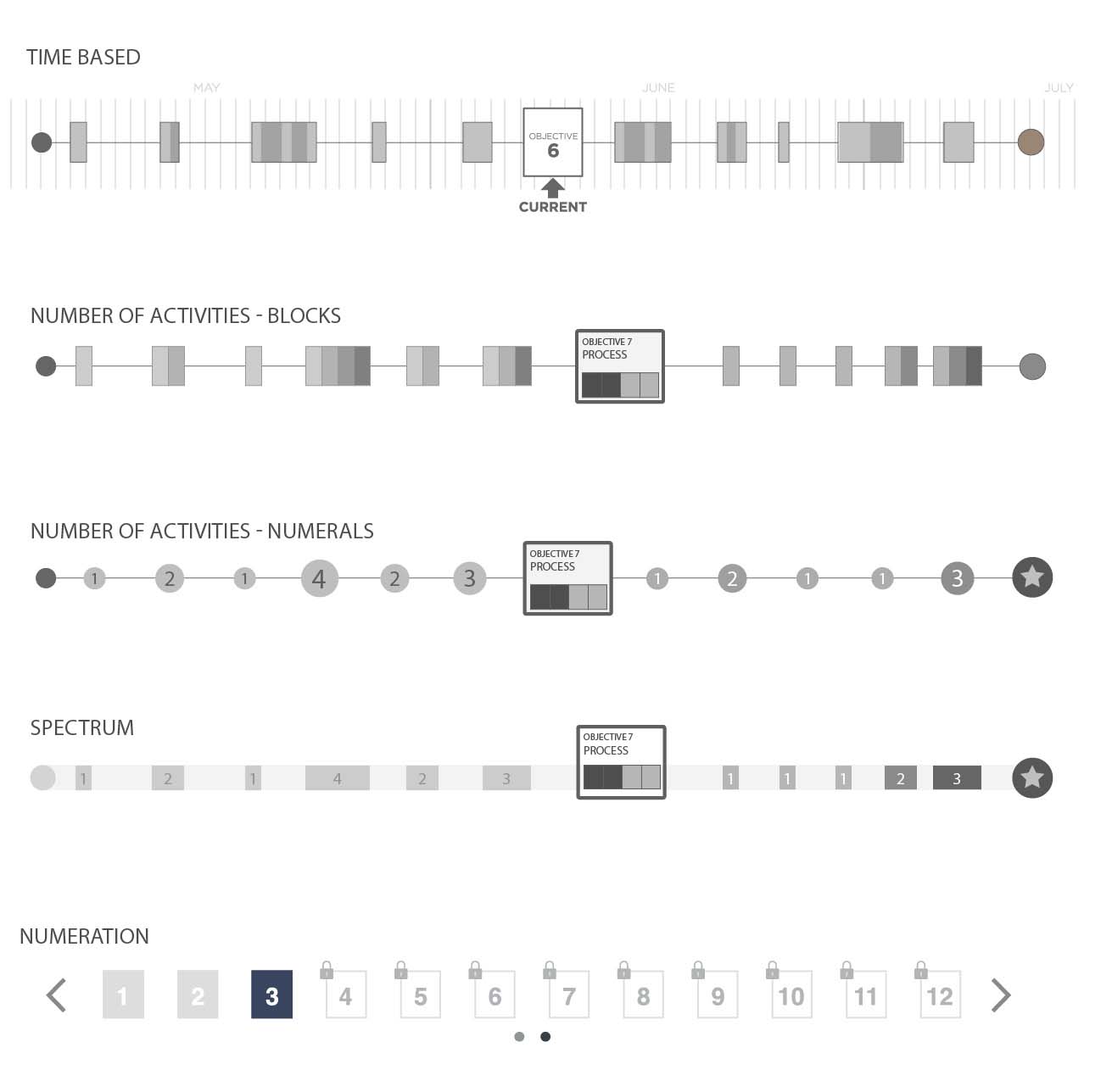
We built a prototype around that idea. It mapped the complete learning arc: a visual timeline, estimated hours per section, a progress meter that showed how far they had to go. We thought seeing the whole thing would reduce anxiety. We thought transparency would build confidence.
The testing told us we had it exactly backward.
Learners looked at the complete journey view and froze. Not metaphorically. They stopped clicking. They stopped talking. A few said versions of the same thing: I don’t have time for this. One nurse said she’d rather just figure it out on the floor. The visualization we’d built to reassure people was, instead, turning a manageable task into an impossible one before they’d done anything at all.
That was the moment the real design problem came into focus. This wasn’t a training problem. It was a change management problem, and the tools we’d been drawing from weren’t built for this population.
The Diagnosis
To understand why that matters, you have to understand what was actually happening in hospitals in 2014. The ACA’s “meaningful use” mandate had set a hard deadline: healthcare providers had to demonstrate meaningful use of certified EMR systems or face financial penalties. This wasn’t a product rollout where users could opt in gradually. Adoption was compulsory, the timeline was externally imposed, and the workforce being asked to adopt had neither requested the change nor designed the workflows that resulted from it.
Organizational change management frameworks (ADKAR, Kotter’s 8-step, Prosci’s methodology) were well-established by then. But they’d been developed and refined primarily for enterprise software rollouts: voluntary or at least internally-mandated migrations, with reasonably flexible timelines, in workforces where directed learning was a normal part of professional life.
Clinicians are different. Their professional identity is bound up in demonstrated competence, not certified completion. A physician doesn’t think of herself as someone who completes training modules. She thinks of herself as someone who already knows how to do her job. An LMS built on corporate learning patterns asks that person to temporarily occupy the position of student, and the resistance that produces isn’t irrational. It’s a defense of professional identity.
Add to that the structural reality: hospital workflows have almost no slack. There’s no “training time” carved out of a shift. Learning has to happen in the margins: between patients, before rounds, during whatever quiet moments exist. The existing playbook assumed learners had time and motivation. These learners had neither.
What had to be true for a solution to work: the system couldn’t feel like a learning management platform. It had to feel like a tool for getting competent quickly. Those are different experiences with different designs.
The Vision
Cerner’s learning team had already arrived at a useful concept before I joined: journeys. Targeted, sequenced learning experiences designed to build competency incrementally on a specific topic. Not a course catalog. Not a curriculum. A path with a clear beginning and end, scoped to what someone in a specific role actually needed to know.
The journey concept was right. What it needed was a design philosophy that matched the population.
My read, after the user testing: the existing OCM frameworks needed to be adapted, not abandoned. ADKAR’s awareness-desire-knowledge-ability-reinforcement model still applied, but the sequencing had to be compressed, and the design had to work against the learner’s instinct to assess the total ask before committing to any of it. The journey view had to withhold scale deliberately. Show the next step. Make it completable. Let the learner discover the journey is manageable by doing it, not by being told.
The enumerated-step model that emerged from testing was counterintuitive enough that it needed defending. Stakeholders and learning designers had built the original vision around visibility and transparency: learners should understand what they’re getting into. I had to make the case that what learners needed to feel capable wasn’t a complete picture of the path, but evidence that the first step was achievable. That’s a different argument than “simpler is better.” It’s a claim about how professional identity and motivation interact when learning is compelled rather than chosen.
That argument held, and it shaped every subsequent design decision about information architecture, progress indicators, and how we structured the content management tools that administrators used to build journeys.
The Approach
The testing finding shaped two parallel design tracks: the learner-facing journey experience and the administrator content management system.
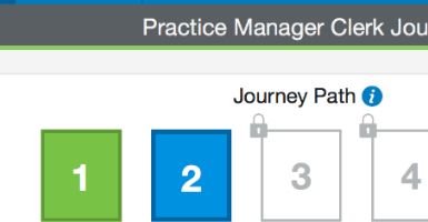
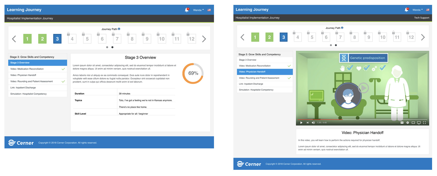
For learners: enumerated steps with three states, locked, current, and complete. No time estimates. No completion percentage relative to the full journey. Progress feedback was local: you finished this step. The system validated momentum rather than measuring distance to a destination. Each step built on the previous one by design. We worked with the learning design team to structure content atomically, smallest conceptual units first, so that competence accumulated in a way that felt earned rather than assigned.
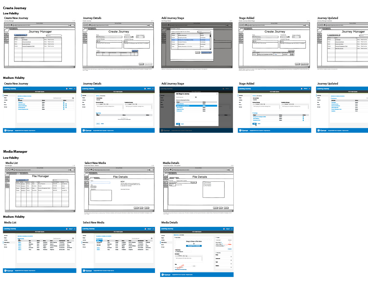
For administrators: building a journey required assembling discrete content objects in sequence, which meant the content management tool had to support a fundamentally different workflow than a standard LMS course builder. I produced low-fidelity flows for the manager interface first, before any learner-facing screens, partly because the admin tool had to ship before the user-facing app could be populated but mostly because the integrity of the learner experience depended on journey architects understanding what they were constructing. If the admin tool made it easy to dump content in without considering sequence and dependency, learners would end up with broken journeys regardless of how well the front end was designed.
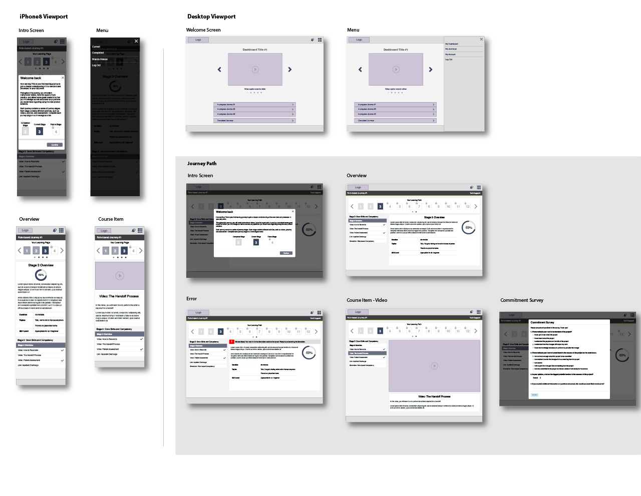
The transition from lo-fi to medium fidelity happened faster than I would have liked, since engineering timelines compressed the iteration window, but we’d done enough testing on the core navigation model that the wireframe phase was mostly about refinement, not discovery. The decision to leverage existing design system elements aggressively, rather than introducing new components, was deliberate: it kept the learner experience visually familiar within Cerner’s ecosystem and reduced engineering risk at a point where we had little schedule margin left.
Building Credibility
The hardest stakeholder conversation wasn’t about the design. It was about the philosophy behind it.
Cerner’s learning team had spent considerable time and energy on the journey concept. They believed in transparency, in giving learners a complete view of what they were taking on. The user testing that contradicted that belief was well-run and unambiguous, but it challenged an assumption that had been organizational consensus. I wasn’t presenting findings to a neutral audience; I was presenting findings that required people to let go of something they’d built.
What made that conversation work was the specificity of the finding. This wasn’t “users prefer simpler interfaces”; that’s easy to dismiss as a preference. This was learners looked at complete journey visualizations and stopped engaging entirely. The behavioral data was concrete enough that it was harder to rationalize away. And because we’d tested multiple visualization approaches, not just the full-journey view versus the step view but several variations of each, the recommendation came with evidence that the direction mattered more than any specific implementation.
The clinical leadership on the team was actually the most receptive audience. They understood immediately why a nurse seeing 14 hours of required training before a shift would close the browser. That credibility made the design argument easier to prosecute with the learning design and engineering stakeholders who had more invested in the original concept.
What Shipped
The Cerner Learning Journey Portal launched as a modified LMS combining targeted courses into discrete, sequenced experiences. The learner-facing interface delivered journeys as enumerated steps with completion indicators, no timeline view and no total-duration estimate. Administrators built journeys through a content management platform designed around atomic content sequencing, with the manager tool preceding the learner-facing app in the release order.
The platform rolled out across 253 client implementations. Per Cerner’s internal client reporting, measured software competency through training improved 48% compared to prior training approaches. Users reported recovering roughly 26% of the time that had previously been consumed by onsite training and bulky learning programs. Given that “no time for training” was the foundational constraint the entire design was built around, that felt like the most honest validation we could have received.
That time recovery number is the one I’d point to first with a skeptical stakeholder. It’s not a satisfaction score. It’s evidence that the design premise held: if you build learning to fit the margins of a clinical workflow rather than asking clinicians to create margins that don’t exist, the math changes. The mandate that had seemed to doom adoption instead became a catalyst. Learners who completed journeys reported feeling more capable rather than simply more compliant. Some progressed beyond basic competency and became learning leaders within their facilities, supporting colleagues navigating the same transition.
That last outcome, clinicians who started as reluctant mandatory participants and ended as voluntary advocates, was the signal that the design had achieved something beyond compliance. It had shifted how those people related to their own competence. That’s a different result than adoption metrics. It’s what happens when the design is built around professional identity rather than course completion.
The Larger Argument
When adoption is mandated rather than chosen, the designer’s job isn’t to make learning easier. It’s to make the learner feel capable. Those are different problems with different solutions.
Making learning easier is an information design problem: reduce cognitive load, improve navigation, clarify instructions. Making someone feel capable is a psychological problem: sequence experiences so that evidence of competence accumulates before the scale of the task becomes visible. The first problem is solved by clarity. The second is sometimes solved by strategic opacity.
The existing OCM playbooks didn’t make that distinction because they were built for contexts where learners had a choice, where motivation could be developed, where adoption could be gradual. Healthcare EMR adoption in 2014 had none of those affordances. It required a different theory of change, and getting to that theory required testing assumptions that the client’s internal team had treated as foundational.
That’s a pattern I’ve returned to across different domains: the most important design work is often the work of identifying which assumptions are load-bearing and which aren’t. The journey concept was load-bearing. The transparency assumption wasn’t. Knowing the difference is what made the project work.
Team
- User Experience
- Business Strategy
- Learning Design
- Partnership Management
- Clinical Leadership
- Engineering
- Data Architecture
Agent view
This page has a machine-readable twin, generated from the same source rather than written alongside it.
See how an agent reads this page