
Peru State: A Tiered Landing Page System That Beat Conversion Goals
Peru State had ad traffic, competitive programs, and prospective students actively searching for online degrees. What they didn’t have was landing pages designed around how those students actually made decisions. Visitors were arriving at general information pages and leaving without a reason to stay.
Tags & related work
The Challenge
Our partnership with Peru State was to raise brand awareness of their online degree programs, with the outcome of growing enrollments into the online programs. The school had very general information pages to which ad traffic was directed, and they were experiencing a high bounce rate for visitors to the page.
Project Overview
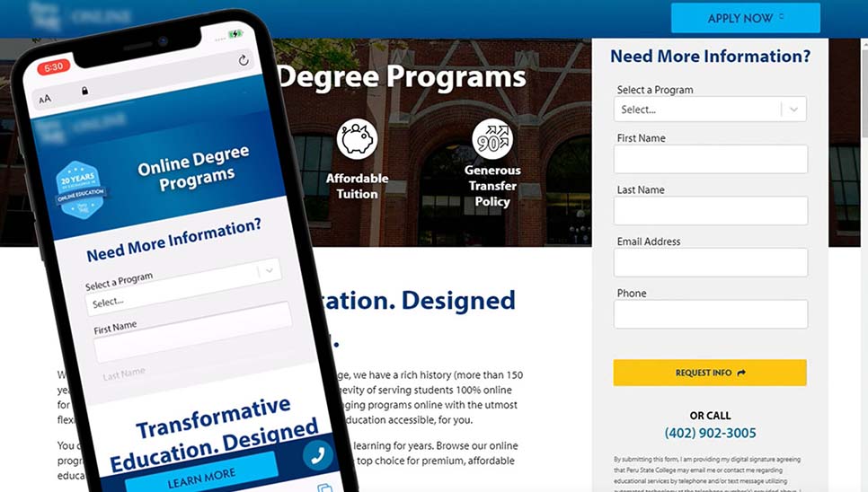
I was the sole UX practitioner and performed all UX phases, with final sign-off from the account owner. Creative, content, campaign, admissions and engineering contributions remained part of cross-functional delivery. The team partnered with the client to create a suite of landing pages utilizing the existing university brand to motivate online degree seekers to submit a request for more information on the program offerings. This was a tiered approach, with a general branded landing page that would display information on all the available online programs, a set of pages that would focus on the programs for the two levels of degrees (Undergraduate and Graduate), and then focused pages for each program.
Since the university’s brand was not widely recognized, our challenge was to instill trust in the quality of education offered, the affordability and flexibility of the education, and the social proof that a degree from the institution would be recognized in the industry. Prior to the discovery, part of our strategy was to plan out multivariate tests at regular intervals to evolve the content and visuals, as users’ expectations tend to change in a 5-8 month cycle.
Journey Map
The university had the challenge of attracting degree-seeking students to their online programs due to a lack of brand awareness and a thin online marketing strategy. I worked with the school to understand more deeply the types of learners that typically attend their on-campus programs, as well as researching the current trends in psychographic and demographic audiences who enroll in online higher education programs.
I set up direct user interviews based on the personas derived from the data to understand what a typical process of searching for an online degree for a Bachelors in Accounting, a Masters in Education, and a Masters in Organizational Management. These steps and user feedback were captured and visualized in a journey map to discover the areas we would need to focus on to remove friction for the prospective student.
Information Architecture
Peru State Online (PSO) was a connected 15-page mini-site, with links between its own pages and one link to the main Peru State educational website. The aim was to keep visitors within PSO for the full visit. The site supported online-enrollment inquiries, online-course information, and contact with the online-classes admin desk. Visitors could browse online classes by department or degree and view course details drawn from the institutional course catalog database. Submitting a request for more information remained a key action.
This action would enter the user into the admissions nurturing program where consistent and regular contact would be made with the interested user through personalized digital experiences to further inform and engage the prospective student, email drip campaigns to keep the prospect engaged with key admission and enrollment dates, and direct phone calls from assigned admission and enrollment advisor.
Wireframes
Focusing on the areas of opportunity identified in the journey maps, aligning with the business requirements, and using the content strategy outlines for each page, I utilized user experience patterns and principles to build a flow that would highlight the key actions the user would take on a given page. The wireframes would be used in lo-fi usability testing to ensure we were getting expected behaviors, as well as discover any new barriers to the user completing the task.
Conclusion
The team delivered the connected 15-page mini-site to suit the needs of paid search marketing as well as persona-driven social media campaigns. These pages delivered a range of content from full overviews of all programs, targeted programs, as well as contexts such as community college transfers and non-traditional degree seekers.
During my tenure, quarterly Academic Enrollment business numbers and product-management GTM click-through/conversion tracking informed reports that the project exceeded both visitor-to-lead and lead-to-applicant targets. Exact rates, target percentages, sample sizes and comparison periods were not supplied, and underlying data were not independently verified. These reports do not establish a controlled effect attributable solely to UX or a cost-per-lead result.
The historical account described an initial pandemic-related enrollment spike and later moderate qualified-lead generation during my time at Archer. The adjustment method and lead volumes were not established. I have no post-departure information.
During my tenure, content and layout iteration drew on analytics and qualitative inputs. Multivariate and A/B tests varied messages and information priority within the same ad campaign, using what I called “Google Tag manager 4”. Its product/version interpretation and exact test configuration are not established here. Accessibility evaluation primarily used Lighthouse and manual code checks; it was separate from those experiments and does not establish independently audited WCAG conformance.
Team
- User Experience
- Creative
- Paid Search Marketing
- Admission Advisors
- Audience Intelligence
- Web Development
- Web Analytics
Agent view
This page has a machine-readable twin, generated from the same source rather than written alongside it.
See how an agent reads this page