Scoped, independent delivery, in two stops
Two Archer Education UX engagements with distinct deliverables and qualified historical outcomes. Each account separates my UX work from team delivery and explains the limits of the reported results.
A connected 15-page mini-site with a defined UX scope and reported attainment of both conversion targets. Exact rates and delivery duration are not established.
Archer EducationA three-tier landing page system built around the student decision journey, tested iteratively and shipped in 15 pages. Reported outcomes from my tenure exceeded both visitor-to-lead and lead-to-applicant conversion targets.
Same shape of engagement, solved differently: SEO-first information architecture instead of a landing-page funnel, still scoped, still measured against an enrollment outcome.
Archer EducationI designed the UX for Athens State’s online-degree microsite and landing pages. The coordinated marketing and enrollment effort reported a 20% increase in selected struggling programs, primarily graduate management.
More finished work
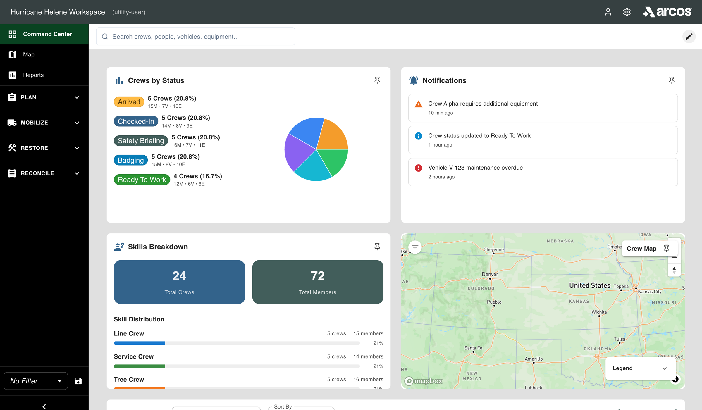
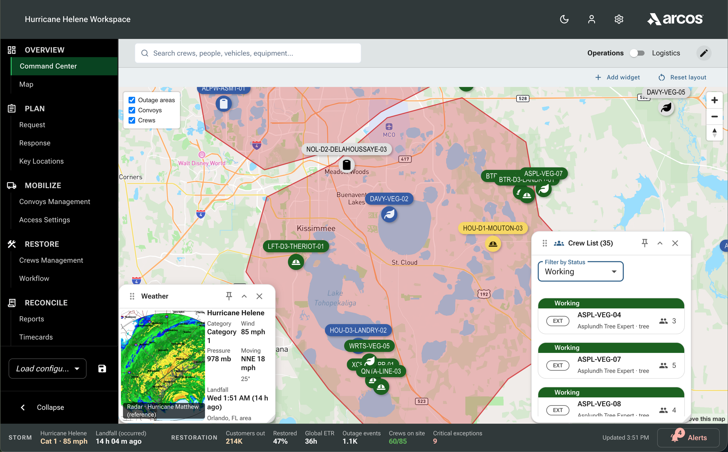
Reconstruction. · Mark 1 · early vision, created by me Reconstruction. · Mark 2 · prototype, created by me Arcos Control Tower: From Concept to Testable Prototype
I created Mark 1, my early vision of the Command Center, and Mark 2, the testable prototype. These public reconstructions show both with fictional data; the near-final Mark 3 in the study was built in three versions by two senior designers and me.
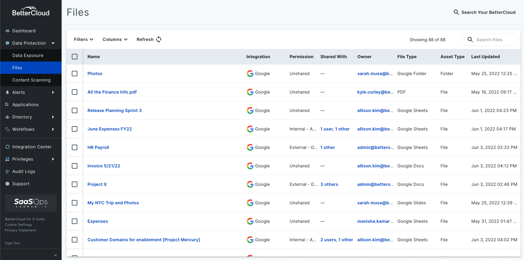
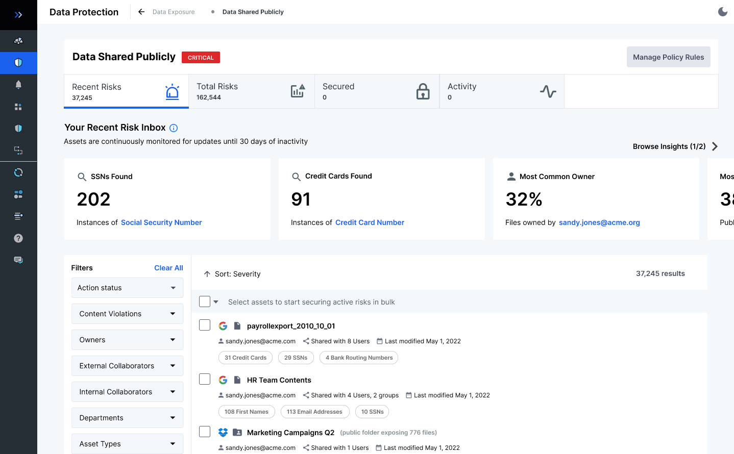
Legacy Files grid, recreated Risk inbox · later design BetterCloud Secure: From File Grid to Risk Inbox
I led the sprints and usability work behind the risk inbox’s list and inline actions, building on research I synthesized with BetterCloud’s Business Intelligence team. Allison Kim, a senior product designer, designed the charts. Parts reached beta; a backend caching issue held up the full release before the project was shelved.
Mark 1: one person (Rodeo build) Mark 2.1: the whole crew Timecards: From One Person to the Whole Crew
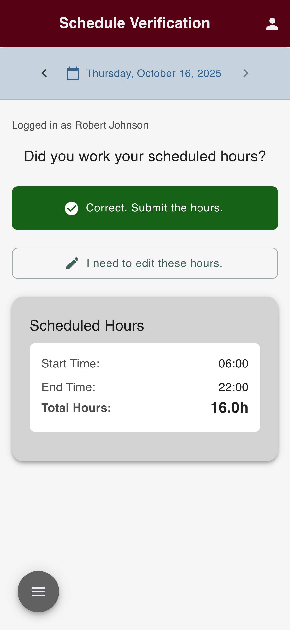
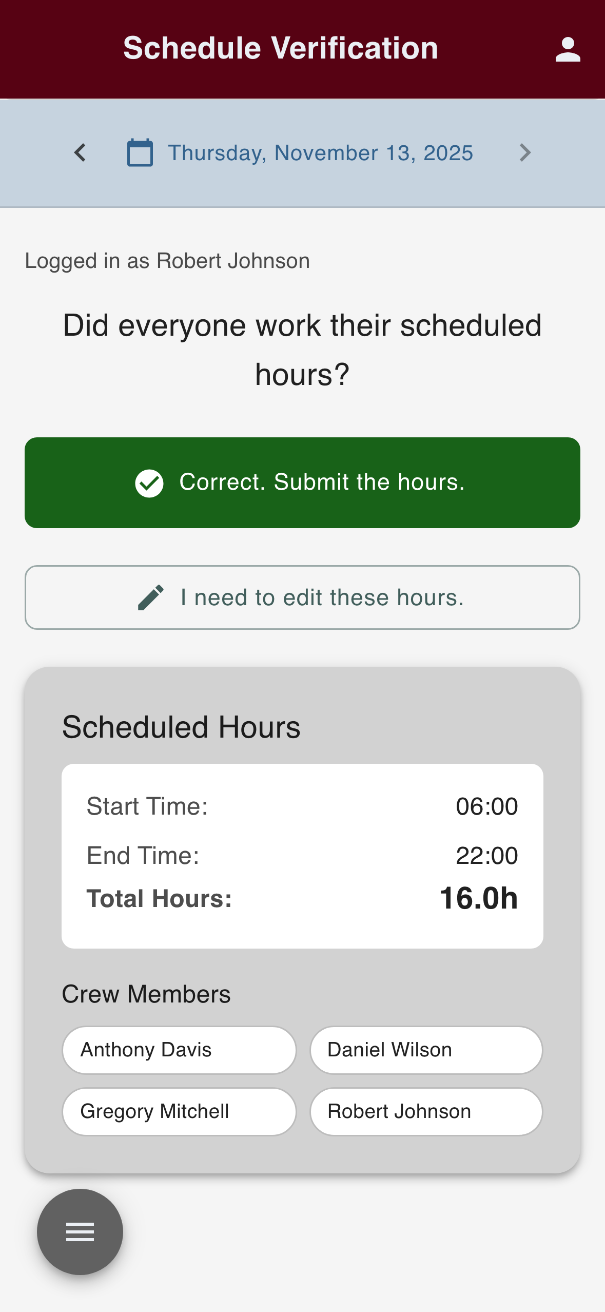
I built Mark 1, the prototype linemen and foremen tested at the Linemen’s Rodeo. When they showed that the crew lead enters everyone’s time, crew entry became the start of Mark 2. The first screen is the Rodeo build; the second is Mark 2.1, the crew-entry build I made at Arcos after the Rodeo. These are original captures, separate from the public Mark 2 demo I reconstructed after leaving. Fictional names, before production code was written.
Earlier design: eShop Neo Redesign: Innovatis TVH Uplift: From eShop Neo to Innovatis
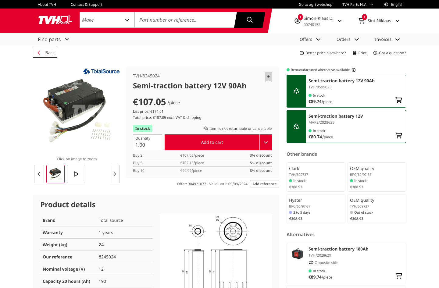
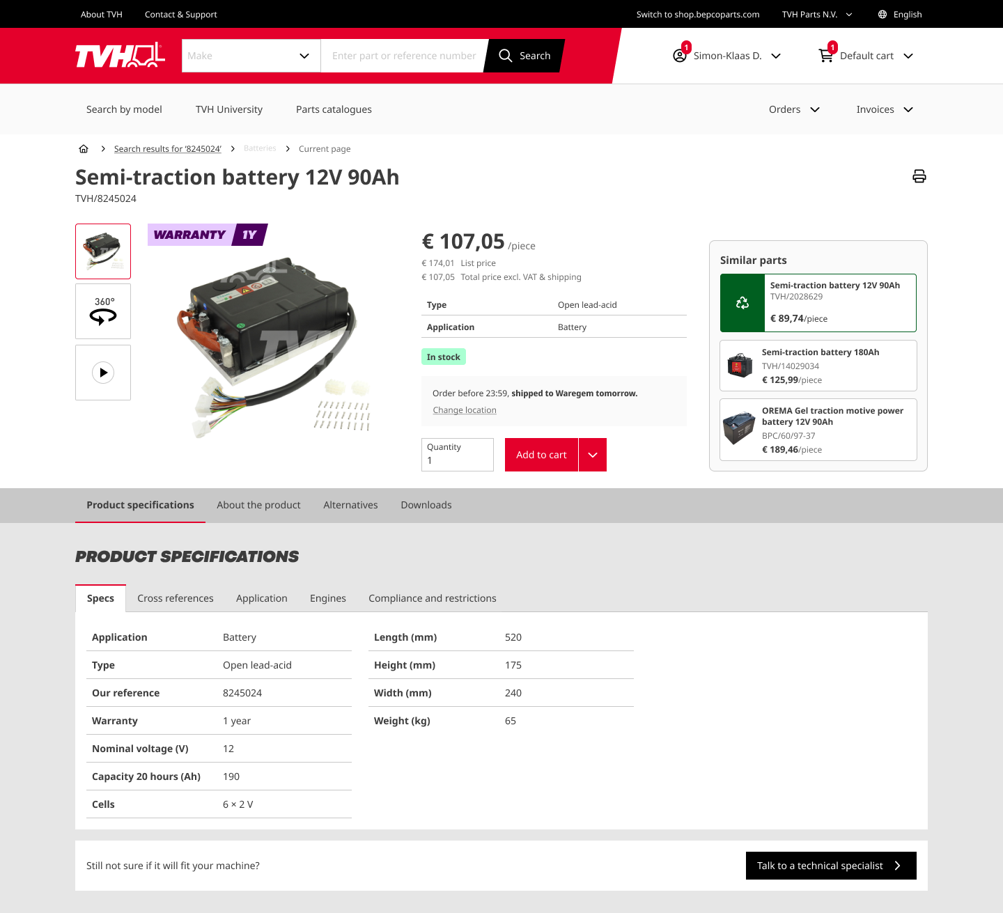
Two PDP design-file exports. I contributed low/mid-fidelity specs/details tabs alongside Geoffrey Van Meirhaeghe and Suzan, who finalized both displayed screens. I made the composite. Innovatis and cross-brand work remained in progress at my October 2024 departure; this comparison does not establish a customer release.
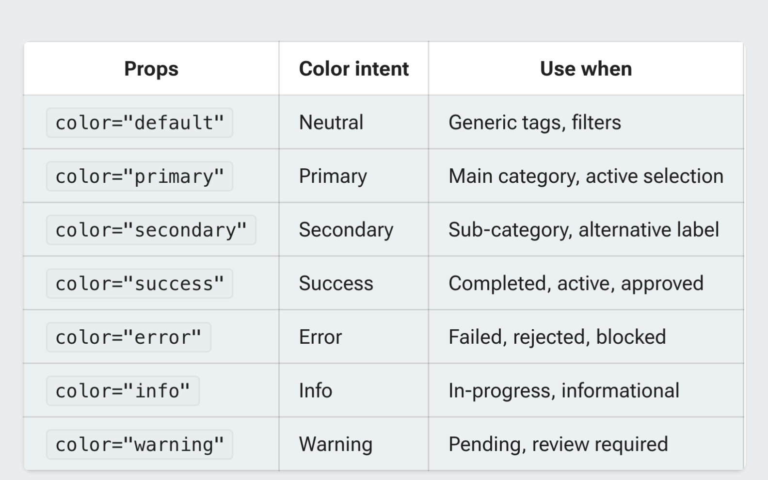
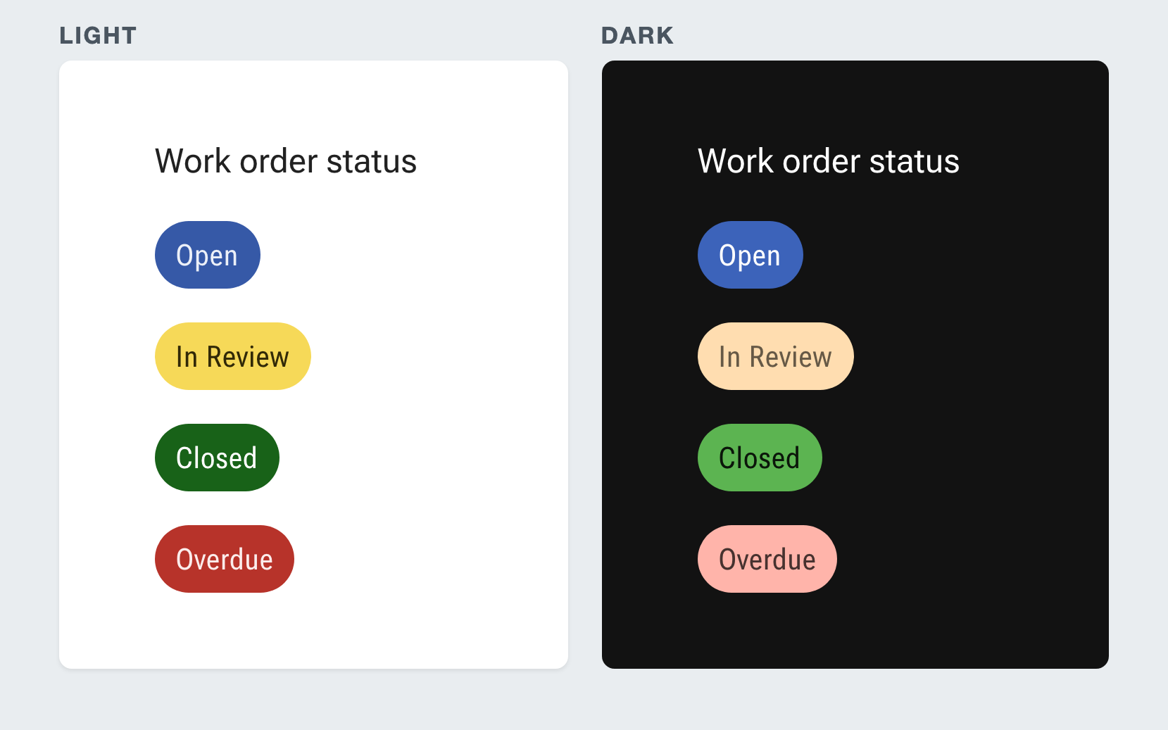
Guidance: warning means pending or review required Example: The Harmony Chip Intent example shows the same work-order statuses in light and dark themes. Harmony: One Intent, Two Themes
Harmony was intended to carry design intent to designers, engineers and AI coding agents. Harmony’s chip guidance maps color to semantic intent; warning means pending or review required. The Harmony Chip Intent example shows the same work-order statuses in light and dark themes.