
Format: System · Pipeline
Harmony: A Design System Built for Machines
AI-Ready Design Infrastructure at Arcos
AI coding agents read a design system’s names and props but not its intent, so they picked by the closest match: a warning chip could read correctly in one theme and fail contrast in the other.
- My part
- I led Harmony’s architecture and contributed hands-on at Arcos, including work with a senior designer on the token architecture. Other contributors owned or completed parts of the component and implementation work. Harmony’s token descriptions, where authored, explain a token’s intended use. Engineering manager Zack Fantauzzi and I re-architected my first approach into themes layered on unmodified MUI through ThemeProvider, with two MCP servers scoped to designers and to developers. I wrote the web theme, the npm package, Code Connect, and the governance and enforcement agents.
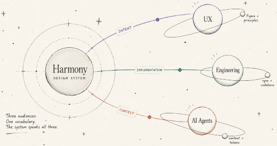
Illustration.Three audiences. One vocabulary. My sketch, finalized with ChatGPT’s help. - The team’s part
- Ales Karoza co-established the token architecture with me and created the JIRA kickoff skill. Steve Herring, a Slalom consultant, helped structure the token library in Figma and defined the Base Theme tokens. Zack Fantauzzi was the engineering partner on the re-architecture. Three senior designers trained for two weeks to author in the same toolchain; HM-AR-01, the selected Harmony account below, records the token-architecture credit. Two Arcos Control Tower web pods piloted the Storybook MCP and the enforcement agents.
- Status
- Internal
- Timeline
- Feb 2025 – Jul 2026
Outcome
Figma Code Connect, which I built, mapped Harmony’s atomic components and three desktop patterns (Panel, MainNav, WebAppBar) to their TypeScript implementations.
Tags & related work
Selected Harmony account
This selected retrospective account is separate from the authored story. It does not establish every claim, artifact credit, release status or image permission on this page.
I led Harmony’s architecture and contributed hands-on at Arcos, including work with a senior designer on the token architecture. Other contributors owned or completed parts of the component and implementation work. Harmony was intended to carry design intent to designers, engineers and AI coding agents.
scope: This retrospective account does not claim sole authorship, universal adoption or ownership of every component.
Harmony’s token descriptions, where authored, explain a token’s intended use.
scope: This does not establish that every token has a description.
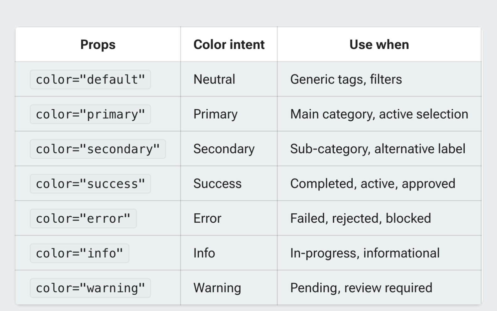
Harmony’s chip guidance maps color to semantic intent; warning means pending or review required.
scope: This is the documented design account, not a fresh test of production behavior or a captured agent exchange.
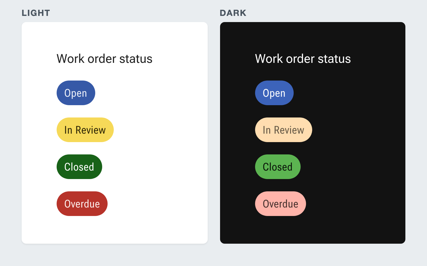
The Harmony Chip Intent example shows the same work-order statuses in light and dark themes.
scope: The example does not establish production-wide correctness, accessibility conformance or a measured user outcome.
Account context and references
Project scope: scope: Selected retrospective account, not the whole study or an independently audited implementation.
Work context: Arcos, Inc: UX field research and Control Tower/mobile design leadership. scope: Scoped work description, not a confirmed employment title or employment period.
Evidence account: Jason Sonderman. Retrospective account of the selected Harmony purpose and Chip Intent statements. scope: Supports the four selected statements as an owner-confirmed retrospective account only. uncertainty: No independent technical corroboration, captured agent exchange, production-wide outcome or media permission is established.
Source availability: Owner-confirmed retrospective account of Harmony purpose and Chip Intent. uncertainty: Retrospective account; original employer records not independently inspected. Private confirmation material is not provided by this API. Original source URL: not publicly available.
- Project: prj_harmony, revision 1; experience: exp_arcos, revision 2.
- Assertion: HM-AR-01, revision 1; kind: personal_contribution_with_shared_scope; verification: historically_confirmed_not_independently_verified.
- Assertion: HM-AR-02, revision 1; kind: interpretation; verification: historically_confirmed_not_independently_verified.
- Assertion: HM-AR-03, revision 1; kind: interpretation; verification: historically_confirmed_not_independently_verified.
- Assertion: HM-AR-04, revision 1; kind: interpretation; verification: historically_confirmed_not_independently_verified.
- Evidence: evd_harmonyaccount, revision 1; kind: account; support assessment: supports.
- Source: src_harmonyaccount, revision 1; kind: account; availability: not_publicly_available; public_url: null.
- Projection revision: r_5dd98d79d429a73f252b7d8b2205b657b8962e9a5ff157d87fbacfb72e2ec638.
The short version
Notice
Harmony is my third design system, built on what Fulcrum and Uplift taught me about reaching engineering and protecting ownership. Harmony was intended to carry design intent to designers, engineers and AI coding agents. Arcos Control Tower shipped in dark and light, so a warning was a role, not a hex value, and a model picking by the closest name makes a chip that passes contrast in one theme and fails in the other.
Recreated, not a screenshotWarning is a role, not a hex value
Recreated.The failure Harmony was built against. The warning role resolves to different values in light and dark, and when a value from one theme lands in the other, the chip reads fine in one and fails contrast in the other. The colors are chosen to show the failure, and the ratios are computed from them. Find
An engineer looking for a status chip searches Harmony’s Storybook, which documents what each component is for, not only its props. An agent asks the Storybook MCP, in pilot with two Control Tower web pods. Harmony’s chip guidance maps color to semantic intent; warning means pending or review required. No capture of that exchange exists, so the figure is drawn and labeled as a recreation.
Recreated, not a captureRecreated.An agent finds a status chip through the Storybook MCP. The reply is the same documentation a person reads in Storybook, delivered into the agent’s context. No capture of this exchange exists, so it is drawn. Install
Harmony reached engineering as an npm package I built and first pushed to private AWS CodeArtifact around April 2026, installed in the Control Tower web pilot as a versioned dependency. It carries the compiled token layer, both themes, and component stories, and sits on unmodified MUI through ThemeProvider. Figma Code Connect, which I also built, maps the atomic components and three desktop patterns to their TypeScript implementations in the package.
Reconstruction.Redrawn from my architecture diagram. Harmony’s token descriptions, where authored, explain a token’s intended use. Harmony’s layers run from the token file to the build. The Storybook MCP and the enforcement layer were in pilot, and Chromatic was under evaluation, when I left. Use
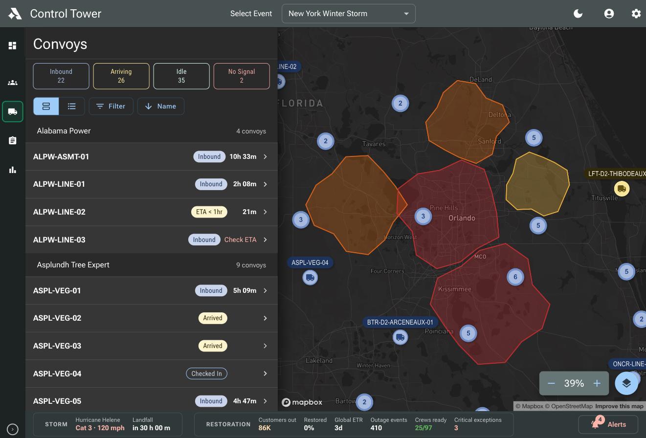
A correct first use is a choice by intent, not by color. Harmony’s chip guidance maps color to semantic intent; warning means pending or review required. The Harmony Chip Intent example shows the same work-order statuses in light and dark themes. The same kind of status chip carries convoy status in Control Tower.
- Guidance: warning means pending or review required
- Example: The Harmony Chip Intent example shows the same work-order statuses in light and dark themes.
- In product: status chips in the Convoys view
One decision, traced. The Storybook captures show Harmony as it stood when I left Arcos. Harmony’s chip guidance maps color to semantic intent; warning means pending or review required. The Harmony Chip Intent example shows the same work-order statuses in light and dark themes. The same kind of status chip carries convoy status in Control Tower. Catch
When a developer reached for a raw MUI component where a Harmony one existed, an enforcement agent flagged it. Two Control Tower web pods piloted these agents, which also ran accessibility validation and reviewed code against the AI-generated design spec. The system didn’t ask developers to follow it. It made the wrong path visible at the moment they took it. The message shown is recreated from that description.
Recreated, not a captureRecreated.The error message, in place of a silent mistake: the component enforcement agent flags raw MUI where a Harmony component exists. Two Control Tower web pods were piloting it when I left. The wording is drawn from this study; no capture exists. Explain
Harmony’s token descriptions, where authored, explain a token’s intended use. The name stays semantic for people; the description carries the meaning a name can’t. That documentation travels: the Storybook MCP puts component purpose into the agent’s context, and the Zeplin MCP delivers feature-scoped design intent into the developer’s build environment at the moment of build.
Harmony’s token descriptions, where authored, explain a token’s intended use. The same Harmony token is shown with and without its $description. This is a real entry from the light-theme token file. Adopt
Storybook launched on Chromatic in April 2026. Three senior designers trained for two weeks into VS Code with Claude Code CLI, and Ales Karoza co-established the token architecture (HM-AR-01, the selected Harmony account). When I left in July 2026, the Storybook MCP and the enforcement agents were still in pilot, QA was evaluating Chromatic visual regression, and no Spanish build had shipped in an Arcos product. The layer was ready for a locale; readiness is not a shipped locale.
How Harmony reached engineering: the npm package and Storybook on Chromatic, both around April 2026, and where things stood in July 2026 when I left. Hold
The first UX-authored higher order component, the Desktop Panel, was merged into the Control Tower product by engineers who hadn’t built it, though release integration was unfinished when I left. The mobile pod, never part of the rollout and never trained, connected the Zeplin MCP into its own Claude Code workflow. Tech leadership’s questions about codebase ownership were still open when I left. The figure shows Harmony in Arcos Field, the crew’s phone app.
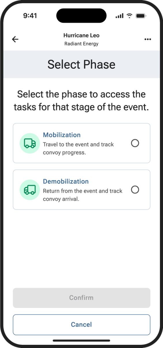
Harmony in Arcos Field, in the light theme: a crew member chooses the Mobilization or Demobilization phase of an event.
Decisions that mattered
Decision 1
Should Harmony own MUI’s components, or theme them?
- Options
- Choice
- Layer Harmony themes on unmodified MUI components through ThemeProvider
- Evidence
- Owning components meant owning MUI version updates, bug fixes that started in MUI, and every regression from a breaking change. UX had no dedicated React developers to carry that work.
- What followed
- UX controlled the visual layer and engineering kept the component layer. If Harmony failed to load, MUI defaults still rendered and the software still worked, and dark and light became token sets rather than component forks.
Decision 2
How does a token tell an agent when to use it?
- Options
- Choice
- Harmony’s token descriptions, where authored, explain a token’s intended use.
- Evidence
- A token named color-feedback-warning tells a developer something and tells a model a label. The description is what lets a model pick the right token for the right reason instead of the closest syntactic match.
- What followed
- Harmony’s token descriptions, where authored, explain a token’s intended use. The MCP servers carried that kind of intent into the agent’s context.
Decision 3
One MCP server for everyone, or one per consumer?
- Options
- Choice
- Figma MCP for designers, Zeplin MCP for developers
- Evidence
- Designers needed the source at full fidelity for authoring, governance, and system updates. Developers needed the information for the build in front of them, scoped to the feature, at the moment of implementation.
- What followed
- Developers worked only in Zeplin MCP, with the Storybook MCP adding component purpose in pilot, and a JIRA kickoff skill, created by Ales Karoza, paired each ticket with its Zeplin context to draft a build plan before anyone opened VS Code.
Decision 4
Roll the enforcement agents out everywhere, or pilot them first?
- Options
- Choice
- Pilot them in two Control Tower web pods
- Evidence
- Each layer needed the one under it to be solid before it could be tested honestly, and the pilot was how the team learned how the model performed against real delivery cycles before scaling it.
- What followed
- When I left, the agents were still in pilot. Scaling them past two pods, tuned for different teams, was the next step I saw, not something that happened while I was there.
What I’d do differently
I would bring tech leadership into the architecture earlier. Their questions about codebase ownership and what UX-generated code meant inside an engineering org were fair, the theme-provider pivot answered only part of them, and that conversation was still open when I left. I would also have pushed for one Spanish build inside the pilot, so the localization claim rested on a shipped locale rather than on readiness.
Results
- Figma Code ConnectAtomics + 3 patternsAtomic components plus Panel, MainNav, and WebAppBar, mapped to their TypeScript implementations
- First UX-authored HOCMerged, not yet releasedThe Desktop Panel was merged into the product by engineers who hadn’t built it; integration with release code was unfinished when I left
- Team enablement3 designers, 2 wks trainingInto VS Code with Claude Code CLI; Ales Karoza co-established the token architecture
- Pilot footprint2 pods, 3 senior designers
What shipped
Harmony in Control Tower’s Convoys view, in the dark theme: status filters and chips for Inbound, Arriving, Idle, No Signal, Arrived, and Checked In.
Harmony in Arcos Field, in the light theme: a crew member chooses the Mobilization or Demobilization phase of an event.
Read the full story9 min
Where the first two systems stopped
Harmony is my third design system. I led Harmony’s architecture and contributed hands-on at Arcos, including work with a senior designer on the token architecture. Other contributors owned or completed parts of the component and implementation work. BetterCloud Fulcrum became the best prototyping library its designers had ever had and never crossed into engineering, and TVH Uplift crossed into engineering but drifted, trusted in some teams and built around in others, until its engineers moved under UX with protected capacity.
At Arcos I treated both lessons as solved premises: a system has to live in engineering, and it needs an owner who can protect it. The third problem was new. Once AI entered the delivery pipeline, the gap between what a person could read in a design system and what a machine could act on stopped being theoretical. Harmony was intended to carry design intent to designers, engineers and AI coding agents.
How did building Fulcrum and Uplift shape what Harmony needed to be?
What a name can’t carry
AI is very good at moving fast and very bad at knowing what it doesn’t know. Feed a model a Figma spec and it will produce code, confidently, making the same small judgment calls a developer would make. A developer can ask a question. A model just picks.
Agentic coding tools are only as good as the context they can reach, and most design systems were written for a human reader who could infer and ask. A token named color-feedback-warning tells a developer something. It tells a model a label. A component documented with props and variants tells an engineer how to use it and tells an agent the syntax. Neither carries what decides whether the output is right: why this token and not the similar one two rows up, why this component and not the raw library element underneath it.
Two product requirements made that gap concrete. Arcos Control Tower shipped in both dark and light, and a warning surface was not a hex value. It was a role that resolved to different values in each theme. A model that picks by the closest name, or worse by the value it saw last, produces something that reads correctly in one theme and fails contrast in the other, and nobody catches it until a user in the wrong theme reports it.
The second requirement was language. Customers kept asking for Spanish across the storm-response tools, and a component whose padding, line count, or truncation quietly assumes English string length breaks the moment the copy grows by a third. Neither constraint shows up in a token name or a prop table.
So intent had to be legible at every layer: in the token descriptions, in component documentation grounded in user need, in feature-level intent from the design spec, and in agents that enforce the system rather than only assist with it.
What does 'machine-readable design intent' actually mean in practice?
Building the chain
Dark and light were both core from the start of the token work, not a later theme variant, and dark got the design attention first. Command center and dispatch users sat in Control Tower for hours at a stretch, command center operators alongside seven other applications across four monitors, and during a storm event that stretch became a shift and then another one. A majority of them asked for dark, so dark was where contrast, elevation, and status color were validated first, and light was then held to the same bar. Localization arrived implied rather than stated, so the layer had to let a locale drop in without a redesign: no copy baked into components, spacing and line handling that tolerated longer strings, and formatting that resolved from locale rather than from a hardcoded pattern.
The chain started with the tokens. Harmony used the DTCG format because the standard was open, the tooling was mature, and the description field was structured. Harmony’s token descriptions, where authored, explain a token’s intended use. The descriptions went into the DTCG file after the first extraction from Figma, when the JSON file in the repo became the source of truth. The names stayed semantic for people, and the descriptions carried the layer of meaning a name couldn’t: the layer that decides whether a model picks the right token for the right reason or just the closest syntactic match. I led Harmony’s architecture and contributed hands-on at Arcos, including work with a senior designer on the token architecture. Other contributors owned or completed parts of the component and implementation work. That senior designer was Ales Karoza, who helped establish the external JSON file as the canonical source of truth for the token layer. Steve Herring, a Slalom consultant, helped structure the token library in Figma and defined the Base Theme tokens.
From the tokens, the system built upward. I built the Harmony npm package and pushed it to private AWS CodeArtifact, where the Control Tower web pilot installed it as a versioned dependency. Figma Code Connect, which I built, mapped the atomic components and three desktop patterns to their TypeScript implementations, so the source of truth and the code couldn’t drift apart silently. Storybook ran against the published package and documented what each component was for, grounded in user need. Harmony’s chip guidance maps color to semantic intent; warning means pending or review required. The Harmony Chip Intent example shows the same work-order statuses in light and dark themes.
- Guidance: warning means pending or review required
- Example: The Harmony Chip Intent example shows the same work-order statuses in light and dark themes.
- In product: status chips in the Convoys view
The architecture I left behind wasn’t the one I first drafted. My first approach consumed MUI components, overrode each one with a theme provider, and exported the result, so engineering would import Button from Harmony instead of from MUI and UX would own the whole visual layer. The case against it showed up as soon as I worked through the implications: owning components meant owning MUI version updates, bug fixes that started in MUI, and every regression from a breaking change. UX had no dedicated React developers, the way the design system org at TVH did, to carry that.
Engineering manager Zack Fantauzzi came in once my first code theme was ready for review, and together we re-architected it. Harmony provided themes instead: token sets and implementations delivered through MUI’s ThemeProvider, layered on unmodified MUI components. UX controlled the visual layer and MUI handled the component layer. The system gained a safety property the first draft lacked: if Harmony failed to load, MUI fell back to its defaults and the software still worked. That separation made the system safe to ship in pilot, because UX wasn’t claiming anything it couldn’t sustain. It also settled theming. I wrote the web theme myself, because development didn’t have the people for it. A mode was a token set, so dark and light stayed a configuration of the layer UX owned instead of a fork of the layer engineering owned. A pivot made for capacity turned out to be why the theme layer could carry two modes at all.
The agent layer closed the chain, with two MCP servers scoped to two consumers. Designers worked in Figma MCP at full source fidelity, for authoring, governance, and system updates. Developers worked only in Zeplin MCP, which delivered feature-scoped design context and user intent annotations into the build environment. Storybook was MCP-enabled in pilot, so component purpose flowed into the agent’s context alongside the feature spec. A kickoff skill Ales Karoza created pulled the JIRA ticket that defined a feature, paired it with the Zeplin context, and generated a build plan before anyone opened VS Code.
Underneath ran agents that enforced rather than assisted. I built them, with process input from a few senior and lead developers. UX used governance agents for design system updates. Two development pods piloted enforcement agents that ran accessibility validation, reviewed code against the pilot-generated design spec, and caught developers reaching for raw MUI components when a Harmony equivalent existed. The system didn’t ask developers to follow it. It made the wrong path visible at the moment they took it.
Earning engineering’s trust
The argument had to be heard before anything got built. Individual developers came on board first; they paid the highest cost of the old handoff and saw the relief most clearly. Product leadership followed. Tech leadership was the harder room, and that conversation was still open when I left. Their questions about codebase ownership and what UX-generated code meant inside an engineering org were legitimate, and they deserved careful answers rather than workarounds.
The pilot couldn’t run on my work alone. Three senior designers went through two weeks of training and environment setup to work in VS Code with Claude Code CLI. That is a real ask for experienced designers who had never opened a terminal, and they showed up for it. The model held because the team could run it without me.
Engineering credibility came from work engineers could judge on their own terms. When the first higher order component (HOC) from UX, the Desktop Panel, went to the Control Tower codebase, the question wasn’t whether it looked right. It was whether engineers who hadn’t built it could review, trust, and merge it. They could, and it was merged into the product. It lived in the same repository as the production code and arrived through the same dependency channels as any other internal package. Integration with release code was still unfinished when I left, so no UX-authored HOC reached a customer release.
The sharpest proof came from somewhere I hadn’t planned. The mobile pod, never part of the original rollout, with no training and no onboarding, connected the Zeplin MCP into its own Claude Code workflow during a planning session, using it to visualize shaping outcomes mid-discussion. The pod also built a UX Designer agent trained on the UX team’s documented ways of working. Nobody onboarded them. They read the same architecture the pilot pods used and extended it themselves.
Where it stood when I left
The pieces went in a deliberate order: foundation, then chain, then enforcement. Code Connect couldn’t ship until the package existed. The Storybook MCP couldn’t pilot until Storybook ran against the package. Chromatic only meant something once Storybook imported the real dependency.
In production, as of when I left. The Zeplin MCP was active across planning and initial build, and Ales Karoza’s kickoff skill generated build plans against JIRA tickets. Storybook had been live on Chromatic since April 2026 with tokens and core components. UX ran my governance agents as normal practice.
Launched and instrumenting. I first pushed the Harmony npm package to private AWS CodeArtifact around April 2026. It was installed only in the Arcos Control Tower web pilot, where existing production code was being refactored against the token and theme layer, not in released product code. I had just finished Figma Code Connect, built with Figma MCP and Claude Code CLI, mapping the atomic components and three desktop patterns (Panel, MainNav, WebAppBar) to their TypeScript implementations.
In pilot or under evaluation. The Storybook MCP was in pilot with two Control Tower web pods, who were assessing its accuracy against their own feature work. The enforcement agents ran in those same two pods, and the Design Implementation Spec generator I built was still in pilot. Across three piloted Control Tower cycles, structured Zeplin attributes based on Harmony tokens, both MCPs, and the AI-generated design spec worked together to cut kickoff from two weeks to three days. Routine Zeplin and governance use did not mean every automation element had rolled out. QA was evaluating Chromatic visual regression.
Localization was the honest item on the list. The layer was built so a Spanish locale could drop in, but no Spanish build had shipped in an Arcos product when I left. Structural readiness is not a shipped locale.
The delivery numbers this pilot produced are told in The Handoff Is the Bug: kickoff went from a two-week investigation sprint to three days, time to market ran about 30% faster across piloted delivery cycles, and I built a testable coded concept, Timecards Mark 2.1, in about 12 hours over 3 days, which Ales Karoza then integrated and refined, against my estimate of roughly 40 hours for a wired Figma prototype covering the same scope. What was in pilot was in pilot because that’s where the work stood when my time there ended, not because it stalled.
Team
- 3 Senior Designers
- 2 Pilot Development Pods
- 1 Engineering Advocate
Agent view
This page has a machine-readable twin, generated from the same source rather than written alongside it.
See how an agent reads this page